

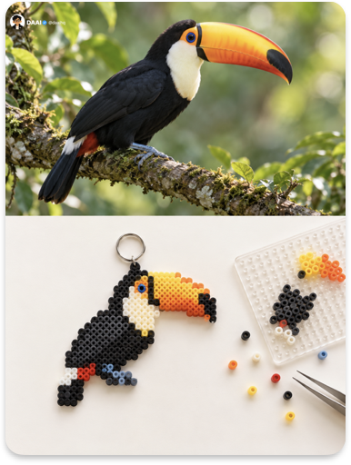
Turn each photo I upload into a separate, standalone premium design poster. Do not create multi-image collages; output each photo individually. Use an overall 3:4 vertical composition, divided into two areas with strictly equal heights at a 1:1 ratio, each occupying 50% of the image. In the upper half, preserve the original photograph, maintaining the subject’s identity, structure, pose, realistic texture, natural lighting, and original color atmosphere. Apply only subtle, sophisticated color grading to give it the quality of an art magazine or lifestyle publication. The surrounding environment may be naturally extended to fit the aspect ratio, but the subject must not be stretched, distorted, or altered. In the lower half, extract the photograph’s most recognizable subject, silhouette, and color relationships, then compress them into a low-resolution fuse bead artwork or fuse bead pixel object. Construct the subject using approximately 20×20 to 30×30 small colored beads, with simplified contours and minimal detail. Use only a few key colors so the original object is instantly recognizable. The finished piece should resemble a small charm that could hang from a keychain or a treasured handmade badge. The visual narrative should have two layers: a completed fuse bead piece that has already been ironed, with slightly fused edges, and a nearby unfinished section on a transparent pegboard, accompanied by a small number of loose beads and a pair of tiny tweezers, as if the maker had just paused. Use no more than two supporting objects and keep the arrangement restrained. Emphasize the authentic material qualities of fuse beads: the hollow hole in each bead, slight fusion and flattening after ironing, a soft semi-matte surface, imperfect granular edge contours, subtle warping, and short, soft shadows cast on a solid-color background. Avoid flat digital pixel fills, the appearance of a video game screenshot, and excessively smooth 3D-rendered plastic. Use a top-down still-life composition. The completed piece should be the primary visual focal point but occupy only about 30%–35% of the lower half. Create a loose, asymmetrical balance between the finished piece, the pegboard, and the scattered beads. Keep the background an extremely pale solid color, such as cream white, light mint, pale pink-white, or light misty blue, with generous negative space. Extract the 4–6 brightest and most vivid colors from the photograph above and convert them into the cheerful colors commonly found in fuse beads: brighter, purer, and less gray. The palette should feel fresh, soothing, and uplifting, never cheap or fluorescent. Use text sparingly. It may appear as a small handwritten label, a number, or a short word placed quietly within the empty space. Any language may be used. The overall result should present a light, playful visual language formed by fuse bead pixels, heat-fused surfaces, the handmade process, top-down still-life photography, and abundant negative space. The core principle is that pixels do not necessarily have to glow; they can also be tiny beads pressed by hand onto a pegboard. Avoid video game pixel art, full-frame bead coverage, a cheap plastic toy appearance, fluorescent colors, cartoon styling, and template-like commercial product imagery.