

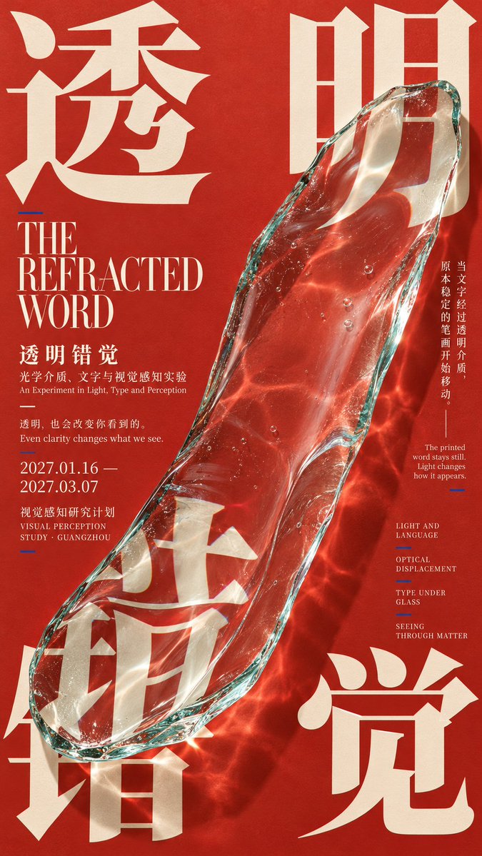
【Theme】 【Four-character Chinese title】 【Main visual subject】 【Subject × typography interaction】interweaving / occlusion / refraction / passage / deformation / material fusion 【Primary background color】 【Primary typography color】 【Accent color】 【English title】 【Exhibition information】 【Aspect ratio】9:16 Create a contemporary experimental poster with the qualities of **East Asian Contemporary Exhibition Poster, Japanese Experimental Graphic Design, Editorial Art Direction, and Four-Corner Typographic Composition**. Build the core around a “four-corner giant-character composition.” Split the 【Four-character Chinese title】 into four enormous Chinese characters and use them as visual anchors in the upper-left, upper-right, lower-left, and lower-right corners. Do not make the four characters mechanically equal in size or spacing, and do not arrange them as a rigid four-quadrant grid. Use varied type sizes, cropping, bleed, font weights, and positioning to establish an asymmetrical yet stable compositional tension. Place a highly distinctive 【Main visual subject】 at the center of the image. The subject must be large enough and genuinely participate in the typography rather than simply sitting between the four characters. Based on the 【Subject × typography interaction】, establish two to three clear relationships. For example, the subject may pass in front of and behind character strokes, obscure parts of the letterforms, refract text through transparent material, grow along the negative spaces of the characters, extend real materials into portions of the strokes, or alter the typography through transitions between photographic and printed states. Every interaction should feel “unexpected but logical,” while keeping the Chinese characters recognizable. Choose only one strongest visual mechanism as the core of each artwork. Do not simultaneously pile up refraction, fluids, penetration, particles, transparency, and complex effects. The subject itself must feature rich, realistic material detail, such as plant veins and roots, glass refraction, metallic particles, fabric folds, folded paper surfaces, animal feathers, or insect scales, ensuring that the main visual is worth examining at a larger scale. Organize the typography into three levels: the enormous Chinese characters in the four corners form the primary visual layer; the 【English title】 and the Chinese name of the work form the second layer; and the subtitle, date, location, short artwork statement, thematic keywords, and a small amount of explanatory copy form the third. Use clear contrasts in type size, shifts between horizontal and vertical setting, asymmetrical alignment, fine rules, and tight spacing to create a mature editorial design. Keep the information density medium to high, but do not fill the entire image evenly. Establish a rhythm of “locally dense × locally quiet” areas. Use the 【Primary background color】 as a large color field, the 【Primary typography color】 to create a stable structure, and the 【Accent color】 only for the subject, fine lines, the date, or a very small number of print marks. Maintain high contrast, a limited color palette, and a contemporary printed texture. You may add extremely subtle paper texture, screen-print halftone dots, offset-print grain, and localized overprint effects, but avoid heavy aging, grime, or punk collage aesthetics. The final reading order should be: first, notice the powerful overall form created by the huge Chinese characters in the four corners and the subject; second, discover that the subject genuinely changes, passes through, or participates in the typographic structure; third, examine the realistic materials, occlusion, refraction, and spatial relationships; and finally, read the 【English title】 and a small amount of exhibition information. The finished work should resemble an authentic contemporary art exhibition poster, an experimental graphic design annual, a cultural visual identity, or an independent art publication, rather than a conventional “subject image + text in four corners” template. Avoid: mechanical four-quadrant grids, four characters of exactly the same size, an undersized subject, separation between text and subject, random English text, meaningless parameters, a PowerPoint-like appearance, technological HUD elements, excessive effects, heavy grunge, logos, QR codes, numbering, starburst effects in the four corners, and copyright marks.