

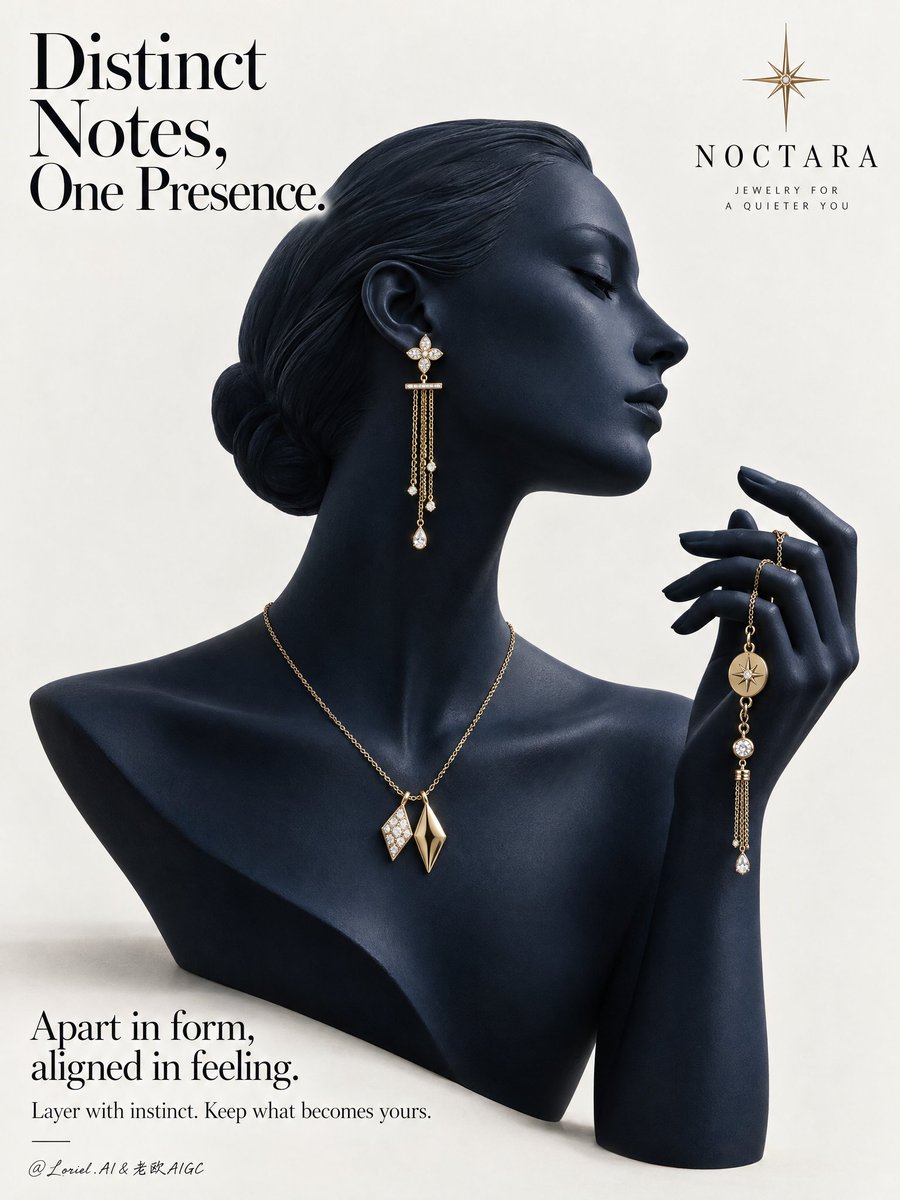
A Cannes-level luxury jewelry campaign poster for the fictional contemporary fine-jewelry brand NOCTARA, designed as a product-first editorial still life that fuses sculptural atmosphere, collector-grade material precision, and curator-level minimal restraint. The composition centers on a deep midnight-navy mannequin bust in elegant side profile, with a matching raised hand entering from the right to form one continuous sculptural gesture. The jewelry set remains the absolute focus: a refined yellow-gold mix-and-match composition across ear, neck, and hand, presented against a pale gallery-clean background with disciplined typography and strong negative space. Use a vertical poster format, straight-on with slight editorial monumentality. The mannequin occupies the center-left and center field, facing right. Preserve the clean poster rhythm: a large headline in the upper-left, a minimal star-like emblem near the upper-right, and a refined text block in the lower-left. The bust silhouette, neck curve, profile line, and raised hand should create a single elegant visual flow. Keep the background warm white to pale stone gray, uncluttered and spacious, with only a faint grounding shadow beneath the bust. The image should feel like a museum-grade print ad. The hero jewelry set is contemporary fine jewelry in polished champagne-yellow gold with restrained diamond-white accents. The visible ear wears one long drop earring with a small floral-geometric stud, a slim horizontal connector, and delicate chain tassels ending in tiny luminous drops. Around the neck sits a minimal gold chain necklace with two asymmetrical geometric pendants, intentionally non-identical yet harmonized, one brighter with a stone-led glint and one warmer sculptural gold form. The raised hand gently holds a coordinating chain bracelet or hand jewel with small medallion details and a slim dangling tassel. The overall language should feel modern, poetic, collectible, and quietly personal. The mannequin bust should be smooth, elongated, and refined, with poised chin, elegant collarbone line, and a calm profile directing attention toward the lifted hand. The hand must feel sculptural and couture-like, with gently curved fingers and believable tension where the jewelry is held. The jewelry distribution from ear to neck to hand should create a refined cadence, guiding the eye without crowding. Remove anything non-essential so the jewelry reads with maximum clarity and desirability. Keep the setting radically minimal and editorial. Depth should come from silhouette separation, tonal modeling, jewelry layering, and fine shadow falloff rather than scenery. The mannequin and hand should feel fully dimensional against the quiet pale background, with the jewelry emerging as warm points of precision. No props, furniture, texture overload, or narrative clutter. Use a restrained palette of midnight navy, pale stone white, champagne gold, and diamond-white highlights. Build a soft directional key from upper-left front grazing the profile, neck, shoulder line, fingers, and jewelry edges. Add subtle frontal fill to preserve detail in the navy surface while maintaining sculptural depth. Gold reflections should remain warm, crisp, and elegant, never harsh. Tiny diamond or pearl-like highlights should punctuate the jewelry with precision. Maintain premium contrast without dead black areas or flat gray dullness. Render everything with hyper-real luxury product photography and fashion-editorial polish. The mannequin surface should feel like matte-satin ceramic or lacquered resin with velvety density, between sculpture and couture display form. The gold jewelry must show immaculate polish, believable chain scale, precise link articulation, clean stone setting, and subtle micro-reflections. The finish should be immaculate, tactile, and high-end, with every edge resolved and every highlight controlled. No plastic sheen, muddy reflections, or cheap gloss. Place a refined wordmark for NOCTARA with a minimal starburst emblem in the upper composition. In the upper-left, set the headline: Distinct Notes, One Presence. In the lower-left, add: Apart in form, aligned in feeling. Beneath it: Layer with instinct. Keep what becomes yours. Typography must feel airy, elegant, and integrated, using a refined serif-led hierarchy with graceful spacing and no heavy crude fonts. Luxury jewelry poster, product-dominant, ultra-clean, editorial, hyper-real, no extra accessories, no clutter, no background scene, no gibberish text, no malformed fingers, no broken chain physics, no floating jewelry without support, no warped facial profile, no muddy navy tones, no dead black patches, no blown gold highlights, no duplicated pieces, no topology collapse, no style drift, no cheap catalog aesthetic.