

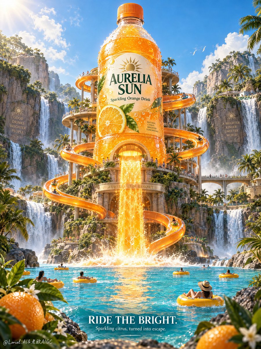
Create a premium vertical commercial poster for a fictional citrus beverage brand, "AURELIA SUN". Build it as a Cannes-level product-first fantasy ad where one giant real plastic bottle becomes the architectural heart of a luxury tropical waterpark. The bottle must remain the absolute visual hero, towering at center while a radiant stream of sparkling orange drink pours from its base like a glowing waterfall into a vivid turquoise lagoon. The image should merge premium packaging realism, engineered leisure spectacle, and destination-grade escapist storytelling into one clean, high-impact key visual. Use a frontal, slightly low-angle cinematic composition with strong central symmetry. Place the oversized bottle on the central axis, dominating the upper-middle frame. Wrap multiple elegant spiral waterslides around the bottle body, rising and looping with believable engineering, clean supports, and graceful rhythm. The orange liquid waterfall aligns with the bottle center and becomes the main vertical motion line, crashing into the lagoon below. Use tropical foliage, lagoon curves, floating tubes, and rock edges to frame the lower third, with distant cliffs and side waterfalls adding balanced depth. Preserve generous open sky around the bottle for premium breathing room and brand clarity. The bottle must feel hyper-real, collectible, and fully manufacturable: chilled clear plastic, smooth molded curvature, realistic cap threading, a premium orange cap, dense luminous orange drink, subtle suspended pulp, and abundant varied condensation beads. The front label must read exactly: "AURELIA SUN" Secondary line: "Sparkling Orange Drink" Include one small premium solar emblem. The label should feel globally branded, shelf-dominant, highly readable, and cleanly integrated into the bottle form. Set the scene in a lush tropical canyon resort with tall waterfalls, layered cliffs, palm trees, warm sunlight, clear blue sky, and a crystalline lagoon. The bottle acts as the central attraction tower of the park. Small visitors ride inflatable tubes and move through the slide system below, but remain tiny, sparse, and clearly secondary. Add restrained oranges and citrus leaves in the lower foreground corners as flavor anchors, elegant and minimal. The environment should feel luxurious, joyful, and immersive, as if the beverage has transformed into a premium destination. The slides must feel structurally plausible and carefully engineered, with clean entrances, believable supports, and readable circulation. The orange beverage waterfall should feel thicker and more luminous than water, glowing with citrus energy as it pours into the lagoon. The impact zone should show dynamic but controlled splash, foam, ripples, and reflected orange light. Every motion element must feel physically coherent, legible, and product-driven. Use bright tropical daylight with a warm directional key from upper left, clean ambient sky fill, and luminous specular highlights across the bottle, condensation, slide surfaces, and water. Build a 60/30/10 palette: 60% citrus orange, mango-gold, and warm solar glow; 30% lagoon turquoise, tropical blue, and lush green; 10% warm neutral rock, white splash foam, and small label accents. Increase local contrast on bottle edges, label print, condensation, slide gloss, and waterfall highlights while avoiding muddy shadows, dead blacks, dirty haze, or oversaturated chaos. Render everything with elite advertising realism: chilled plastic texture, crisp label edges, glossy slide coating, sparkling foam, tropical mist, wet rock surfaces, sunlit citrus peel, dense foliage, and subtle atmospheric depth. Add one refined external lockup in the lower-center or lower-right: "RIDE THE BRIGHT." Supporting line: "Sparkling citrus, turned into escape." All non-label text must stay secondary and never interrupt the bottle silhouette. Premium vertical poster, exact single-bottle hero, product-first hierarchy, giant bottle-waterpark fusion, tropical canyon setting, highly readable packaging, and unified commercial finish. Maintain coherent bottle geometry, realistic slide scale, believable support structures, a physically plausible luminous liquid waterfall, disciplined human scale, elegant citrus accents, and clear negative space around the product. Avoid extra bottles, unreadable label text, warped slide loops, theme-park clutter, messy crowds, cartoon cheapness, muddy water, distorted foliage, accidental resemblance to any real beverage brand, or any loss of the bottle as the dominant visual hero.