

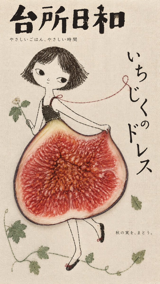
[Customize] Food: [Real food or ingredient] Subject: [Handdrawn person, animal, or object] Creative Interaction: [How the food transforms into part of the illustration] Magazine Title: [Original Japanese magazine name] Headline: [Short Japanese headline] Caption: [Short supporting text] Color Palette: [Muted background + accent colors] Aspect Ratio: 9:16 Create a whimsical Japanese editorial magazine cover combining naive handdrawn illustrations, delicate embroidery, natural linen textures, and realistic food photography. Visual Concept: The real food becomes an unexpected but natural part of the illustrated world—a dress, horn, umbrella, light, or another imaginative object. Preserve authentic photographic details in the food while keeping the surrounding illustration simple, imperfect, and expressive. Illustration Style: Loose black ink outlines, irregular handdrawn strokes, subtle pencil marks, occasional stitched details, and playful asymmetrical proportions. Characters should feel charming, quirky, and full of personality. Composition & Typography: Use an oversized illustrated subject, one striking food element, generous negative space, and a flexible Japanese editorial layout. Place a bold magazine title at the top, with a short headline and minimal supporting text naturally integrated into the illustration. Texture & Color: Warm linen paper, subtle fabric fibers, muted earthy colors, soft matte printing, and natural food textures. Let the food provide the strongest color accent. Art Direction: Playful yet sophisticated, nostalgic, handcrafted, and visually surprising. Every element should feel intentionally connected. Create one complete, original 9:16 magazine cover.