

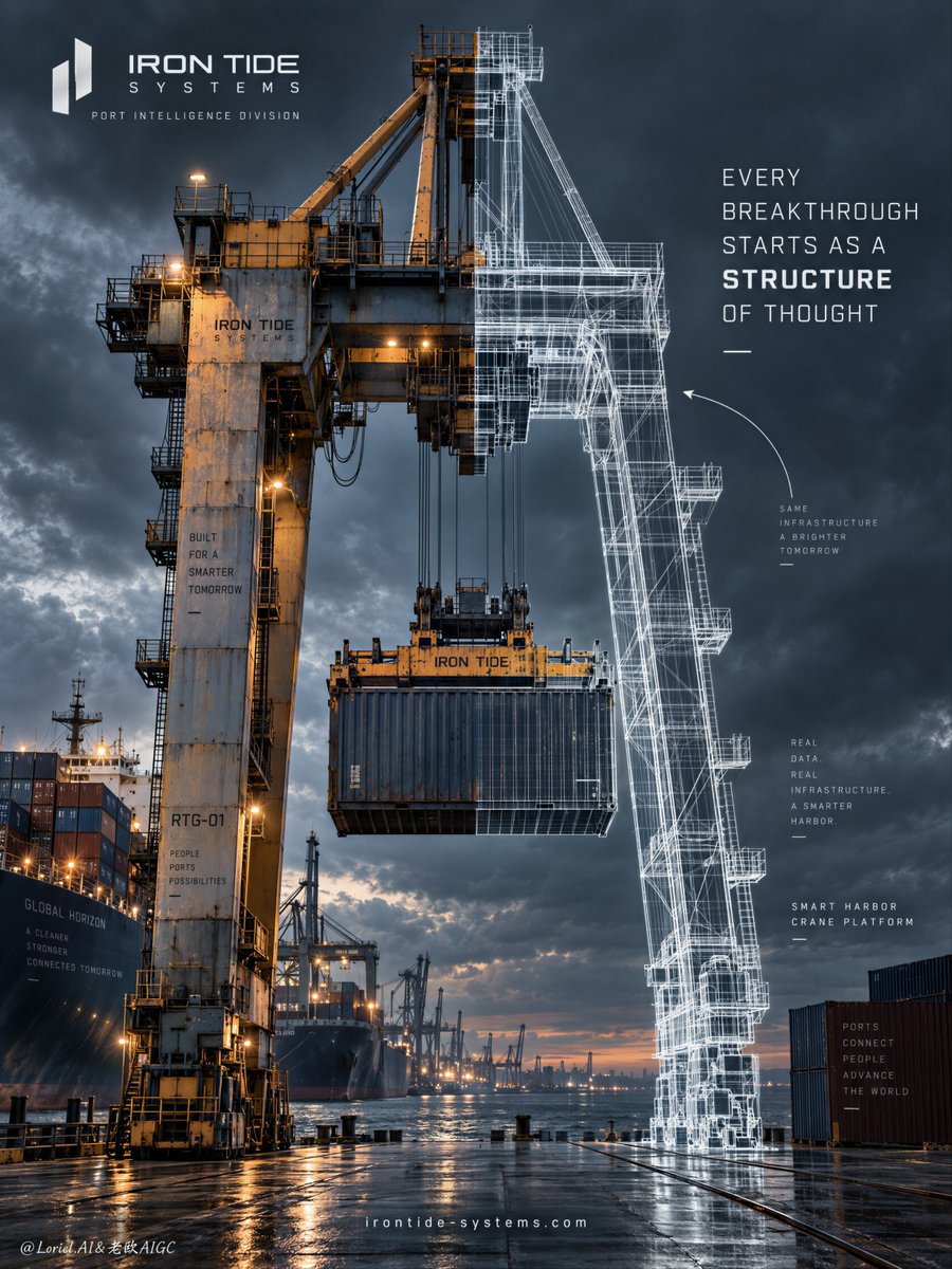
Create a Cannes-level industrial innovation poster for fictional smart-port engineering brand IRON TIDE SYSTEMS, merging heavy industrial realism, architectural blueprint logic, and gallery-clean campaign design into one unified hero image. The core concept is engineered transformation: a single monumental harbor crane stands at the center of a storm-dark dock, with one half rendered as a real operating machine and the other half translated into luminous technical wireframe, so the object exists simultaneously as built infrastructure and pure engineering thought. The crane must remain the absolute visual leader. Use a vertical full-bleed poster with a front-facing industrial hero composition. The crane dominates the center and extends through most of the frame height. Preserve the exact structure: left half grounded in real dockside machinery, right half rendered as white engineering linework, dark atmospheric port background, compact brand lockup in the upper left, campaign statement in the right upper-middle, and a restrained website line near the bottom. The transition between real machine and wireframe must happen through one single object, not separate layers. Keep generous negative space in the upper and lower right so the typography and wireframe can breathe. The image should feel strong, visionary, and instantly legible from distance. Design a towering modern container-handling port crane with a suspended cargo container beneath the lifting assembly. The real half must show painted steel, weathered surfaces, bolts, pulleys, ladders, catwalks, heavy cable logic, and structural joints with believable engineering load. The wireframe half must show exact linework, dimensional transparency, layered structural mapping, and scaffold-like precision, as if extracted from a high-end engineering drawing system. The fictional brand is “IRON TIDE SYSTEMS” and the platform identity is “SMART HARBOR CRANE PLATFORM”. The crane must feel manufacturable, strategic, and premium. Set the scene in a major harbor at blue-hour or pre-storm dusk, with container stacks, part of a cargo vessel, dock structures, and dark water occupying the lower left and lower midground as secondary scale references. The background should be cinematic and simplified, with dense storm-cloud atmosphere, faint industrial glow, and clean depth falloff. Keep the dock believable but controlled, never cluttered. No people, no crowd action, no extra hero machines, no traffic overload. Depth comes from layered port structures, the suspended container, the waterline, and the crane’s towering vertical presence. Lighting and color merge into one controlled palette: 60% graphite black, storm blue-grey, and deep dock shadow; 30% oxidized yellow-orange steel, muted rust warmth, and restrained sodium-vapor industrial glow; 10% crisp white wireframe linework and a subtle cool technical aura. Use strong directional side light across the real crane to carve steel texture and scale, while the wireframe half carries faint internal luminosity as if intelligence glows beneath the structure. Preserve contrast without muddy blacks, flat greys, or oversaturated warning yellow. The emotional tone is intelligent, heavy, precise, and future-facing. Materials must feel hyperreal and polished: steel grain, chipped paint, weather staining, cable tension, metal edge wear, and container weight on the real half; mathematically precise layered wireframe with different line densities implying hidden structure on the other half. Water, ships, and container stacks must remain believable but secondary. The overall finish should feel like a global engineering brand campaign, sharp, refined, and strategically art-directed rather than brochure-like. All in-image text must be English only. In the upper left, place a compact brand lockup for “IRON TIDE SYSTEMS” with a minimal geometric emblem and a sub-line such as “PORT INTELLIGENCE DIVISION”. In the right upper-middle, place the campaign statement: “EVERY BREAKTHROUGH STARTS AS A STRUCTURE OF THOUGHT”, with “STRUCTURE” subtly emphasized in a heavier weight. Add a restrained thin annotation arrow or diagram cue curving toward the wireframe half. Near the bottom center, place a small website line such as “ Typography must feel minimal, technical, elegant, and fully integrated into the industrial layout. Output: a full-bleed industrial innovation poster with the crane as the central hero, real-to-blueprint fusion built into one machine, English text only, clean port environment, no people, no extra hero machinery, no warped crane geometry, no broken cables, no unreadable wireframe, no infographic clutter, no muddy atmosphere, no dead black blocks, no low-quality AI texture, no generic corporate-brochure feeling, and no style drift.