

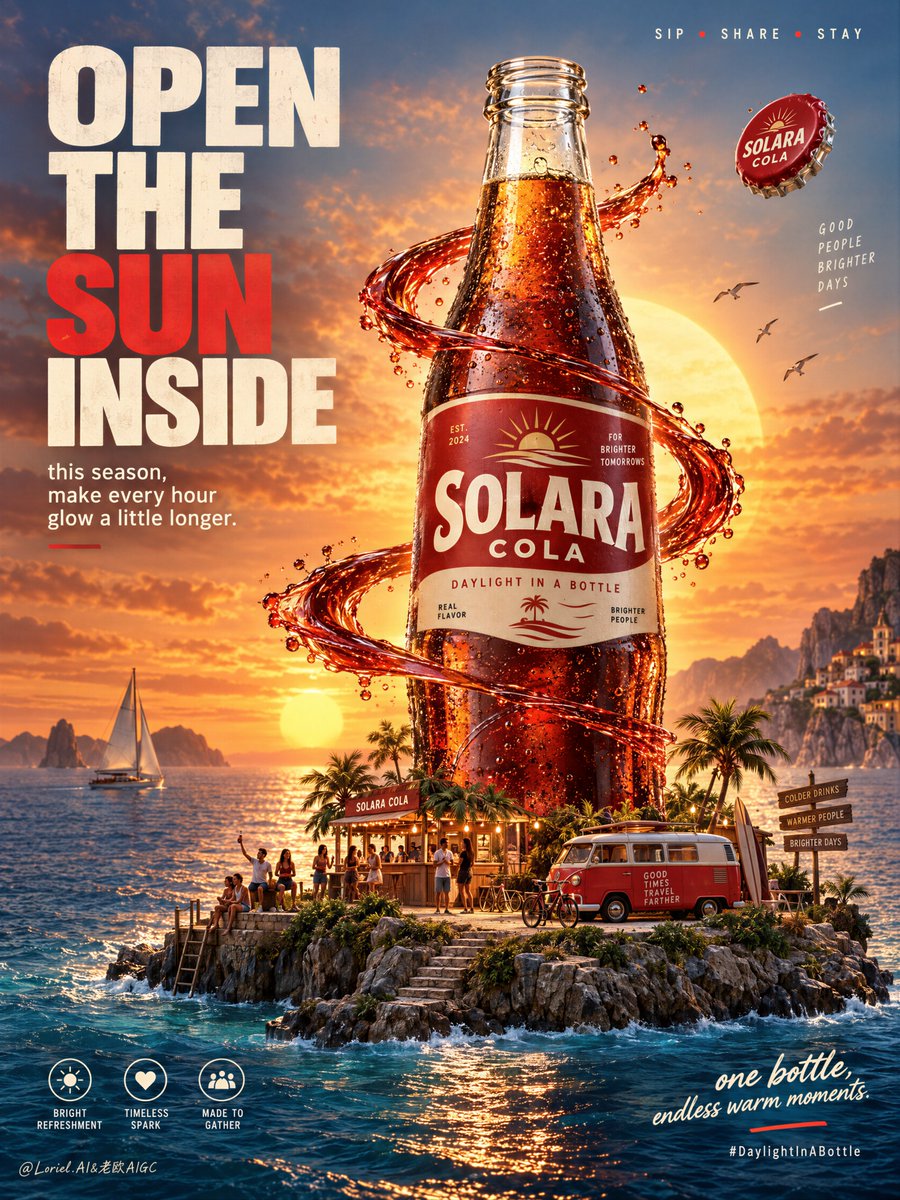
Create a premium commercial poster for fictional classic cola brand SOLARA COLA, designed as a fusion of real product photography, cinematic lifestyle world-building, and bold graphic advertising. The hero object is a towering glass cola bottle rising from a tiny floating seaside island at golden sunset, presented as the emotional center of an entire micro-world. The bottle must remain the absolute visual leader, while the island, people, vehicles, liquid ribbon, and typography only amplify its desirability and iconic presence. Use a vertical full-bleed poster with a frontal hero layout and strong product-dominant center-right composition. Preserve the exact structure: a large left-side headline wall, a giant glass cola bottle dominating the middle, a glowing sun disk directly behind the bottle neck, and a miniature island world at the base. The bottle stands tall in the center-right zone, fully readable, with a low horizon line to preserve sky space for atmosphere and small top-line messaging. The left side holds a powerful editorial headline block, and the lower right stays open for a concise emotional closing line. The composition should feel immersive, uplifting, and instantly readable at poster scale. Design a premium retro-inspired glass cola bottle with deep caramel liquid, realistic embossed glass curvature, vivid condensation droplets, and a clean red-and-cream label system. The fictional brand is “SOLARA COLA”, with the campaign platform “DAYLIGHT IN A BOTTLE”. The bottle must be uncapped, with the glass mouth open and clearly visible. Remove the crown cap from the bottle neck entirely, but keep one single crown cap floating in the air near the upper-right midzone as a secondary accent. It should read as freshly popped, slightly rotating, cleanly separated from the bottle, and clearly subordinate to the hero. The bottle should feel collectible, cold, iconic, and meticulously real, with rich internal glow where the sunset passes through the liquid. The label must be original and unlike existing soda brands. The bottle stands on a small lush coastal island platform that feels like a condensed world of joy and shared time. Around the base, include a tiny nostalgic van, a compact beach kiosk or terrace bar, a few miniature human figures socializing, one or two bicycles, steps down to the water, and small palm or coastal planting accents. These elements must stay secondary and scale-reinforcing, never crowded. A ribbon-like red liquid or graphic energy band curves around the bottle midsection and arcs outward, suggesting flavor, motion, and connection. The floating cap remains small, clean, and visually subordinate, never competing with the label zone or sunset circle. Set the scene in a cinematic seaside sunset with a giant warm sun low on the horizon, calm water surrounding the island, and a few birds crossing the glowing sky. The island should feel dreamy yet physically believable, suspended between realism and ad-world fantasy. Use layered depth: large readable bottle in the midground, island details and people at the base, ocean and sunset beyond, headline wall to the left, and soft atmospheric sky above. Keep the image rich but controlled, never chaotic. Lighting uses a high-impact golden-hour palette with warm-to-cool contrast. Palette hierarchy: 60% sunset gold, amber, cola brown, and glowing warm highlights; 30% deep marine blue, twilight teal, and coastal shadow tones; 10% vivid red brand accents and off-white typography. Main light comes from the sun behind and slightly behind the bottle, creating luminous transmission through the cola, glowing edge highlights, and warm reflections on glass and water. Add soft frontal fill to preserve label readability. The open bottle mouth should catch a subtle specular rim and hint of inner glass thickness. Avoid muddy shadows, dead blacks, or oversaturated tourist colors. The emotional tone is joyful, nostalgic, expansive, and premium. Materials must feel hyperreal and polished: convincing glass thickness, condensation droplets, subtle label fiber texture, rich internal liquid refraction, a precise cold uncapped rim with wet highlights and believable glass lip detail, a glossy floating cap with slight edge wear, and small but believable island textures such as stone edge, foliage, wood decking, painted kiosk surfaces, van trim, and water foam at the shoreline. The red liquid ribbon should feel like a hybrid of real splash physics and design gesture, glossy, aerodynamic, and visually clean. Keep hero zones extremely crisp and the distant background elegantly soft. Integrate original English typography as an essential graphic layer. On the left, place a bold stacked headline in a high-impact sans-serif system: “OPEN / THE / SUN / INSIDE”, with one keyword emphasized in richer red. Beneath it, add a smaller support block such as “this season, make every hour glow a little longer.” At the top right, place a tiny lifestyle triplet line like “SIP • SHARE • STAY”. At the lower left, add three compact circular icon-style markers with short descriptors such as “bright refreshment”, “timeless spark”, “made to gather”. At the lower right, place a concise emotional closing line such as “one bottle, endless warm moments.” Add a subtle hashtag or campaign cue near the bottom only if needed. Typography must feel art-directed, balanced, and kept away from the bottle recognition zone. Output: a full-bleed premium beverage poster with product-first hierarchy, strong campaign readability, cinematic micro-world storytelling, clean graphic order, hyperreal bottle detail, open bottle mouth clearly visible, one single floating cap in the air, no cap attached to the bottle, no real brand names, no copied slogans, no extra oversized bottles, no warped glass shape, no unreadable text, no chaotic crowding, no muddy sunset haze, no dead black areas, no low-quality AI textures, no generic stock-ad feeling, no off-brand packaging, no style drift, and no clutter competing with the hero bottle.