

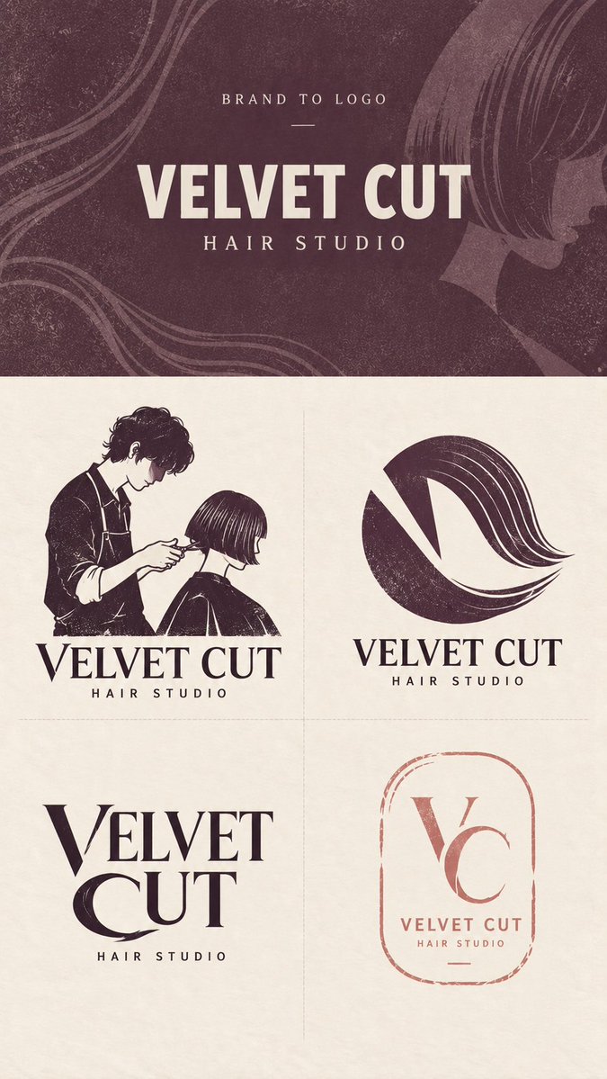
[Brand Name]: {BRAND NAME} [Descriptor]: {BUSINESS TYPE / TAGLINE} [Brand Type]: {e.g. bakery, hair studio, ceramic studio, bicycle workshop} [Brand Keywords]: {3–5 keywords} [Core Visual Ideas]: {people, objects, symbols, or concepts related to the brand} [Primary Colors]: {2–4 restrained colors} [Header Color]: {main header color} [Final Ratio]: 9:16 Create a professionally art-directed Brand to Logo exploration sheet for this brand, inspired by refined Japanese independent-shop identities, boutique branding, handcrafted print graphics, editorial typography, screen printing, block printing, and thoughtful local-business design. The result should feel designed, distinctive, and concept-driven rather than generated from generic AI logo templates. LAYOUT Use a strict 9:16 vertical composition. The upper brand-input section must occupy exactly 30% of the total image height, while the lower logo exploration section occupies exactly 70%. Keep the dividing line fixed at 30% from the top regardless of the length of the brand name. If the name is long, reduce the font size instead of increasing the header height. Divide the lower 70% into four equal 2×2 quadrants using only very subtle thin dashed separators. Keep all four cells equal in size, with no outer border and no A/B/C/D numbering. TOP SECTION Use [Header Color] as the main background, with subtle paper grain, handmade print texture, and extremely low-contrast graphic traces inspired by the brand’s visual world. These background elements should remain atmospheric and should never become a full illustration. Show only BRAND TO LOGO, [Brand Name], and [Descriptor]. Use clean, neutral typography for this original brand input and do not turn it into a finished logo yet. Do not add slogans, paragraphs, fake addresses, dates, decorative badges, unnecessary icons, or excessive microcopy. LOGO DIRECTION 1 — CHARACTER / PICTORIAL Create one memorable, concrete brand image using a person, animal, product, object, or recognizable activity directly related to the business. Simplify the subject into a compact logo composition with a strong silhouette, limited detail, restrained color, and subtle handmade print texture. The image should feel like a genuine brand character or pictorial mark rather than a complete illustration. Avoid anime styling, exaggerated cute mascots, generic stock characters, or overly detailed scenes. Integrate the image naturally with the brand name so the pictorial element and wordmark feel like one identity. LOGO DIRECTION 2 — EMBLEM / SYMBOL Create a compact graphic symbol by combining two or three important ideas from [Core Visual Ideas]. Use negative space, shared geometry, overlap, transformation, visual metaphor, or double meaning so the elements become one unified mark rather than several icons placed next to each other. The design should reward a second look while remaining simple enough to work at very small sizes. Prioritize a strong silhouette, clever graphic relationships, and clear conceptual relevance to the brand. LOGO DIRECTION 3 — CUSTOM WORDMARK Turn the brand name itself into the primary logo. Do not place a separate generic icon beside ordinary typography. Instead, identify a few letters with strong visual potential and modify them through cuts, shared strokes, altered counters, extended curves, negative space, structural substitutions, or subtle references to the brand’s core concept. Only modify the letters that genuinely benefit from the concept. Keep the name highly readable and avoid decorating every character. The final result should feel like a custom-drawn wordmark designed specifically for this brand, with a clear visual idea embedded directly into the typography. LOGO DIRECTION 4 — BRAND MARK Create a secondary identity mark appropriate to the business, such as a maker’s mark, workshop tag, studio label, shop stamp, service mark, packaging mark, mirror label, ticket, or another format that naturally belongs to the brand’s real-world context. Keep the structure restrained, open, and highly usable. Allow subtle handmade irregularity, broken edges, missing ink, incomplete borders, or asymmetry where appropriate, but maintain generous negative space and a clear hierarchy. Avoid rigid generic circular badges, overcrowded vintage emblems, fake heritage details, and unnecessary decorative information. STYLE & DESIGN CONTROL Use only 1–3 colors per logo, selected from [Primary Colors]. The four directions should share the same brand world, color logic, and general print character, but they must be visibly different in design methodology. At least one of the four concepts must contain a clear pictorial or character-based image; do not make all four logos abstract, typographic, or monogram-based. Prioritize strong silhouettes, meaningful visual relationships, custom typography, negative space, restrained color, generous breathing room, subtle print grain, controlled irregularity, and authentic small-business character. The handmade quality should feel intentional and refined rather than distressed for decoration. Avoid generic leaves, random botanical decoration, luxury serif clichés, fake founding dates, meaningless monograms, stock-vector icons, glossy effects, gradients, metallic foil, chrome, 3D rendering, photorealistic mockups, storefront scenes, packaging mockups, and unrelated decorative elements. The finished image should resemble a sophisticated logo exploration page from an independent branding studio, showing four genuinely different but visually related directions for the same brand.