

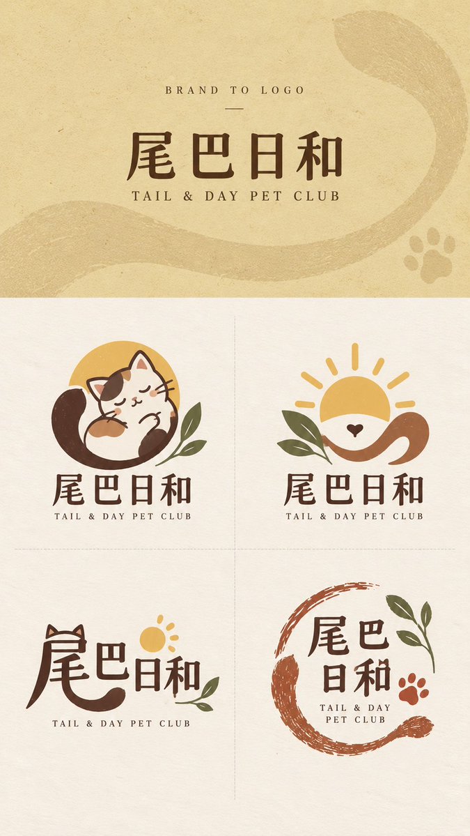
【Brand Name】: {Example: Tail & Day} 【English Name】: {Example: TAIL & DAY PET CLUB} 【Brand Type】: {Example: pet lifestyle brand / flower shop / restaurant / bookstore} 【Brand Keywords】: {Example: warm, natural, friendly, handcrafted} 【Core Visual Motifs】: {Example: tail, sun, companionship with pets} 【Suggested Main Colors】: {Example: cream yellow, dark brown, brick red, sage green} 【Top Background Color】: {Fill in according to the brand’s character} 【Aspect Ratio】: 9:16 Create a complete “Brand to Logo” brand logo concept exploration sheet for the brand above. The goal is not simply to generate four similar logos, but to propose four genuinely different visual design directions based on the same brand name, industry characteristics, and central concept. The final composition must use a fixed vertical 9:16 format. The top brand-input area must occupy exactly 30% of the total height, while the bottom logo-display area must occupy exactly 70%. This ratio must not change regardless of the length of the brand name. If the name is long, reduce the font size instead of enlarging the top area. Strictly divide the bottom 70% into four equal sections in a 2×2 grid. Separate them only with very light, very thin dashed lines, and do not draw an outer border. 【Top Brand Area】 The top is only an introductory area for the brand’s original information, not the main visual poster. Use the 【Top Background Color】 and add an extremely subtle paper, washi, packaging-paper, screen-print grain, or low-contrast brand-related pattern. It should add texture without forming a complex illustration. Retain only three levels of information at the top: BRAND TO LOGO 【Brand Name】 【English Name】 Render the brand name in a normal, clear, modern print typeface. Do not turn it into a logo, handwriting, or a distorted graphic form at this stage. Do not add a slogan, brand description, large amounts of small English text, numbering, seals, supporting icons, or complex lighting and shadows. Let the visual focus fall naturally on the four logo concepts below. 【Bottom Logo Display Area】 Use a consistent Warm Ivory paper background throughout the lower area, retaining only a subtle natural paper texture. All four logos must be developed around the 【Brand Type】, 【Brand Keywords】, and 【Core Visual Motifs】. They should preserve the same brand essence while using clearly different design methods. Each logo should be a complete brand mark that could genuinely be used for a storefront, packaging, labels, social-media avatars, business cards, or merchandise. It must not be a complete illustration, poster, or decorative image. Limit each concept to 1–3 main colors and prioritize the 【Suggested Main Colors】. Avoid highly saturated miscellaneous colors, complex gradients, 3D, metallic embossing, glass effects, and commercial mockups. 【Mascot】 Design a highly distilled character or anthropomorphic subject derived from the brand name, industry, or core motif. The character should have a clear, bold silhouette and a strong memorable feature, but it must not become a complex anime character or a complete scene illustration. Create a meaningful relationship between the character and the brand concept. For example, the character might hold the product, hide behind an object, or merge with a central plant or animal. Pair it with the complete 【Brand Name】 wordmark and a smaller 【English Name】. The overall identity should feel friendly, story-driven, and suitable for social sharing. 【Emblem】 Rather than relying on a complete character, extract the 2–3 most important elements from the 【Core Visual Motifs】 and combine them into a focused, balanced brand emblem that remains recognizable at small sizes. Prioritize negative space, wrapping forms, vertical overlaps, partial enclosures, or shared shapes so that the different elements truly merge into one mark instead of appearing as several small icons placed side by side. Pair the emblem with the brand wordmark to form a complete and stable logo system. 【Type-led】 Use the 【Brand Name】 itself as the central design subject. Analyze the strokes, structures, components, negative spaces, and contours of Chinese characters or Latin letters with the greatest visual potential, allowing the brand’s core motif to grow naturally from within the text. You may omit or share strokes, extend, cut, partially replace, reconstruct negative space, or merge letterforms, but basic legibility must be preserved. Do not place an additional icon beside an ordinary typeface. The key is to make “the text itself the logo,” producing a more modern, intelligent, and professionally designed concept. 【Stamp | Open Handcrafted Mark】 Design a logo with the character of hand carving, printmaking, a shop stamp, or a packaging imprint. Do not use a neat, fully enclosed square frame, and do not cram all the content into a closed oval. Use incomplete boundaries, open arcs, natural strokes, and the brand’s central graphic or text to create a loose visual enclosure. Elements may be slightly misaligned, and the edges may include small natural gaps in the ink and uneven handmade printing, giving the overall mark room to breathe. The Stamp must maintain a clear visual hierarchy and generous negative space. Do not let the pursuit of a stamped appearance make it rigid, dense, or difficult to use in practice. All four concepts must share the same brand world, core motifs, and basic color palette, but they must not merely present the same logo in four visual styles or layouts. Do not add labels such as A/B/C/D. Do not add slogans, explanatory sentences, or unnecessary information in the lower area. Do not generate packaging mockups, realistic storefront scenes, or complete illustrations. The final image should resemble a mature, clean, professional Logo Exploration Sheet with clearly differentiated methods and genuine brand-design value.