

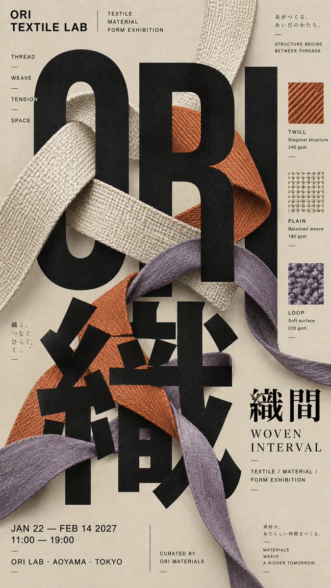
【Theme / project name】: {enter, for example, an exhibition, music event, publication, or brand visual} 【Main title / giant text】: {enter a main title in Chinese, English, or Japanese} 【Core subject】: {enter, for example, a person, vinyl record, fabric, book pages, product, or object} 【Image–text interaction】: {occlusion / interweaving / weaving / refraction / cropping / foreground-background layering} 【Primary color】: {enter one primary color} 【Supporting colors】: {enter one or two supporting colors} 【Event / brand information】: {brand name, date, location, subtitle, keywords, etc.} 【Aspect ratio】: {9:16 by default} Create a sophisticated Japanese Editorial Typography poster. The core idea is not to place text over an image, but to make the giant typography itself the primary structure of the composition. Then make the 【core subject】 genuinely enter the letters, creating clear and believable occlusion, interweaving, and foreground-background depth relationships with the letterforms. The main title should be large enough to extend beyond the layout, allow partial cropping, and use an offset arrangement, so that the text is perceived first as a large geometric form and only afterward read as content. Organize the layout with a strict but invisible editorial grid. The overall composition should be asymmetric while maintaining a clear sense of order. The subject may cross through the text, emerge from behind the strokes, overlap portions of the letterforms, or connect with the typography through realistic physical relationships. Avoid the simple arrangement of placing the subject in the center and the title beside it. The image should feature obvious interaction between imagery and text, along with a strong sense of spatial depth. Limit the palette to three to five core colors, using the 【primary color】 as the foundation and combining it with the 【supporting colors】. Emphasize complete, rich, and clean printed color fields. Use high-quality matte art paper, subtle paper fibers, and a restrained offset-print texture. Avoid obvious retro aging, scratches, yellow stains, heavy grain, or cheap filters. Build a realistic and complete information system: the main title should provide the primary visual level; the brand name, project name, and subtitle should provide the secondary information; and the date, location, category, creator, keywords, and short description should provide the tertiary information. Do not concentrate all small text at the bottom or arrange it as UI cards. Distribute it naturally along the edges of the layout, around the letterform structure, or near the core subject to create the editorial character of a cultural publication, exhibition poster, or independent publication. Maintain a medium-to-high information density while preserving a clear hierarchy. From a distance, viewers should first notice the giant text, core subject, and primary color blocks. At a medium distance, they should notice the occlusion and interweaving between image and text. Up close, they should be able to read all small information and see the printing details. The final result should resemble an authentic cultural poster produced by a contemporary Japanese or East Asian design studio, rather than an AI poster template. Avoid: conventional centered layouts, no relationship between the subject and text, meaningless English, Lorem Ipsum, clustering all small text together, excessive minimalism that leaves the composition empty, excessive collage that creates visual chaos, UI cards, rounded modules, cheap 3D, neon gradients, excessive aging, four-point starbursts, sparkle, No.01, Vol.01, or other numbered series labels.