

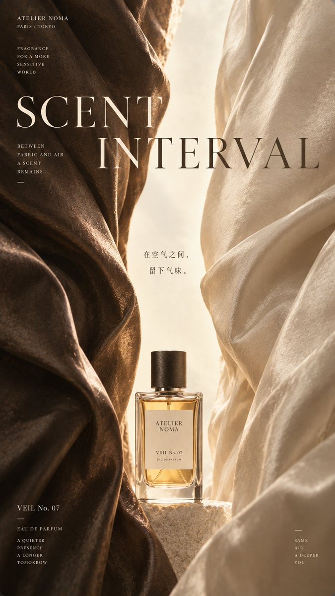
Generate a high-end commercial Editorial Design poster using 'Interval Composition'. Two massive commercial material entities enter the frame from the left and right sides, cut off by the frame edges. Both sides compress toward the center, forming a narrow vertical negative space that extends from top to bottom. The central negative space is the true visual protagonist of the entire poster. The fissure should not be completely straight, and can have a slow, natural S-shaped expansion and contraction relationship: slightly wider at the top, tightening in the middle, and opening again at the bottom. Keep the interior clean, bright, and airy, without filling in complex backgrounds. Use【massive material on the left】and【massive material on the right】for the massive materials on the sides, emphasizing real large-scale structures, continuous textures, and high-end commercial material texture, without letting tiny textures overpower the overall composition. Always follow: see the massive material relationship first, then see the subject details. Both sides can form subtle differences, for example, one side darker, heavier, more robust, the other lighter, softer, more translucent, avoiding complete symmetry. Add【core subject】in the lower part of the central negative space, using【subject position and state】for the subject state. The subject can be a product or a person, but do not completely fill the central space, there must be enough air above the subject so that the 'interval composition' is still clearly established. The subject can slightly cross the central negative space boundary, creating partial overlap or occlusion relationship with the materials on the sides, making the subject truly participate in the composition, rather than simply being pasted in the middle. Use large English Serif Typography:【English title】the title spans the materials on the sides and the central negative space. The text naturally switches light/dark colors according to the background brightness: dark material areas use warm white or light text, bright fissure areas use dark gray or dark ink text. Allow the material edges or subject to slightly occlude some letters, forming a clear two-dimensional editorial hierarchy, but maintaining overall readability. Add a smaller vertical Chinese title【theme】or corresponding Chinese concept word inside the central negative space. Chinese uses a delicate, restrained modern Song font with an oriental structure or high-end publishing font, not using huge brush calligraphy. Add brand information【brand name】and product name/series name【product name/series name】, with a minimal amount of auxiliary text【auxiliary text】. All small text uses small font size scattered at the material edges or blank areas, without forming ordinary information boxes, without adding meaningless English. The overall color palette uses【main tone】, maintaining low saturation, restraint, realism, and high quality. The image should have the temperament of brand Campaign, fashion magazine, commercial poster, product visual, and Editorial Design. Overall visual formula: - Massive materials on left and right - Central vertical negative space - Core subject in the lower middle - Large cross-layer Typography - Large areas of low information The final effect must make people first see 'massive materials on both sides creating a bright channel' even in thumbnail state, and only discover the subject, material details, brand information, and small text up close. Avoid: ordinary e-commerce product image, subject centered filling everything, complex background, full-screen texture, too many props, strong effects, water fire smoke, promotional information, price, QR code, complex parameter table, vivid colors, strong HDR, CGI plastic feel, 3D Typography, meaningless English, and excessive decoration.