

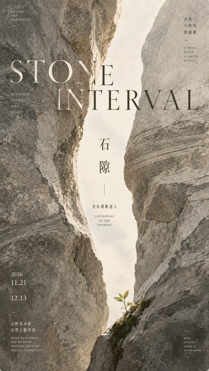
【Theme】: Such as Stone Interval / Ice Interval / Forest Interval / Earth Interval 【English Title】: Such as STONE INTERVAL 【Left Massive Material】: 【Right Massive Material】: 【Central Gap Atmosphere】: 【Bottom Tiny Life Element】: 【Main Color Palette】: 【Auxiliary Copy】: 【Aspect Ratio】: 9:16 Generate an Oriental Naturalism Editorial Design poster, adopting "Interval Composition / Interval Composition". Both sides of the frame are entered by two massive-scale natural material entities and are cropped by the frame edges. The side subjects compress toward the center, forming a narrow vertical negative space that penetrates from top to bottom in the middle. The central gap is the true visual protagonist of the entire poster. The gap should not be completely straight, and can present a slow natural S-shaped opening and closing relationship: slightly wider at the top, tightened in the middle, and opening again at the bottom. The interior maintains brightness, cleanliness, and airiness, without filling in complex landscapes. Use 【Left Massive Material】 and 【Right Massive Material】 for the left and right massive materials, focusing on expressing real large-scale structures, continuous textures, and natural surface qualities. Do not let tiny textures overwhelm the overall composition. Always follow: first see the massive forms, then see the material details. The side subjects can form slight differences, for example, one side is deeper, heavier, rougher, while the other side is lighter, more translucent or softer, avoiding complete mirroring. Add an extremely small-scale 【Bottom Tiny Life Element】 at the bottom of the central gap, such as a new sprout, fern leaf, moss, seed, or fine grass. The life element only occupies an extremely small area of the frame, forming an obvious proportion contrast through "large-scale natural entity" and "tiny life", giving the frame a narrative quality. Use large English Serif Typography: 【English Title】 title spanning the left and right materials and the central gap. The text naturally switches between light and dark colors according to the background light and dark: dark material areas use warm off-white text, and bright gap areas use deep ink-gray text. Allow the material edges to slightly obscure some letters, forming a clear two-dimensional editorial hierarchy, but maintaining overall readability. Add a smaller vertical Chinese title 【Theme】 inside the central gap. Chinese uses slender, restrained, modern Song typeface with oriental structure or cultural publishing fonts, not using giant brush calligraphy. Add an extremely small amount of auxiliary copy 【Auxiliary Copy】, using small font sizes scattered on material edges or white space areas, not forming ordinary information boxes, not adding meaningless English. The overall color scheme uses 【Main Color Palette】, maintaining low saturation, natural, matte, and restrained. The frame should have the quality of high-level art exhibition posters, independent publications, natural material research, and Editorial Design. Overall visual formula: Left and Right Massive Entities * Central Vertical Negative Space * Bottom Tiny Life * Cross-layer Large Typography * Large-area Low-information Zones The final effect must allow people to first see "two massive side forms squeezing out a bright gap" even in thumbnail state, and only discover material textures, life details, and small text upon closer inspection. Avoid: ordinary landscape photography, tourism posters, subject filling the center, complex backgrounds, full-screen textures, dense cracks, abundant plants, vivid colors, strong HDR, CGI materials, 3D Typography, meaningless English, and excessive decoration.