

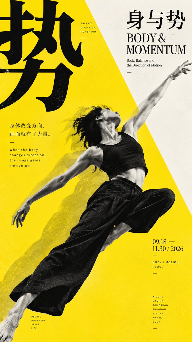
【Topic】 【Main Visual Subject】 【Chinese Core Character】 【Chinese Title】 【English Title】 【Diagonal Relationship】Person crossing angle / Diagonal negative space / Natural boundary / Topographic cross-section / Other 【Main Color】 【Accent Color】 【Aspect Ratio】9:16 Generate a modern vertical poster with the aesthetic of **East Asian Modernist Exhibition Poster, Japanese Contemporary Graphic Design, Editorial Design**, with a core focus on "diagonal composition". Don't simply rotate images or text by 45°, but first establish an invisible diagonal axis, allowing the main subject, natural boundaries, color zones, or negative spaces to progress from one corner to another, creating a clear direction for the visual weight of the composition. According to 【Topic】, choose the most suitable diagonal mechanism: for human subjects, let body movement extend from the lower left to upper right, forming a visual axis through the posture itself; for minimalist subjects, let large diagonal negative spaces become the true main subject, adding only small figures as scale references; for natural subjects, use coastlines, water surfaces, slopes, or light and shadow boundaries to divide the composition; for topographic or architectural subjects, use large cross-sectional areas, scale differences, and negative spaces to create a sense of distance. Highlight only one main mechanism in each composition, don't mix people, diagonal lines, color blocks, and complex perspectives all together. Diagonal composition should rely on "major relationships", not small decorations. The main subject or primary color zone should occupy approximately 45%–65% of the composition, while maintaining an obviously quiet area, creating a directional change from "dense to sparse", "near to far", or "heavy to light". Avoid an average 50-50 split, and don't use standard mechanical 45° diagonal lines; allow the diagonal angle to be slightly offset to make the layout more natural and editorial. Typography must remain stable, contrasting with the dynamic image. Chinese core characters can be enlarged, edge-aligned, or partially cropped, but maintain horizontal or vertical orientation; English titles should use Serif, Grotesk, or Condensed Sans; small information should use Neutral Grotesk. Don't let all text follow the diagonal lines. It's suggested to form a relationship of "image responsible for movement, text responsible for stability", and allow a slight intersection, occlusion, or edge compression between the main subject and text. Control overall colors in 2–3 main levels, primarily cool white, warm white, black, gray, or a single high-purity accent color. Accent color can be used for short lines, nodes, local titles, or main subject areas, but should not be evenly distributed. Maintain modern, restrained, clean aesthetics, reducing traditional decorations and templated explanatory text. Information density should be moderate, maintaining at least 25%–35% effective white space. The final reading order should be: first eye catches the strong diagonal form; second eye understands how the main subject or boundary forms direction; third eye discovers the relationship between scale, negative space, and text; finally reads the title and small amount of information. The overall effect should look like real modern exhibition posters, photographic series, cultural visuals, or design yearbook cases, not ordinary images placed diagonally. Avoid: all elements tilted, standard 45° templates, average 50-50 split, diagonal timeline, PPT feel, full-page explanatory text, meaningless English, complex traditional decorations, tech HUD, logos, QR codes, numbers, and copyright marks.