

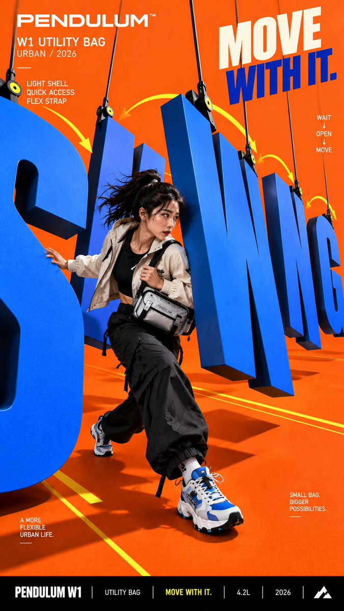
Create a bold commercial campaign poster where oversized typography behaves like a real physical object and actively interacts with the subject. Brand: [BRAND NAME] Product: [PRODUCT] Main Word: [SHORT WORD] Subject: [PERSON / PRODUCT / BOTH] Motion Type: [SWING / FLEX / FLIP / ROLL / OTHER] Main Color: [COLOR] Accent Color: [COLOR] Aspect Ratio: [9:16] Use realistic commercial photography, oversized typography, strong perspective, vivid color contrast, and contemporary editorial design. Make the main word extremely large and give it one clear physical behavior: SWING: suspend the letters and let them move like swinging gates while the subject passes between them. FLEX: let the letter surface bend smoothly under the subject's weight, then visibly rebound. FLIP: rotate different letters around simple pivot axes and reveal a contrasting back surface. ROLL: turn a round letter into a rolling typographic form that moves through the scene and interacts with real wheels or objects. The subject must physically react to the typography through stepping, dodging, balancing, riding, or making contact with it. Keep the typography clearly readable. Use clean matte surfaces, even colors, sharp edges, and controlled depth. Avoid rough concrete, distressed textures, scratches, dirt, random noise, and heavy 3D architecture. All motion arcs, guide lines, callout lines, and curves must be smooth, continuous, and clearly rendered. Keep people highly realistic with natural anatomy, believable proportions, real skin texture, controlled highlights, detailed hair, and authentic clothing materials. Avoid waxy skin, oily reflections, CGI appearance, distorted limbs, oversized hands or feet, and extreme wide angle deformation. Use one dominant high impact color, one contrasting accent color, and black or white for balance. Add only a few meaningful campaign details such as the brand name, product name, slogan, and 2 to 3 short feature callouts. The final image should feel like a finished campaign key visual where typography, motion, and the subject behave as one physical system. Avoid generic subject plus big text layouts, random motion effects, broken lines, unreadable typography, cluttered UI, rough materials, unrealistic anatomy, and meaningless filler text.