

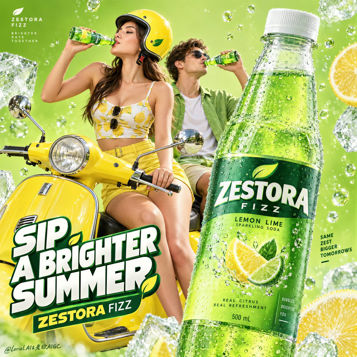
Create the definitive Orbit + Transit + Port final poster for the fictional international lemon soda brand ZESTORA FIZZ. The image must preserve the exact commercial architecture of a high-impact summer beverage campaign while refining it into a cleaner, sharper, more collectible global hero poster. Keep the same core logic: acid-lime field, lemon-yellow retro scooter, stylish young couple drinking, one monumental foreground bottle, floating carbonation and ice-cold freshness cues, and one bold stacked typographic block. The final result must feel more premium, more controlled, and more product-led than a typical youth soda ad. The absolute hero is one oversized lemon soda bottle in the right foreground, pushed closest to camera and dominating the composition through scale, cold realism, and retail clarity. The bottle must read first from across the room. Render it as a sleek transparent bottle with a frosted white cap, filled with vivid sparkling emerald-lime soda and dense fine carbonation. Design newly invented English-only ZESTORA FIZZ branding with elegant premium soft-drink typography, refined citrus icon behavior, crisp flavor hierarchy, and a clean modern packaging system. The bottle surface must show exact transparent plastic behavior, accurate refraction through the liquid, luxurious condensation droplets, sharp label edges, subtle cold gloss, believable micro-reflections, and precise cylindrical perspective. No warped packaging, no muddy label, no fake text behavior. The bottle is the entire campaign anchor. Near center-left, place a fashionable young woman seated at the front of a glossy lemon-yellow retro scooter, lifting a small chilled glass bottle to her lips in a natural mid-sip pose. Slightly behind and to the right, a young man also drinks from a matching bottle, reinforcing shared summer energy without competing with the hero product. Their function is emotional atmosphere and scale confirmation, not narrative dominance. The woman must remain the stronger visual figure between the two people. She should wear a lemon-yellow and white editorial fashion look with restrained citrus-inspired print language, paired with a coordinated glossy yellow helmet. Her anatomy must be elegant and realistic: correct head-neck-shoulder proportion, natural mature chest gravity, believable torso and pelvis structure, smooth hip-to-thigh transition, naturally full lower-body volume, subtle skin elasticity, faint natural dimpling, realistic hands with five fingers, clean finger spacing, clear knuckles, natural wrist behavior, and no mannequin stiffness. The man wears a fresh lime-green casual look that supports the palette and rhythm without overpowering the heroine or the bottle. The retro scooter is a lifestyle stage and compositional bridge, not the hero object. It should be a saturated lemon-yellow European-style step-through scooter with polished chrome mirrors, clean headlamp detailing, refined lacquer reflections, and compact iconic geometry. The scooter must support the youthful campaign attitude while remaining secondary to the product and the foreground bottle. The background must be reduced into a highly controlled acid-lime commercial field with suspended carbonation bubbles, a few oversized ice fragments or frosted freshness accents pushed toward the edges, and subtle citrus-energy atmosphere. Keep it graphic, minimal, luminous, and clean. No literal road, city, landscape, or unnecessary set dressing. This is a poster-space built for product desire, not an environmental scene. Preserve generous negative space so the bottle, figures, and text architecture breathe. Typography must be minimal, bold, and newly invented in English only. Do not copy any wording from the source image. Use one stacked headline block in the lower-left area as graphic architecture, not as cluttered ad copy. The wording should be short, punchy, and campaign-ready, such as a custom phrase in the spirit of “CHASE THE CHILL” or an equally sharp summer-refreshment line, with the brand name integrated below in a restrained premium way. Add one tiny brand mark in an upper corner. Typography must feel dimensional, crisp, youthful, and internationally polished, with white lettering, deep green framing, and tiny lemon accents if needed. Keep all text secondary to the foreground bottle. Lighting must be bright, premium, and ultra-clean: a sunny frontal commercial key with slight side shaping so skin, helmet gloss, chrome mirrors, scooter lacquer, and especially bottle condensation all feel dimensional and luxurious. The bottle should carry the sharpest highlight control and the crispest reflective behavior in the frame. Avoid muddy shadows, overexposed whites, or cheap flash aesthetics. The whole image should feel polished, fresh, and expensive. Use a disciplined 60/30/10 palette hierarchy: 60% acid lime and luminous citrus-green atmosphere, 30% lemon yellow and bottle-green product color, 10% white, chrome, and icy highlight accents. The color balance must feel instantly cold, refreshing, youthful, and globally campaign-ready. Material semantics are critical. The hero bottle must feel cold, wet, transparent, sparkling, and commercially irresistible. The smaller bottles must feel consistent with the same product family. The scooter must feel lacquered and premium. The helmet must feel glossy and solid. The clothing must feel lightweight and editorial. The skin must feel natural and alive. The ice must feel sharp and frosted. The bubbles must feel suspended and effervescent rather than decorative. Orbit priority: maximize first-glance desire through the giant cold hero bottle, the lemon-yellow scooter, and the shared drinking gesture. Transit priority: make the poster clearly expandable into a full citrus campaign family with the same layout logic, color logic, and youthful product-stage system. Port priority: remove all unnecessary environmental detail, reduce the text load, strengthen negative space, and compress the image into a rare, graphic, international hero poster with exact product-first hierarchy. Target feeling: collectible international soda campaign poster, premium summer freshness, graphic youth energy, product worship, modern editorial advertising, clean hierarchy, strong brand memory. Quality target and exclusions: photoreal beverage advertising image, exact bottle geometry, accurate transparent packaging behavior, readable invented English label design, realistic anatomy, realistic hands with five fingers, correct finger spacing, natural facial structure, believable bottle-to-lips contact, clean scooter perspective, no warped plastic, no broken reflections, no fused fingers, no extra limbs, no distorted faces, no random letters, no muddy greens, no flat dead lighting, no cheap poster clutter, no style drift, no AI artifacts, no watermark, no real brand names, no real person names.