

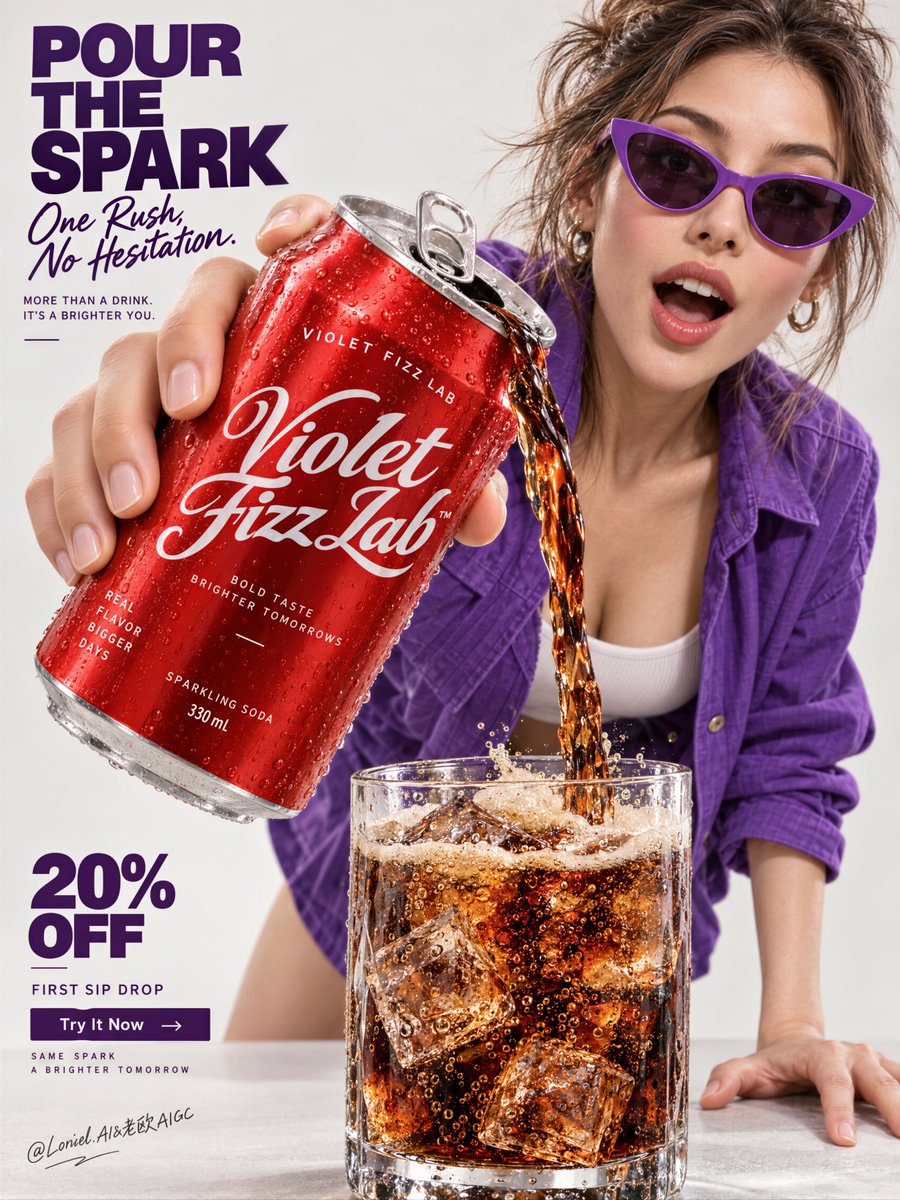
Create a flagship beverage campaign poster for a fictional international soda house named VIOLET FIZZ LAB, designed as a single vertically composed master image that fully merges Orbit, Transit, and Port into one best solution: emotionally immediate, structurally expandable, and curatorially sharp. The image must feel like a Cannes-level soda advertisement, a collectible pop-commercial print, and a globally premium launch visual at once. The absolute hero is one oversized chilled soda can thrust toward the camera in dramatic forced perspective, occupying the upper-left to center-left foreground as the dominant product mass. The can is held in one realistic hand and tilted downward, pouring a rich stream of dark sparkling soda into a tumbler below. The can must feel hyper-real and premium: bright lacquered red aluminum body, icy condensation droplets, crisp seam lines, believable pull-tab opening, tiny handling dents, sharp metallic highlight rolloff, and newly invented English branding in elegant white script and clean utility sans. The can must read instantly as cold, pressurized, refreshing, and commercially irresistible. The liquid action is the central motion event and must be physically convincing. A continuous glossy stream of deep caramel-black soda flows from the can in a smooth twisting arc into a clear tumbler glass at the bottom-center foreground. The soda must show amber translucency at the edges, rising carbonation, sparkling internal bubble trails, bright highlights, and a lively foam crown blooming at the top of the glass. Inside the tumbler, include hard transparent ice cubes with trapped bubbles, crisp refraction, slight melting edges, and believable condensation on the glass wall. The glass supports the refreshment story, but always remains secondary to the can. Place one mature young woman in the right-middle and upper-right field, leaning forward behind the product with bold pop-fashion energy and immediate attitude. She wears a saturated violet-purple overshirt or jacket over a pale inner top, paired with minimal lower styling mostly outside the crop. Add sharp violet cat-eye sunglasses or similarly iconic eyewear that reinforces the brand color identity. Her posture is interactive and kinetic: one hand extended forward holding the can close to lens, the other planted on the surface for balance, torso leaning into the action as if presenting the pour directly to the viewer. Her expression is open, surprised, impressed, and charismatic. Anatomy must be realistic and elegant: correct head-neck-shoulder proportion, natural mature chest gravity, believable torso and pelvis structure, smooth limb relationships, realistic hands with five fingers, subtle skin elasticity, faint natural dimpling, and no mannequin stiffness. The composition must preserve the strongest structural logic of the reference while elevating it: bold typography architecture on the left, monumental product in forced perspective, action pour into glass at the bottom, and fashion-driven human figure behind the hero object. The can is first read, the liquid second, the woman third, the glass fourth, and typography locks the page together. Keep the whole layout extremely immediate and ad-ready. The background is a pale premium studio field, somewhere between warm off-white, light stone, and soft neutral grey, with enough tonal shaping to prevent flatness but no environmental scene at all. This is a pure graphic advertising space. Use a disciplined 60/30/10 palette hierarchy: 60% light neutral studio field and skin tones, 30% lacquered red product and cola-brown liquid energy, 10% saturated violet-purple wardrobe and typographic accents. The red-violet contrast must feel memorable, contemporary, and brandable. Typography must be entirely newly invented in English only. Do not copy any text from the source image. Build a strong left-column headline in the upper-left with bold sans and one contrasting script or softer line, such as "POUR / THE / SPARK" paired with a line like "one rush, no hesitation" or another sharper brand thought. Below it, place one short supporting sentence that frames the drink as the main event. In the lower-left corner, create a compact promotional block such as "20% OFF" or "FIRST SIP DROP", followed by one small CTA line like "Try It Now". Typography must be crisp, spacious, and integrated into the available negative space, never touching the face or the can silhouette. Orbit: the image must hit instantly through the forward-thrust can, the living soda stream, and the fashion-pop presence of the woman. Transit: the structure must feel campaign-expandable, allowing multiple flavor variants, colorways, wardrobe accents, offer blocks, and can designs to operate inside the same hero-pour system. Port: remove all nonessential décor so the final poster remains clean, collectible, and internationally elevated, with no kitchen scene, no tabletop clutter, no unnecessary props, and no visual noise. Lighting must be bright, commercial, and materially exact. Use a clean frontal key with a slight side bias so the aluminum can gleams, the soda stream remains readable, the ice catches sharp internal highlights, and the woman's face stays expressive and luminous. Add soft bounce from below to preserve clarity in the tumbler and lower layout. Shadows should be soft-edged and controlled, enough to ground the product and glass without making the page heavy. The overall lighting should feel cold-refreshing, polished, and premium. Material semantics are critical. The can must feel like chilled printed aluminum. The soda must feel sparkling, dense, and fresh. The ice must feel hard, transparent, and cold. The glass must feel thick, weighty, and clean. The shirt and sunglasses must feel tactile and fashion-driven. Skin and hair must remain natural and alive. Typography must feel like premium printed campaign design layered over a real photographic poster. The final image should read as a high-energy beverage desire poster where can, pour, glass, gesture, and left-side graphic language are fused into one exact commercial object. It must be photoreal, product-dominant, contemporary, and unforgettable at first glance. Quality target and structured exclusions: photoreal only, correct female anatomy, realistic hands with five fingers, no extra fingers, no missing fingers, no fused fingers, no broken wrists, no distorted face, no warped can geometry, no broken liquid physics, no fake ice, no muddy soda, no unreadable text, no random letters, no environmental clutter, no dead black blocks, no flat lighting, no style drift, no AI artifacts, no watermark, no real person names, no real brand names.