

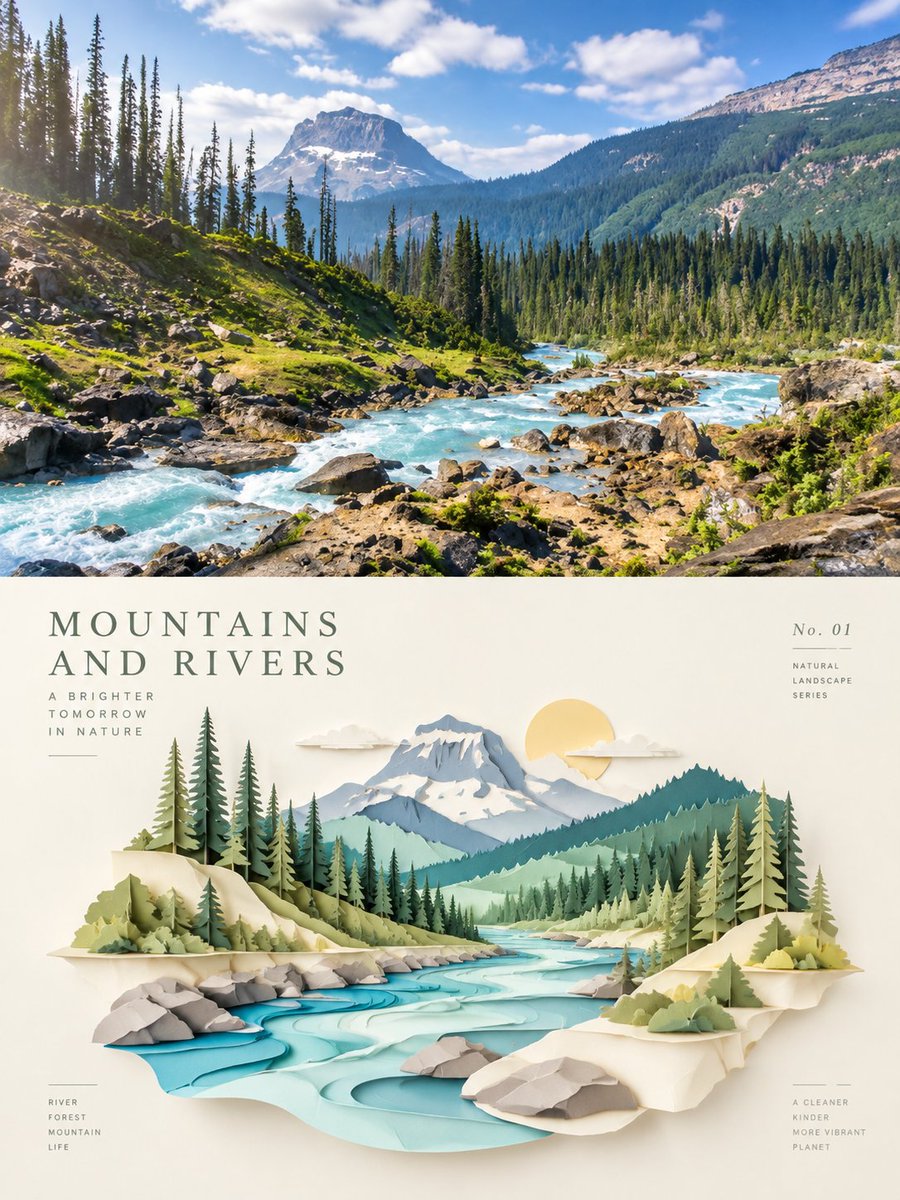
Turn each photo I uploaded into a separate, high-end minimalist design poster — no multi-image collages; output each photo individually. Use a 3:4 vertical composition, with the top and bottom areas strictly equal in height at 1:1, each occupying 50% of the frame. The top half keeps the original photo, preserving the subject's structure, real texture, natural light and shadow, and original color mood, applying only a slight high-end color grade to give it the quality of art photography and exhibition visuals. To fit the aspect ratio, the environmental background may be naturally extended, but the subject must not be stretched, distorted, or altered. The bottom half extracts the subject's most recognizable outline, structure, spatial relationships, and narrative features and reconstructs them into a paper-sculpture miniature scene in the style of layered paper cut art / 3D papercraft diorama / architectural relief. Do not copy the photo's details; retain the most essential visual symbols and re-express them through multiple paper layers, cut contours, cutout structures, and spatial layering, so the subject looks like a paper-art installation in a modern design exhibition. Use simple structure, precise edges, multiple layered facets, and slight spatial shadows to build dimension, without pursuing realistic 3D rendering, instead presenting a lightness that combines paper, architectural model, and art installation. Keep a single visual center, generous white space, and a restrained, balanced composition. Build the palette by extracting the brightest, most vivid, most alive colors from the photo above rather than averaging colors. Raise overall brightness and color purity, using bright hues naturally derived from the original — clear sky blue, lake cyan, tender green, warm yellow, coral orange, peach pink — with ivory and warm beige as the main spatial background, creating a healing feel through fresh warm-cool relationships. Main colors are vivid but not harsh, with warm orange, gold, or pink as accent touches. Avoid dirty, aged, muted Morandi tones, dark-brown filters, fluorescent colors, and cheap candy looks. Text intervenes sparingly, freely generating short titles, numbering, or tiny annotations based on the subject, location, mood, or cultural meaning. Use a delicate, restrained modern font with an architectural editorial feel, like the captions of an art exhibition or the informational labels in high-end brand visuals, blending naturally with the white space. The overall style references international design studios, architectural posters, art exhibition visuals, and high-end brand visual systems, presenting paper-cut space, modern Eastern aesthetics, clear colors, generous white space, and a sense of refined craft. Avoid realistic CG, plastic texture, childish handmade looks, complex backgrounds, and template-like effects.