

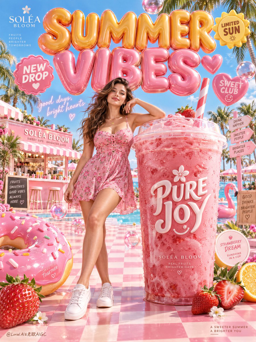
Create a premium vertical advertising poster for a fictional international summer beverage brand named SOLÉA BLOOM, designed as one unified flagship key visual that fuses Orbit, Transit, and Port into a single best solution: emotionally radiant, materially irresistible, and graphically curated. The image must feel like a Cannes-level seasonal lifestyle campaign where oversized product design, inflatable typography, playful resort iconography, and a fashion-led female presence are merged into one polished commercial dreamscape. The mood is bright, ecstatic, sweet, and instantly memorable, but the layout must remain controlled, elegant, and campaign-ready. The absolute hero is one monumental iced strawberry-pink signature drink placed on the right side of the composition, scaled large enough to dominate the poster like a sculptural product monument. The cup is tall, premium, and photoreal, made of smooth translucent glossy plastic with believable thickness, subtle surface reflections, tiny condensation droplets, and a fitted clear lid. Inside, render a dense creamy frozen fruit beverage with rich pink tonal depth, faint swirls, and light-catching translucency near the edges. A striped straw rises cleanly from the lid with accurate perspective and material realism. On the front of the cup, place newly invented elegant dimensional branding such as "PURE JOY" in large white raised lettering with a small floral accent and a tiny cheerful icon integrated into the graphic system. The product must look manufacturable, desirable, tactile, and luxury-commercial, never toy-like, never cartoon-cheap. Anchor the upper half of the frame with a huge inflated 3D headline built from glossy balloon-like letters, reading "SUMMER VIBES" in a custom sculptural typographic composition. The lettering should feel monumental and buoyant, as if floating above the resort street like a festival-grade fashion installation. Use a warm orange-to-golden-yellow treatment for the top word and a pink-to-rose treatment for the lower word, with rounded highlights, subtle seam logic, inflated internal pressure, and controlled reflections from the sky and surrounding objects. Around the main title, place a few curated bubble-badge elements such as "NEW DROP", "LIMITED SUN", and "SWEET CLUB", each rendered as premium dimensional stickers with their own silhouette language. These elements must frame the composition and enhance the typographic architecture without overwhelming the product or obscuring the model's face. Place one mature woman in the center-left foreground, positioned between the giant typographic monument and the hero drink, acting as the emotional lifestyle anchor of the campaign. She wears a short flowing pink sundress with delicate floral micro print, light ruching, and airy fabric movement, styled with premium white sneakers and subtle gold jewelry. Her hair is long, softly windblown, and luminous under summer light. Her expression is poised, inviting, and lightly flirtatious, never exaggerated. Her pose must feel natural and elegant: one leg extended forward with relaxed confidence, the other carrying weight, torso gently shifted, one arm resting casually against the oversized drink or hovering near it. Anatomy must be fully correct and realistic: balanced shoulders and hips, natural chest weight, believable pelvic structure, smooth hip-to-thigh transitions, realistic mature softness, elegant hands with five fingers clearly separated, subtle skin texture, faint natural dimpling, realistic skin elasticity, and no mannequin stiffness or AI plasticity. Construct the environment as a hyper-stylized resort-dessert street under a vivid summer blue sky. Use a strong but disciplined 60/30/10 palette logic: 60% joyful pink, blush, rose, and strawberry tones; 30% clean cyan sky, pool blue, and fresh turquoise accents; 10% citrus yellow, warm sunlight, glossy white highlights, and tiny golden accents. The ground should be a polished pastel checkerboard or candy-tile walkway receding into depth. Add a limited number of oversized supporting objects that reinforce the campaign world: one giant glossy frosted donut in the left foreground, one ripe strawberry near the lower edge, a few transparent candy-like spheres or jelly bubbles suspended in space, a retro dessert kiosk or sweet shop in the midground, palm silhouettes, a flamingo float, and sliced citrus accents. Every object must feel intentionally art-directed, with clean spacing, strong hierarchy, and premium material finish. Keep abundance without chaos. The Orbit layer must deliver immediate emotional impact and escapist pleasure. The viewer should understand the campaign in one glance: summer, sweetness, fashion, joy, and product desire. The Transit layer must make the image feel system-ready, as if this poster belongs to a wider seasonal campaign that could expand into multiple flavors, colors, and collectible variants using the same product architecture, typographic monument, and resort-world staging. The Port layer must remove all nonessential clutter and keep the composition graphically strong, with clear negative space around the model's head, around the cup silhouette, and between the main visual masses. Even with many joyful elements, the image must feel curated, premium, and internationally polished. Lighting must be bright, clean, and luxurious, like a top-tier summer beverage campaign shot. Use a sunlit commercial key from the upper front-left, soft frontal fill for the model's face, luminous environmental bounce from the pink surfaces, subtle rim light on hair and shoulders, and crisp but gentle specular highlights across the cup, lettering, donut glaze, floating bubbles, and glossy badges. Shadows should be soft-edged and grounding, never muddy, never flat. Build enough contrast for clear volume separation between the sky, inflated letters, model, and product, while preserving the fresh sweetness of the palette. Material semantics must be explicit and highly persuasive. The drink reads as creamy, chilled, dense, and refreshing. The cup reads as premium transparent plastic with physical thickness and convincing reflection behavior. The inflated headline reads as luxury vinyl with air pressure, seam intelligence, and a soft glossy finish. The donut glaze is thick, reflective, and edible. The dress fabric is airy and breathable with believable folds and light transmission. Skin remains photoreal and natural. Decorative badges and smile icons have subtle depth and clean manufactured edges. The tiled floor reflects a little colored light without becoming mirror-like. Typography should be entirely in English only and newly invented. In addition to the giant headline, include one small handwritten glowing phrase placed in the mid-left space, such as "good days, bright hearts", and one or two tiny editorial notes near the lower product area describing flavor or seasonal collection. Typography must feel premium-playful, dimensional, and art-directed, never pasted on, never using crude heavy fonts, never interfering with the product label or the model's face. Text functions as a graphic ingredient inside the composition. The final image must feel like a collectible global summer poster, a luxury pop-resort campaign, and a product-first commercial advertisement at once. The hero drink remains the dominant focal point, the inflated title becomes the visual skyline, the woman supplies aspirational warmth and scale, and the curated dessert-world props complete the dream logic. The image should be hyper-detailed, photoreal, bright, physically believable, emotionally addictive, and ready for premium outdoor, retail, or digital brand launch use. Quality control and structured exclusions: photoreal only, correct female anatomy, correct hands and five fingers, no extra fingers, no missing fingers, no fused fingers, no broken wrists, no distorted limbs, no warped torso, no face asymmetry, no plastic skin, no unreadable text, no gibberish typography, no malformed cup shape, no bent straw, no muddy palette, no dead black areas, no dirty clutter, no sloppy object floating, no toy-like product finish, no cheap cartoon look, no bad perspective, no style drift, no AI artifacts, no watermark, no real person names, no real brand names.