

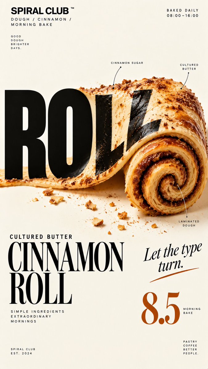
Brand: [BRAND NAME] Food: [FOOD / PRODUCT] Headline: [1 SHORT WORD] Physical Interaction: [ROLL / TORCH / FOLD / GRATE / other physical action] Accent Color: [COLOR] Product Name: [PRODUCT NAME] Price: [PRICE] Aspect Ratio: 9:16 Create a premium editorial food poster where real food physically interacts with and reshapes oversized typography, using a warm cream or ivory background, bold black Heavy Grotesk typography, photorealistic food materials, generous negative space, and a broken editorial grid inspired by contemporary European food branding and high-end magazine design. The food and typography must exist inside the same physical world, the food should not simply overlap, decorate, or sit beside the letters, instead the selected physical action must visibly alter the typography through believable material behavior, geometry, heat, pressure, bending, abrasion, or surface transformation. Examples: ROLL, a continuous food surface rolls into a spiral while the typography printed on that same surface bends, compresses, stretches, foreshortens, and wraps with it; TORCH, heat transforms a real sugar coating on the letters from dry crystals to molten sugar and then amber caramel glass while the black type underneath stays rigid; FOLD, typography printed directly onto a thin food surface follows the same crease, perspective compression, rotation, and occlusion as the food is physically folded; GRATE, a real grater removes material directly from the letters, revealing edible material inside while the removed type becomes realistic shavings and particles. Use only one main physical mechanism per poster, keep the cause and effect visually clear, untouched areas of the typography should remain hard, clean, geometric, and readable, all deformation should happen only where the food, tool, heat, or physical force actually makes contact. Use a broken editorial grid with strong scale contrast, asymmetric placement, edge information, small meaningful annotations, and large areas of negative space, add details such as [INGREDIENTS], [OPENING HOURS], [ADDRESS], and [PRODUCT NOTES], but avoid traditional menu rows, long horizontal divider lines, rigid bottom information bars, boxed prices, and template-like layouts. Use bold Grotesk Sans Serif for the main headline, high-contrast Editorial Serif or Italic Serif for product names, quotes, and prices, keep the palette minimal with a cream background, black typography, natural food colors, and one accent color. The final poster should feel clever, physical, premium, contemporary, and instantly readable at thumbnail size, the first glance should reveal the food and headline, the second glance should reveal the physical mechanism that has transformed the typography.