

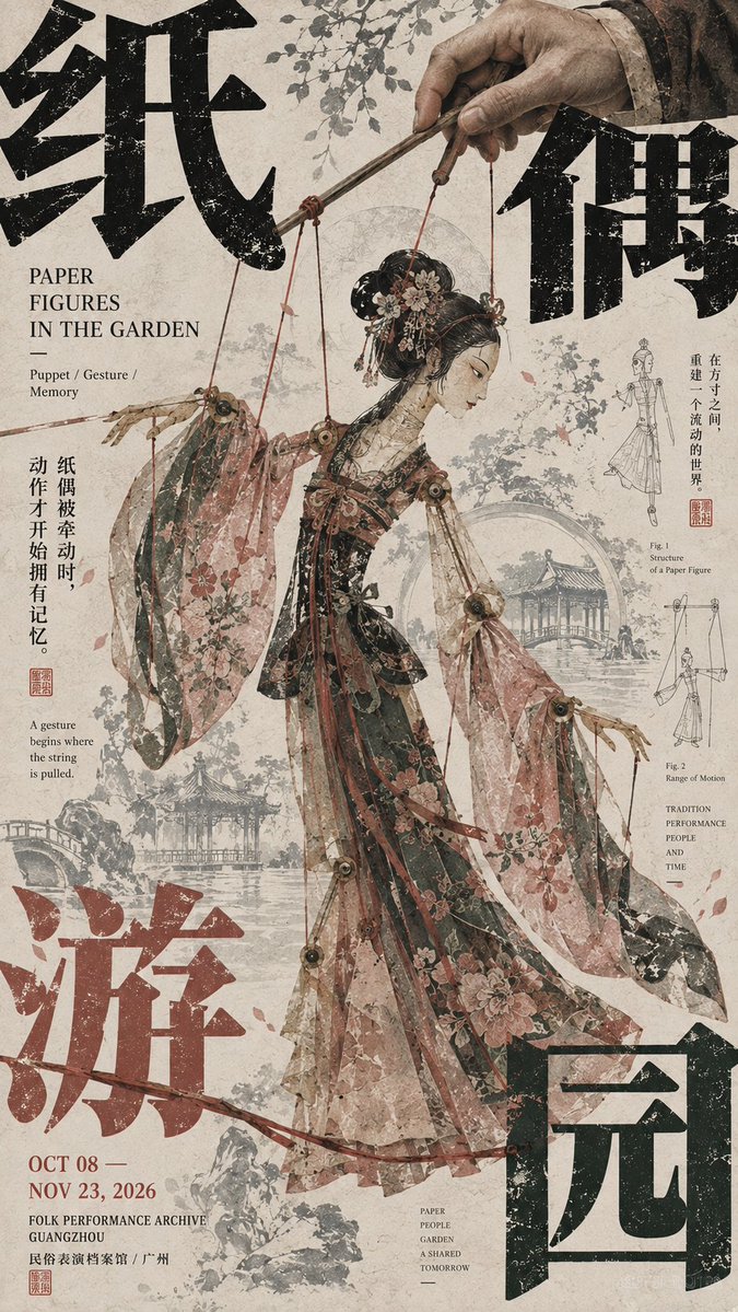
【Theme】: 【Four-character Chinese title】: 【English title】: 【Core subject】: 【Subject's action / pose】: 【Auxiliary visual elements】: 【Main color】: 【Accent color】: 【Exhibition date / institution】: 【Aspect ratio】: 9:16 Generate a high-aesthetic East Asian cultural exhibition poster using "corner composition" and a mature Editorial Graphic Design visual language. The whole is not just subject plus title, but lets a strong main visual, a giant Chinese character, edge information, auxiliary patterns and negative space truly interlock, forming a rich yet orderly layout relationship. The subject occupies about 45%–60% of the frame, staying complete, clear, with a distinct outline and visual weight; it may be a figure, animal, natural landscape, object or folk image. The subject must have the quality of an artwork and a narrative sense; do not deliberately distort, chop up or shrink it too much for the sake of layout. Split the 【four-character Chinese title】 and distribute it across the four edges and corners, but do not make the four characters the same size, evenly spaced or fully symmetrical. Choose 1–2 characters as the main corner press, clearly enlarge them and crop them partly out of the frame, with the remaining characters as a secondary response. The large Chinese characters are not an ordinary title but part of the layout structure, and must genuinely interweave with the subject front-to-back—for example a figure, animal, wings, horns, ropes, branches, sleeves, mountains or other subject outlines passing in front of and behind the character shapes, so that "the character sits behind the subject and the subject grows out of the character." The English title, date, institution and caption text concentrate in 2–3 edge areas, mixing horizontal, vertical, tiny type sizes and different directions. Create a clear scale jump between the huge Chinese, medium English and tiny information; do not arrange all information into a neat modern grid, nor spread it evenly across the whole frame. The entire poster uses only one set of auxiliary visual language directly related to the theme. For example, animals can use horn shapes, footprints or contour lines; figures can use ropes, motion trails or garment structure; landscapes can use ridge lines, water ripples; folklore can use puppet strings, mask patterns or craft structures. Auxiliary elements can repeat, enlarge, crop or fade, but do not pile in multiple unrelated sets of decoration at once. The background uses art paper with the texture of a cultural publication, possibly adding fine paper fibers, slight print grain, very faint line art, residual images of the theme, a few handwritten notes or old woodblock-print texture. The background must have layers but cannot become a second subject; it stays clear from afar, with details discovered only up close. Control color to 3–5 core colors, establishing a clear color stance. There must be an obvious relationship among the large background color, subject color and giant-character color, then use very little accent color to punctuate the date, seal or key details. Avoid several highly saturated colors competing at once. The image's reading order must be clear: at first glance the strong subject and huge corner text; at second glance the occlusion, interweaving and scale relationship between subject and text; at third glance the English, date and edge information; and only last the paper texture and auxiliary line art. The overall effect should look like a truly mature East Asian art-museum exhibition poster, art publication or cultural catalogue: big subject, strong typography, pressure at the edges, focus at the center, rich but not chaotic information, with the visual tension of "order within chaos." Even if all the small text is removed, the image itself should stand as a complete work.