

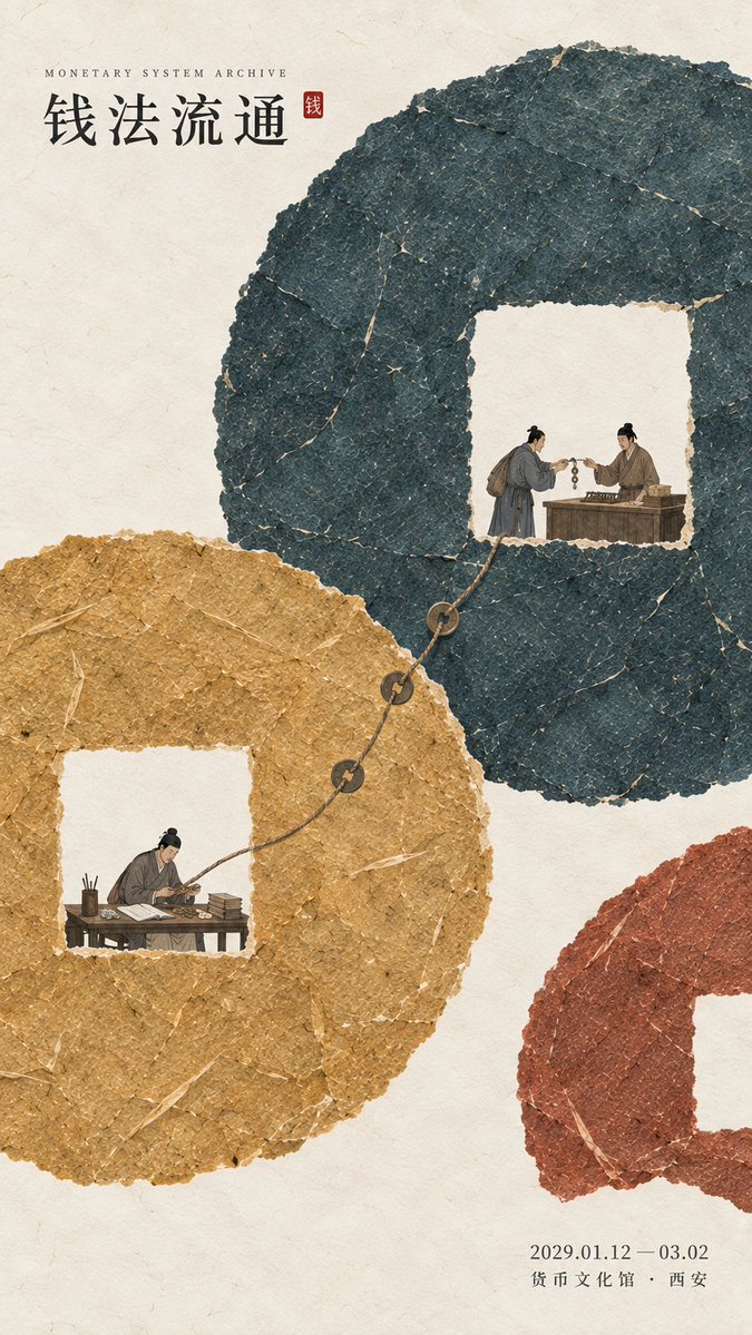
Design a historical-cultural exhibition poster with modern Oriental editorial aesthetics, using "paper fiber + large color fields + micro-scenes" as the core visual language. Do not start from an ordinary antique scene; first extract the [Core Abstract Concept], then use the [Main Visual Structure] to directly translate that concept into a large-scale paper composition. For example, express circulation through a square-hole structure, cycles through continuous rotational relationships, standards through varying-length scales, and division through the joining of color blocks and boundary relationships, so that the viewer senses the logic behind the theme from the composition even without reading the text. Use the [Main Palette] to build 3–6 large paper color blocks with clear visual weight. All blocks retain the real, rich texture of handmade paper, watercolor paper pulp, mineral or plant pigments, with visible natural long and short fibers, pulp grains, pigment deposits, large-scale natural gradations, slight impressions, and irregular torn-paper edges; surfaces complete, matte, clean, and material, without dirt, yellow stains, heavy noise, cheap retro, or digital gradients. The large color fields must carry the primary visual impact, remaining clearly recognizable even when shrunk to social-media feed size. According to the theme, let the large color fields rotate, interweave, join, contrast in scale, complement, enclose, partition, or flow continuously, rather than simply laying a few blocks on the background. The composition should have a very clear sense of method: at first glance one grasps the big form, at second glance the visual surprise of "this relationship is interesting" arises. Moderately reserve warm ivory-white negative space as a breathing zone, but do not leave large empty areas for the sake of minimalism; the blank space must participate in the structure. Embed the [Micro-narrative] within the large paper color fields, with figures and objects occupying about 3%–6% of the image overall. Figures must be performing real actions directly related to the theme, such as exchanging, recording, observing, calibrating, measuring, demarcating, rather than standing and posing. Micro-scenes may be distributed across different color-field nodes, but should not become four quadrants, a flowchart, or step cards; they should be like small stories hidden in the enormous color fields, revealed only up close, showing that behind the abstract structure lies complete human behavior and institutional logic. Keep the figures' clothing, objects, and environment restrained, retaining only the elements necessary to understand the theme. Do not arbitrarily pile up ancient architecture, auspicious clouds, birds, flowers, seals, brush calligraphy, or traditional patterns for the sake of an "Oriental cultural feel." You may use a minimal amount of cinnabar red, warm orange, or old gold as institutional nodes, record marks, or visual focal points, but always in real relation to the content, keeping the total area within 1%–3%. Typography adopts the Oriental editorial language of modern museums, historical archive exhibitions, and knowledge-system exhibitions. The main title [Main Title] uses a slim, upright Chinese Song, Ming, or publication-feel modern font, kept small to medium in size, so typography does not overpower the color fields. English subheadings, dates, and venue information use a smaller size. Keep only three core text groups on the poster as much as possible: "English subheading + Chinese main title + date and venue," without long subtitles, verses, side notes, or meaningless English filler words. The overall reading order should be: large color fields and abstract structural relationships → core concept → miniature figures and real actions → title and exhibition information. The final image should, from afar, have strong memorable form, color, and composition, and only up close reveal paper fiber, figures' actions, cultural details, and knowledge logic, combining material texture, design sense, and narrative. [Theme / Exhibition Name]{fill in, e.g.: monetary system / phenological calendar / musical pitch standard / land surveying} [Main Title]{fill in} [Core Abstract Concept]{fill in, e.g.: circulation / cycle / calibration / division} [Main Palette]{fill in 3–5 colors, e.g.: deep ink-teal + earthy gold-yellow + cinnabar ochre / spring green + summer teal + autumn ochre + winter blue} [Main Visual Structure]{fill in, e.g.: square-hole ring / open spiral / paper columns of varying length / irregular field-block joining} [Micro-narrative]{fill in 2–4 real actions, e.g.: exchange and bookkeeping / observation and recording / vocalization and calibration / surveying and registration} [Exhibition Information]{date / venue, optional} [Aspect Ratio]9:16 vertical