

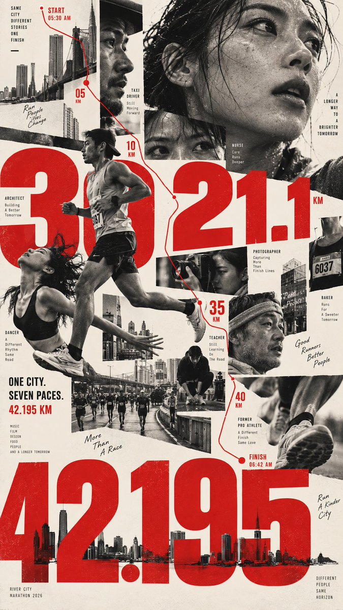
Create a high-end multi-person editorial poster. 【Theme】{fill in} 【Title】{fill in} 【People / roles】{fill in 5–8 characters} 【Main palette】{fill in} 【Poster type】{film / culture / sports / magazine / campaign} 【Aspect ratio】9:16 Build the composition around intentionally irregular visual hierarchy rather than a clean grid. Use dramatically different portrait scales, oversized faces, partial crops, full-body cutouts, narrow photo strips, small documentary fragments, bold typography, and selective negative space. Avoid equal-sized portraits, symmetrical layouts, uniform margins, card-based modules, standard grids, or anything that feels like a PowerPoint or Canva template. The layout should feel carefully art-directed but visually unpredictable, with images crossing invisible boundaries, overlapping typography, breaking out of frames, and creating strong foreground/background relationships. Treat typography as part of the composition rather than a label. Let large words interact with people, disappear behind bodies, cut across photos, occupy negative space, or become structural shapes. Keep the color system controlled, ideally 2–3 dominant colors plus neutrals. Use realistic editorial photography with natural skin texture, distinct faces, believable expressions, and varied poses. Mix large, medium, small, and tiny visual elements to create rhythm. Keep supporting text meaningful and minimal: names, dates, roles, locations, or short contextual information. Avoid excessive filler slogans and decorative copy. The final result should feel like a professionally art-directed editorial poster: irregular, layered, high-density, visually bold, but still clear and intentional. It should look difficult to recreate with a simple template.