

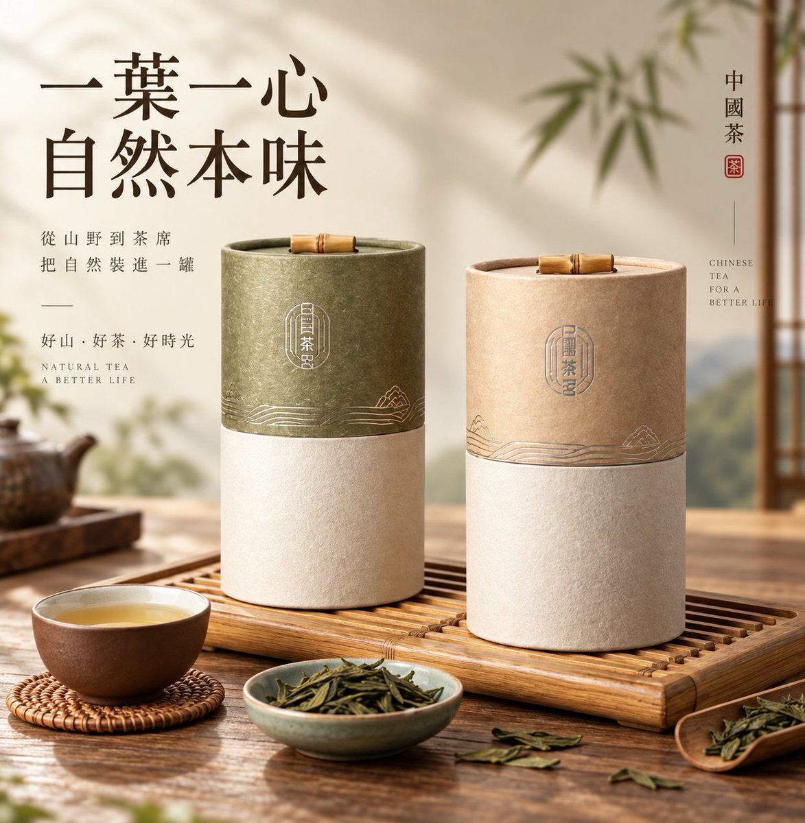
High-end commercial product hero visual photography. First determine the input mode: If the user provides a real product photo, packaging image, or product reference, treat the original product as the highest-priority visual basis. Accurately preserve the product's form, proportions, structure, packaging, brand logo, text positions, colors, materials, textures, and key identifying features; do not redesign, restyle, or substitute the item on your own. You may naturally rebuild light, shadow, reflections, perspective, and ambient color to fit the new scene, so the original product truly integrates into the image rather than being merely pasted in. If the original background is cluttered, you may naturally extract the subject and rebuild the space. If the user provides only a product name, category, or creative theme, build a plausible product form and visual world based on the product's attributes, function, materials, consumption context, and brand character, without mechanically applying preset templates. The image grows outward from the product itself. The subject is clear, real, and has weight; surface texture, edges, and materials carry believable tactility; the product rests naturally on a supporting surface, tabletop, or structural relationship that echoes its character, forming a clear center of gravity and contact shadows, avoiding a floating feel and templated display stands. Only objects, ingredients, materials, or details that genuinely explain the product appear in the foreground and surroundings, with natural density; the background stays restrained, creating space through soft gradients, low-contrast outlines, natural shadows, blurred forms, textures, or faintly suggested thematic imagery, so the environment feels like the aftertaste left by the product's character rather than a direct pileup of thematic elements. The light has a clear direction but stays soft and natural. It focuses on shaping the product's volume, material, edges, and weight, with delicate light-to-dark transitions, air in the highlights, retained layers in the shadows, and a real contact shadow at the base; let the light truly act on the product rather than evenly illuminating the whole frame. Colors extend from the product itself, with background, base, props, and ambient color echoing naturally, allowing subtle variations in warmth, brightness, and material, without mechanical color formulas. If a title is needed, the large type must become one of the clearest visual cores besides the product: bold scale, complete letterforms, clear outlines, legible reading, still quickly recognizable when the image is scaled down; do not let textures, illustrations, or complex backgrounds pass through the main letterforms. Supporting text, English, numbering, and captions recede naturally, forming a refined editorial hierarchy. Overall it is refined, quiet, real, and airy, rich but not overcrowded, with elements drawing toward one another rather than being artificially piled up. Avoid product distortion, altered packaging text, loss of brand elements, floating subjects, cheap display stands, mechanical symmetry, meaningless decoration, even flat lighting, an attention-stealing background, and a templated e-commerce feel. The final result is a mature brand-grade e-commerce hero image, product poster, or brand KV.