

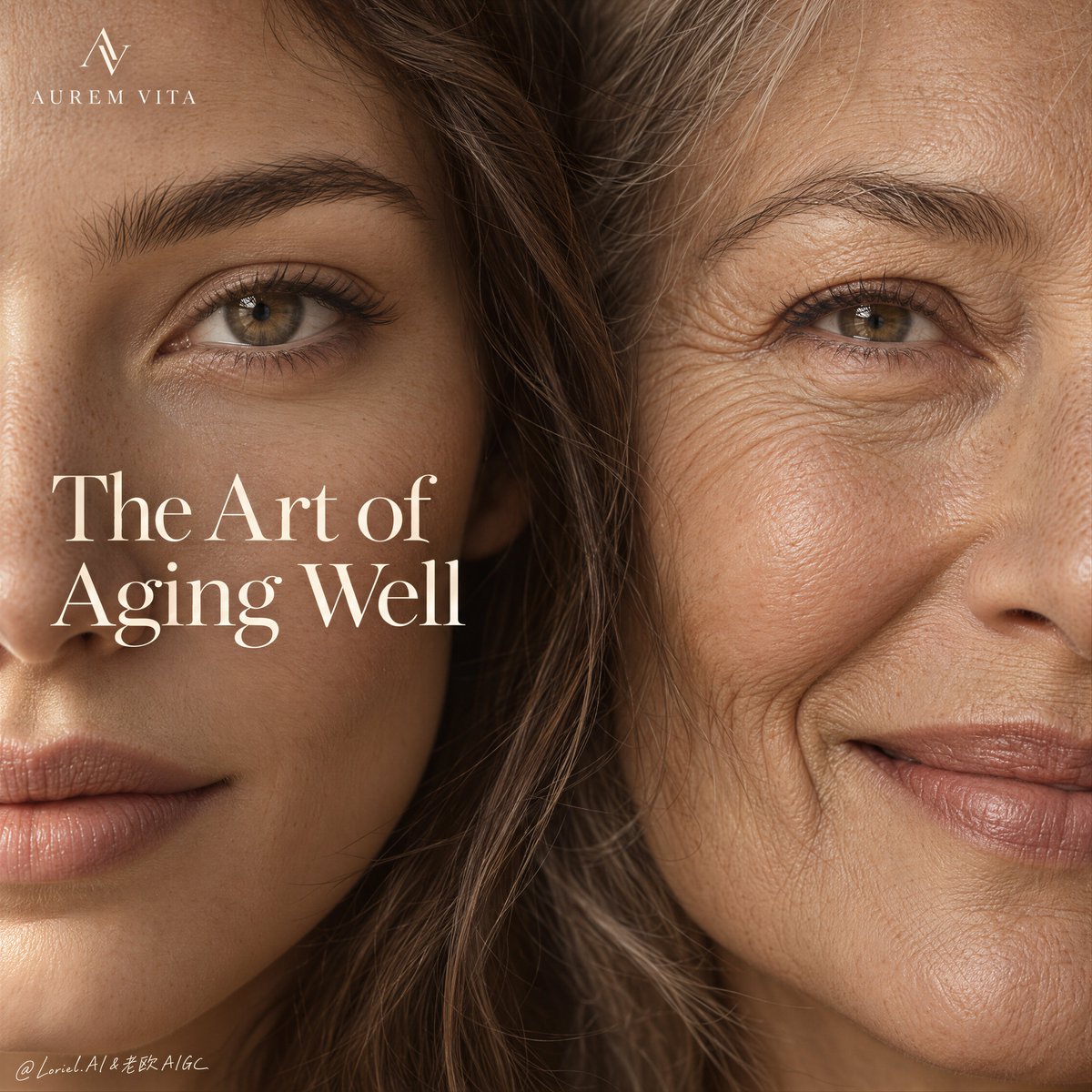
Create a Cannes-level ultra-premium healthy-aging advertising poster for a fictional longevity skincare house called AUREM VITA, preserving the exact structural logic of an intimate split-face editorial campaign while merging emotional warmth, forensic skin realism, and an ultra-reduced copy system. The composition is vertical and edge-to-edge: two adult female faces fill the entire frame in extreme close crop, meeting closely at the center line with only a narrow seam of hair and skin transition between them. One woman on the left appears slightly younger and serene; the woman on the right appears older, warmly expressive, and visibly beautiful in her age. The final image must feel like a luxury manifesto for graceful aging, not a corrective beauty ad. Core composition: fill the frame with the faces of two adult women, cropped tightly from forehead to lower cheek and lip zone so the skin itself becomes the landscape. The left face should present calm stillness and smoother but still fully living skin. The right face should present a gentle smile with visible but elegant fine lines around the eye, cheek, and mouth. Their faces should align intimately and naturally, reading as continuity across time rather than contrast between opposites. Keep the crop frontal, close, and quiet, with one eye from each subject clearly legible and the meeting line between them softened by a few fine strands of natural hair. Orbit atmosphere: the emotional tone should feel like time held close to the skin. The image is not about youth versus age, but about the grace of skin continuing to live, move, and remember. The right side should radiate warmth, softness, and confidence; the left side should hold composure, calm light, and potential. Together, the two faces should feel like an intimate dialogue between present beauty and future beauty, creating a tender and intelligent emotional field rather than a sales message. Transit realism: render both faces with world-class editorial skin precision. Show subtle pores, fine vellus hair, realistic under-eye transitions, soft brow texture, natural lip texture, and nuanced tonal shifts across the skin. On the older face, preserve crow’s feet, smile lines, soft cheek creases, and lived texture without exaggeration. On the younger face, preserve real skin elasticity, soft pores, and natural asymmetry rather than smoothing it into cosmetic plasticity. Hair crossing the center seam should be delicate, sharp, and believable. The entire portrait must feel photographic, tactile, and respectfully real. Reduced copy system: compress all text to only two elements. At the top-left corner, place one small elegant brand mark and the name “AUREM VITA.” In the left-center area, place only one large English serif headline such as “The Art of Aging Well” or “Grace, Backed by Time.” Remove all secondary support lines, descriptors, and bottom notation. The image must read more like a luxury magazine cover or exhibition poster than a conventional product ad. Lighting: use soft warm-natural directional light from upper left, like calm window light. The light should reveal texture instead of hiding it, gently shaping forehead, cheek, eye area, nose bridge, and lips. Shadows must remain soft, breathable, and human. The older face must retain dimensional line detail without harshness; the younger face must retain softness without flattening. Keep the overall lighting warm, intimate, and premium. Material and skin texture: emphasize living skin, faint pores, real smile compression, soft lip dryness or natural sheen, delicate eyebrow texture, and the subtle warmth shifts of human complexion. No filter-like polish, no age-erasure, no exaggerated wrinkle carving. The skin itself is the hero material, and every micro-detail should support trust, intimacy, and dignity. Color hierarchy: 75% warm oat, almond, beige, and skin-toned neutrals; 20% soft taupe, warm brown, and gentle shadow depth; 5% pale cream text and minimal highlight accents. The palette must feel humane, luxurious, quiet, and clinically trustworthy. Design intent: the final poster must preserve the source image’s exact impact logic of two tightly cropped faces sharing the frame, one small top-left brand mark, and one large editorial headline over the left-center, while merging Orbit emotion and Transit realism into a more reduced, more elegant, and more internationally art-directed healthy-aging campaign. The visual message should be continuity, dignity, and intelligence in skin, not transformation or fear. Rendering style: ultra-photoreal luxury skincare advertising, intimate editorial beauty portrait, healthy-aging campaign, natural skin realism, warm minimal design, premium serif typography, magazine-cover restraint, world-class commercial retouching, print-ready finish. Negative prompt: copied source text, real brand names, celebrity likeness, before-and-after ad look, plastic retouching, over-smoothed skin, exaggerated wrinkles, ageist contrast, deformed facial anatomy, beauty filter effect, harsh flash lighting, muddy beige tones, extra support copy, cluttered layout, unreadable text, black blotches, watermark