

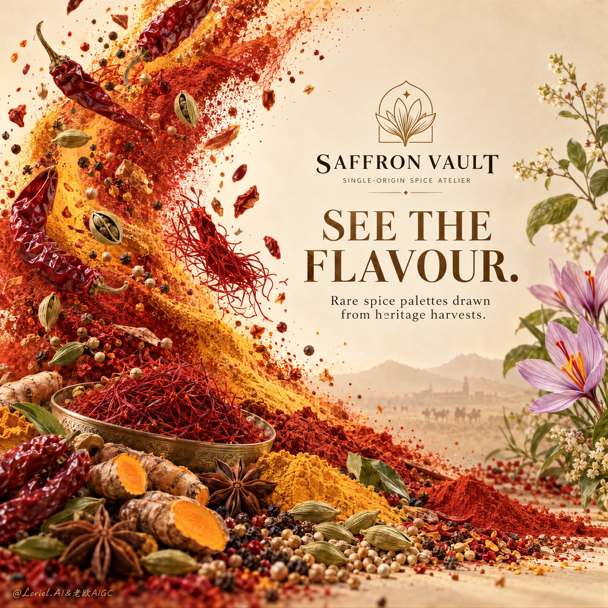
Create a Cannes-level ultra-premium spice advertising poster for a fictional heritage export house called SAFFRON VAULT, preserving the exact structural logic of a refined ingredient-brand campaign while merging emotional atmosphere with forensic material realism and removing the left-side info points and bottom plaque. The composition is vertical and highly disciplined: a warm pale parchment field, one dramatic left-side eruption of spice matter sweeping diagonally upward, one clean centered-right brand-and-title block in open negative space, one delicate floral-botanical balancing element on the far right, and a richly art-directed ingredient base across the lower third. The final image must feel elegant, sensorial, and internationally premium, with less graphic clutter and more visual authority. Core composition: use a soft warm ivory-to-beige background with subtle paper-like tonal variation and generous open space on the right. From the lower-left corner into the upper-left and mid-left frame, build a controlled chromatic wave of spice materials exploding upward in a diagonal arc: chili powder, saffron threads, paprika dust, turmeric haze, roasted fragments, seeds, and whole dried chilies. This spice surge should feel directional and sculptural, not random. In the center-right open field, place the SAFFRON VAULT logo and one large serif English headline such as “SEE THE FLAVOUR.” or “COLOR HAS TASTE.” Beneath it, add only one concise premium support line. On the far right, include a delicate botanical flourish or floral branch to soften and counterbalance the intensity of the spice field. Orbit atmosphere: the image should feel like aroma becoming visible. The left-side spice eruption is not simply a splash of ingredients, but the visual form of heat, memory, sunlight, and trade-route richness rising into the air. The poster should carry the sensation of heritage harvests, ancient spice routes, and the emotional warmth of ground flavor released from the earth. The floral detail on the right should read as the quiet fragrant counterpoint to the fiery energy on the left, creating a sophisticated emotional balance between force and softness. Transit realism: render every spice material with top-tier macro still-life precision. The powders must show real particulate density, layered chromatic depth, and believable airborne dispersion. Whole dried chilies should carry wrinkled skins, slight gloss, natural curvature, and stem detail. Turmeric roots must show earthy matte skin and bright moist cut interiors. Green cardamom pods should display ribbing, tiny surface imperfections, and natural cracking. Saffron threads must feel delicate, wiry, and richly pigmented. Peppercorns, coriander seeds, star anise, and other spice fragments at the base should show precise scale variation, hard dry surfaces, and clear tactile identity. The floral or leaf element on the right must feel naturally integrated and softly lit, not decorative clip-art. Lower ingredient terrain: across the lower third, create a richly layered but tightly edited spice landscape that visually anchors the composition. Build elegant mounds and trails of red, yellow, and green spice powders interwoven with turmeric roots, cardamom pods, dried chilies, seeds, and a few star anise forms. The lower base should feel abundant yet curated, connecting seamlessly into the left-side spice surge. Remove any separate bottom plaque or badge object so the lower zone remains entirely ingredient-led and more luxurious. Typography and graphic system: strip the layout to essentials. At the upper center-right, place one refined emblem and the brand name “SAFFRON VAULT” with a discreet descriptor such as “Single-origin spice atelier.” Beneath it, use one large elegant serif headline like “SEE THE FLAVOUR.” followed by one short supporting line like “Rare spice palettes drawn from heritage harvests.” Eliminate the left informational icon points and the bottom URL-style capsule. The poster should feel more like an art-directed luxury print than a product brochure. Lighting: use soft premium daylight from the upper left with a warm editorial studio character. The spice wave must catch selective highlights and rich volumetric depth, while the powders and whole spices in the lower third remain highly legible in low-angle detail. The right-side title area should stay calm, bright, and readable. Shadows must be soft but dimensional, with no muddy dark buildup and no harsh overexposure. The overall impression should be warm, luminous, and sensorial. Color hierarchy: 60% saffron gold, paprika red, turmeric yellow, and warm parchment neutrals; 30% deep chili crimson, toasted brown, muted olive green, and dark seed tones; 10% soft botanical pinks or leaf greens and restrained dark text accents. The palette must feel rich, aromatic, luxurious, and globally distinctive. Design intent: the final poster must preserve the source image’s exact impact logic of a powerful left-side spice eruption, a clean center-right typography field, a delicate right-side floral balancing note, and a richly layered spice base, while merging Orbit atmosphere and Transit realism into a cleaner, more luxurious campaign image. With the left-side information points and bottom plaque removed, the visual language becomes more refined, more exhibition-like, and more premium. Rendering style: ultra-photoreal luxury spice advertising, editorial ingredient poster, premium heritage export branding, macro material realism, elegant negative space, cinematic still-life atmosphere, world-class commercial retouching, immaculate print-ready finish. Negative prompt: copied source text, real brand names, cluttered market stall look, low-detail spice powders, fake chili textures, messy chaotic explosion, left-side icon points, bottom URL plaque, cheap packaging graphics, unreadable typography, muddy browns, flat lighting, decorative clip-art flowers, black blotches, watermark