

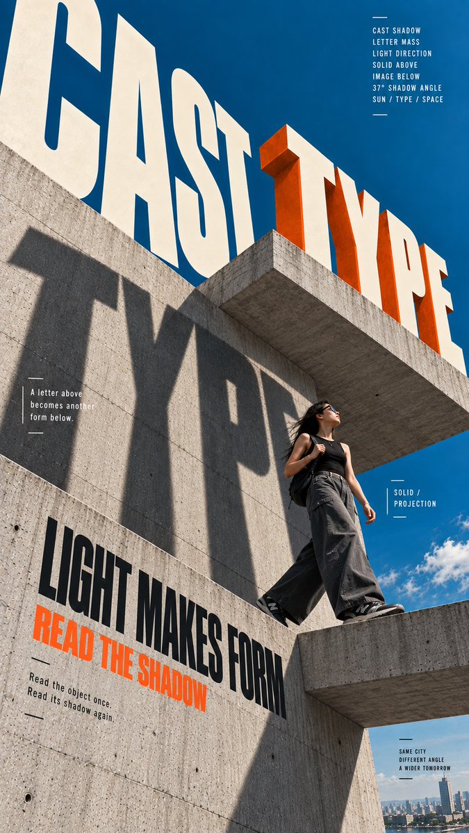
Create a 9:16 vertical editorial poster series in English, combining brutalist architecture, oversized perspective typography, realistic young adult figures, and strong three-dimensional spatial relationships. Keep the visual system consistent across the series: dramatic low-angle photography, deep cobalt-blue sky, warm raw-concrete gray, warm ivory typography, charcoal clothing, and safety orange as the only strong accent. Architecture should feel monumental and simple, with large geometric surfaces rather than complex structures. Typography must actively participate in the space. Let letters follow architectural perspective, change scale with depth, wrap around surfaces, cast real shadows, become partially hidden by people or concrete, and interact naturally with foreground and background elements. Avoid flat text placed over a photograph. Keep the people realistic and naturally posed, with authentic skin texture, natural hair, believable clothing folds, and clear physical interaction with the surrounding architecture. Poster 1: CAST TYPE Create monumental three-dimensional letters spelling “TYPE” mounted above a brutalist concrete structure. Use warm-ivory front faces and safety-orange side depth. Strong sunlight casts huge readable letter shadows across the concrete wall below. Place a realistic young woman walking through the transition between sunlight and the projected shadow. Add “CAST” as giant perspective typography in the sky. Supporting text may include “LIGHT MAKES FORM”, “READ THE SHADOW”, and “SOLID / PROJECTION”. Poster 2: SKY APERTURE Create a monumental circular brutalist atrium viewed from below, with a large round opening revealing vivid blue sky. Integrate “SKY APERTURE” into the curved concrete structure using true circular perspective rather than flat curved text. Add a realistic young man on the lower walkway and a restrained vermilion curved graphic accent. Supporting text may include “OPEN ABOVE”, “CIRCULAR FIELD”, and “LIGHT ENTERS HERE”. Poster 3: OPEN CORNER Create a massive 90-degree brutalist concrete corner viewed from a dramatic low angle. Place a realistic young woman naturally interacting with the corner and an orange three-dimensional L-shaped spatial form. Make “OPEN CORNER” wrap across the two architectural planes so the typography visibly changes direction at the corner. Supporting text may include “TWO SIDES”, “TURN THE GRID”, and “BETWEEN SURFACES”. Poster 4: FLOAT LEVEL Create two offset concrete slabs with a realistic young man walking along the upper level. Introduce two separated translucent planes at different depths, one smoky blue-gray behind him and one orange plane in front, creating a fragmented spatial volume. Place “FLOAT LEVEL” across multiple depths so the words appear at different distances. Supporting text may include “BETWEEN PLANES”, “NO FIXED GROUND”, and “OFFSET HEIGHT”. Use meaningful editorial microcopy, small labels, thin rules, and compact annotations to create rich but controlled information density. Keep clear hierarchy and generous negative space around the main architectural forms. The final series should feel like professionally art-directed architecture and youth-culture editorial posters, with strong thumbnail impact and sophisticated spatial detail up close.