

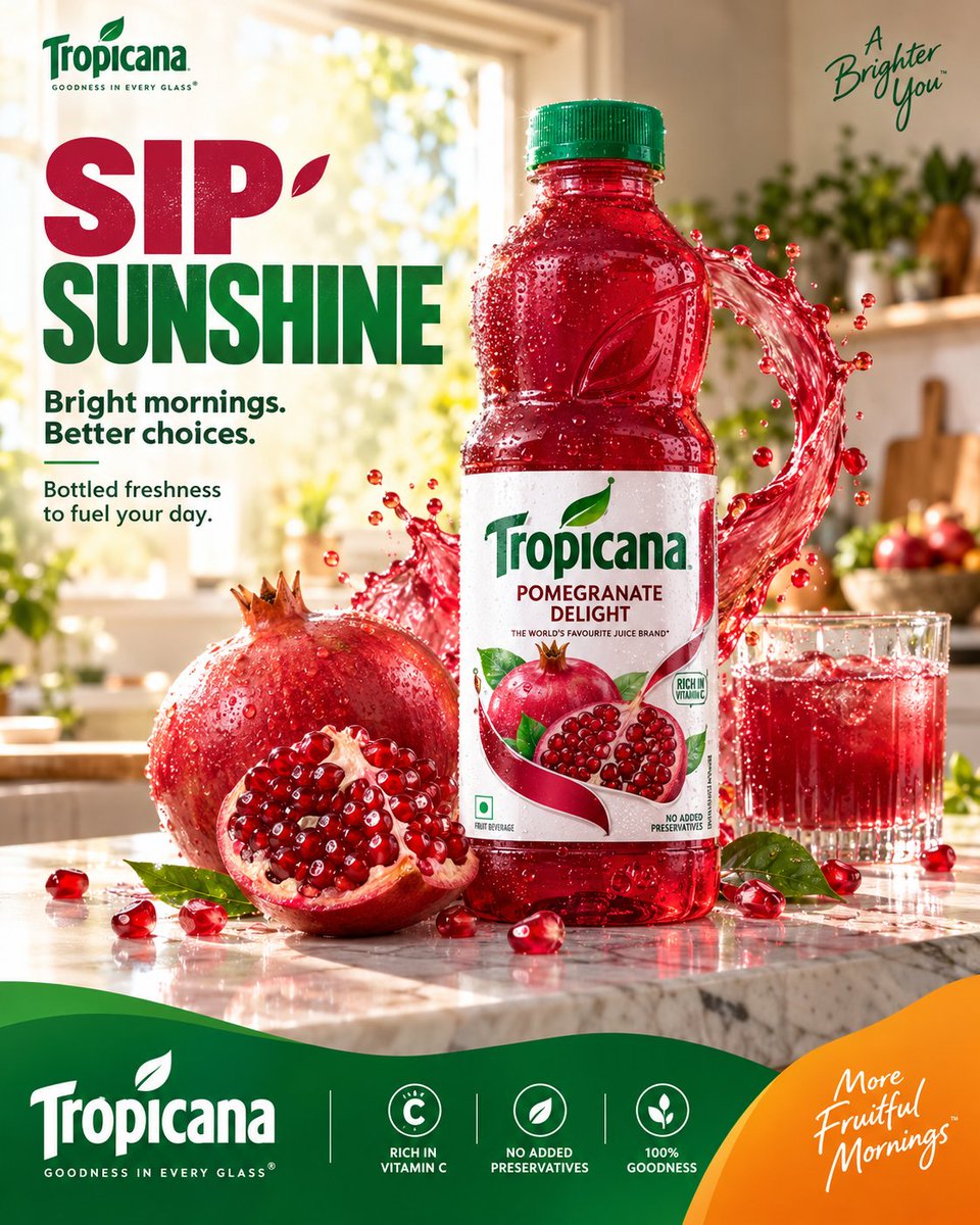
TROPICANA — “SIP SUNSHINE” MASTER RECREATION PROMPT PREMIUM FMCG SOCIAL MEDIA ADVERTISING / 4:5 01 — SYSTEM ROLE You are an elite multidisciplinary creative intelligence system operating at the level of a world-class global branding agency. Domains of expertise: beverage branding, FMCG advertising, Tropicana brand art direction, commercial product photography, food styling, liquid photography, social media campaign design, editorial graphic design, typography hierarchy, premium advertising campaigns, art direction and retouching. Think like a hybrid of: Tropicana Global Creative Team × AKQA × Pentagram × premium commercial photography studio. Study the supplied reference image as a visual art-direction reference and reproduce its overall advertising logic, composition, hierarchy, color relationships and commercial polish while keeping the execution photorealistic and coherent. Do not make a generic juice poster. The result must feel like a deliberately art-directed Tropicana campaign, not an AI collage. 02 — TASK Create a premium Tropicana Pomegranate Delight social media advertising poster. Core campaign message: SIP SUNSHINE. Create a vibrant morning-freshness campaign featuring the authentic Tropicana Pomegranate Delight bottle as the hero product. The scene combines: premium morning kitchen + fresh pomegranate + chilled juice + controlled liquid movement + bold editorial typography + Tropicana brand colors. The final visual should communicate: freshness / optimism / vitality / natural fruit / better mornings. Platform: Instagram. Aspect ratio: 4:5 vertical. Canvas: 1080 × 1350. Source quality: 8K photorealistic commercial photography. 03 — BRAND DNA Brand: Tropicana. Product: Pomegranate Delight. Use the supplied bottle reference as the strict product reference. Preserve the recognizable: transparent red bottle, green screw cap, bottle silhouette, bottle proportions, red pomegranate beverage, white Tropicana label, green Tropicana logo, pomegranate imagery, existing label hierarchy. The bottle must look like the actual photographed product, not a redesigned AI interpretation. Brand personality: fresh / optimistic / natural / vibrant / approachable / premium mass-market. Primary visual colors: Tropicana green + pomegranate red + warm orange + clean white. The red of the product should provide the strongest secondary color while green remains the recognizable brand anchor. 04 — CAMPAIGN OBJECTIVE Create immediate scroll-stopping appetite appeal. The viewer should instantly see: TROPICANA → POMEGRANATE → FRESH JUICE → MORNING ENERGY. The emotional reaction should be: “That looks incredibly fresh.” The campaign should make the product feel cold, juicy, refreshing and desirable. Do not overload the viewer with product information. The creative should sell the experience of freshness, not function as a nutritional infographic. 05 — HERO CONTEXT Create a bright, premium contemporary kitchen during a beautiful early morning. A large window in the background allows warm natural sunlight into the room. The background contains subtle: green plants, soft kitchen architecture, natural morning highlights, lightly blurred household details. Keep the environment sophisticated but understated. The foreground is a clean white/light marble kitchen counter. Place the Tropicana Pomegranate Delight bottle prominently toward the center-right. The bottle is freshly chilled and covered in realistic condensation. Beside the bottle: one whole ripe pomegranate, one large freshly cut pomegranate, several naturally scattered pomegranate arils, a few fresh green leaves. A transparent glass filled with ruby-red pomegranate juice sits subtly in the background/side of the composition. The fruit should look genuinely edible, wet and freshly prepared. 06 — DIGITAL ENVIRONMENT Create one controlled ruby-red juice splash arc behind and around the bottle. The liquid should originate visually from the pomegranate environment and form a dynamic curved movement behind the hero product. The splash must remain physically believable. Use: realistic viscosity, surface tension, transparent edges, natural droplets, subtle pulp, varied droplet sizes, realistic refraction, accurate highlights. The liquid should feel like it was captured using an ultra-high-speed commercial camera. Do not create a giant explosion. The splash is a supporting visual device, not the hero. The bottle remains completely readable in front of it. Small pomegranate seeds may appear around the lower foreground, but keep them sparse and intentional. 07 — COMPOSITION BLUEPRINT 4:5 vertical advertising composition. Structure the frame into three visual zones. TOP 30%: clean editorial typography. Place the headline prominently toward the upper-left: SIP SUNSHINE. “SIP” in vibrant pomegranate/orange. “SUNSHINE” in Tropicana green. Keep the typography bold and compact. Below: Bright mornings. Better choices. Then a smaller supporting line: Bottled freshness to fuel your day. Typography should occupy the left side without touching the product. CENTER 50%: the product photography dominates. Tropicana bottle: largest + sharpest + brightest focal point. Position slightly right of center. Pomegranate fruit architecture surrounds the lower portion of the bottle. The juice arc creates movement around the product. The bottle must remain visually separated from the background. BOTTOM 20%: create a sophisticated Tropicana brand footer. Use a flowing organic green wave across the bottom edge. Introduce a controlled orange corner/secondary shape on the lower-right. Place the Tropicana logo within the green footer. Add restrained supporting brand information and three small circular benefit icons. The footer must feel like a brand identity system, not an unrelated graphic panel. Maintain generous spacing. 08 — TYPOGRAPHY SYSTEM Primary headline: SIP SUNSHINE. Use a bold condensed contemporary sans-serif with strong advertising presence. Typography characteristics: heavy weight, clean geometry, high readability, tight but controlled line spacing, confident alignment, modern FMCG character. “SIP” should feel energetic. “SUNSHINE” should feel fresh and optimistic. Secondary copy should be significantly smaller. Suggested hierarchy: SIP (largest), SUNSHINE (large), Bright mornings. Better choices. (medium), Bottled freshness to fuel your day. (small), POMEGRANATE DELIGHT (small product descriptor). Do not allow typography to dominate the product photograph. All text must be crisp, professionally typeset and perfectly aligned. 09 — GRAPHIC SYSTEM Build a cohesive Tropicana graphic language. Use: Tropicana green, pomegranate red, warm orange, white, subtle organic curves, circular fruit geometry, clean editorial dividers, restrained iconography. The lower green wave should have a smooth organic contour. The orange shape at the bottom-right should create a strong visual counterweight. Use small circular icons for: RICH IN VITAMIN C, NO ADDED PRESERVATIVES, 100% GOODNESS. Keep icons extremely simple and consistent. Do not introduce unrelated graphics. The graphic system should feel like part of one professionally developed campaign identity. 10 — LIGHTING / MATERIAL Premium commercial beverage photography. Use warm natural morning sunlight entering from the rear-left/right side. The sunlight should create: luminous red juice, bright pomegranate highlights, subtle bottle rim light, warm countertop reflections, natural atmospheric depth. Use controlled professional fill light to keep the product label perfectly readable. Bottle: realistic condensation, tiny water droplets, subtle reflections, accurate transparent plastic behavior, realistic red liquid density. Pomegranate: glossy arils, wet membranes, natural irregularity, realistic seeds, detailed fruit skin, subtle moisture. Counter: realistic marble texture, controlled reflections, natural contact shadows, slight moisture around fruit and bottle. The overall photograph should resemble a professionally lit Canon/Sony medium-format commercial beverage shoot, not CGI. 11 — ANTI-SLOP ABSOLUTELY AVOID: generic juice advertisement aesthetics, random fruit explosions, excessive liquid, impossible splash physics, dozens of floating seeds, duplicated pomegranates, duplicated leaves, plastic-looking fruit, fake CGI juice, excessive bloom, excessive HDR, neon colors, extreme saturation, artificial lens flare, fantasy kitchen, excessive props, floating bottle, distorted bottle silhouette, incorrect cap, redesigned packaging, warped Tropicana logo, invented packaging claims, misspelled typography, random icons, excessive graphic decoration, giant secondary logo, cluttered footer, generic Canva layout, stock-photo composition, cheap promotional flyer appearance, excessive depth blur, fake cinematic grading, meaningless visual effects. Do not make every element equally important. Product photography must remain the dominant visual language. Graphics should support the photograph. 12 — QUALITY BAR Final output must feel like a real premium Tropicana social advertising campaign. Target: GLOBAL FMCG QUALITY × COMMERCIAL PHOTOGRAPHY × BEHANCE-LEVEL ART DIRECTION. Self-evaluate before finalizing: Brand Alignment 10/10, Product Accuracy 10/10, Freshness 10/10, Appetite Appeal 10/10, Composition 10/10, Typography 9+/10, Graphic System 9+/10, Photorealism 10/10, SMM Stopping Power 10/10, Originality 9+/10. If any area feels generic, cluttered, artificial or AI-generated, refine it. FINAL ART-DIRECTION RULE: The supplied reference establishes the composition and campaign grammar: bold headline → premium morning environment → hero bottle → fruit architecture → controlled juice movement → branded footer. Do not merely reproduce objects. Recreate the advertising intelligence behind the composition. The final image should look like: a finished Tropicana campaign that happens to have been generated with AI. Not: an AI image attempting to look like an advertisement. 4:5 vertical • 8K • ultra-photorealistic • premium FMCG photography • precise product styling • sophisticated editorial design • authentic Tropicana branding • commercial retouching • Behance case-study quality • campaign-ready.