

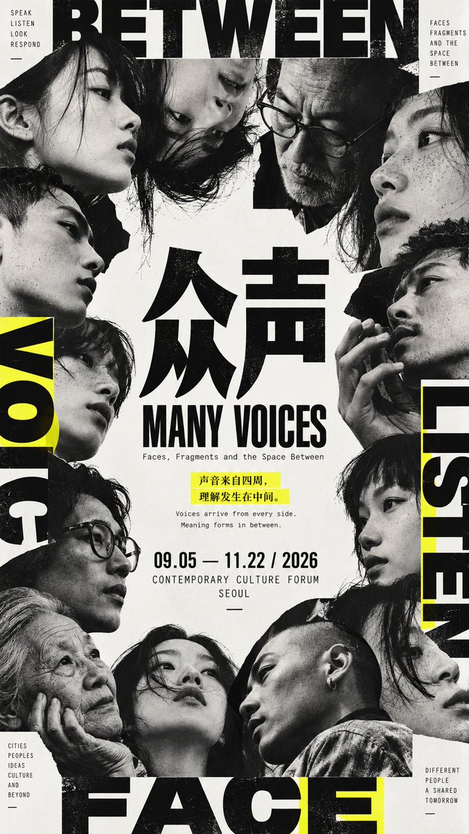
【Theme】 【Main visual subject】 【Chinese core character】 【Chinese title】 【English title】 【Wrapping method】figures surrounding / giant characters on three sides / physical boundaries / nested frames / other 【Accent color】 【Aspect ratio】9:16 Generate a modern exhibition poster with the temperament of **East Asian Modernist Exhibition Poster, Japanese Contemporary Graphic Design, Editorial Design**. The core uses a "wraparound composition": do not simply add a border around the subject; instead, let figures, giant text, real object edges, geometric frames, or photographic crops exert visual pressure from the outer edges toward the center, naturally enclosing a clear visual focus or negative space in the middle. The wrapping relationship should have direction and weight; avoid four sides of completely equal width, quantity, and symmetry; use unbalanced structures like "heavy left, light right, dense top, sparse bottom" or "three sides closing in, one side open" to keep tension. First choose the wrapping mechanism best suited to the 【Theme】. Figure subjects can have multiple cropped portraits converge toward the center; a single sculpture or product can use oversized edge typography and white space to form a three-sided enclosure; real spaces can use curtains, door frames, architectural edges and other physical structures to enclose the central area; graphic subjects can contract layer by layer toward the center with multiple offset geometric frames, repeated text, or nested boundaries. Do not cram all these methods into one image; choose only the one most suited to the current theme as the main skeleton, then add one slight "frame break," such as a figure's shoulder entering the center, the subject pressing on text, an object passing through the boundary, or a frame line interrupted by a real object. Typography must be part of the composition, not an ordinary title. Use a striking 【Chinese core character】 that can hug the frame edge, be partially cropped, rotated, cross zones, or overlap the subject front-to-back; the English title uses modern Grotesk, Condensed Sans, or restrained Serif, allowing ultra-wide tracking, 90° rotation, outline fonts, and edge cropping. Use at most 2–3 typeface characters overall, forming a clear hierarchy of "large type for structure, medium type for theme, small type for information." Information density comes mainly from font size, direction, cropping, and spatial relationships, not from stacking large amounts of explanatory modules to fake "design feel." Keep the image as modern, sharp, and restrained as possible. The background prioritizes neutral colors like cold white, light gray, charcoal black; add only one 【Accent color】 as a visual node; the total accent color area is kept at about 5%–10%, used for small color blocks, short lines, dates, or local graphics. The central area should be noticeably quieter than the periphery, retaining about 25%–40% effective negative space, making "dense outside × sparse inside" the most core visual rhythm. The subject itself stays single, clear, with strong contour; do not simultaneously add landscapes, seals, traditional patterns, complex craft diagrams, material cards, and heavy decoration. The final reading order should be: first the powerful outer forms and central focus; second, understanding how the periphery encloses the center; third, discovering cropping, interweaving, or frame-breaking relationships; last, reading the title, date, and small amount of information. The whole work should look like a real contemporary exhibition poster, an international graphic design annual work, or an independent cultural magazine visual, not a traditional cultural propaganda page, PPT layout, or museum archive description board. Avoid: equal four-sided borders, mechanical symmetry, full-page explanatory text, traditional decoration, landscape backgrounds, stacked seals, templated small text, tech HUD, meaningless English, Design Study, Vol., numbering, Logo, QR code, and copyright marks.