

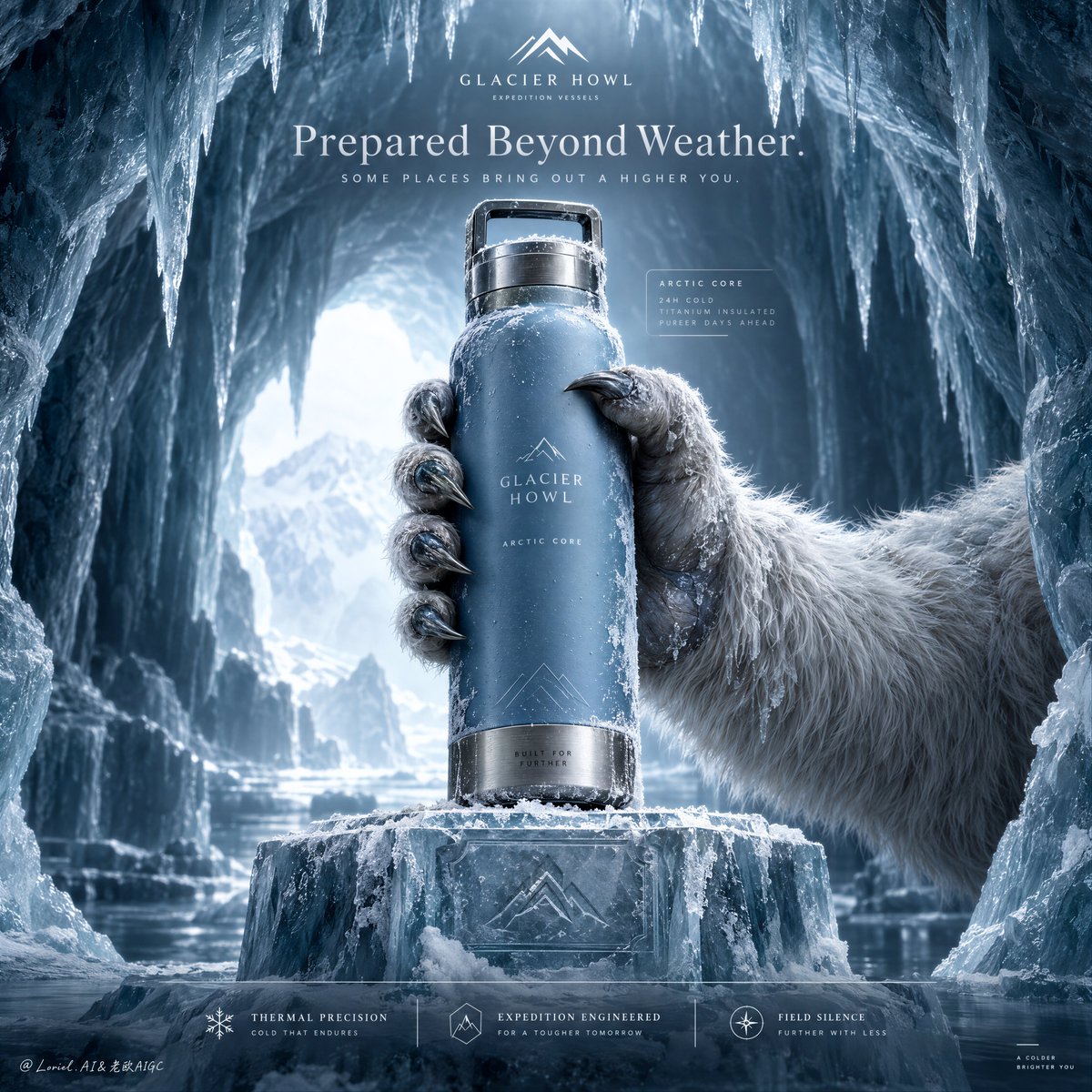
Create a Cannes-level ultra-premium outdoor hydration advertising poster for a fictional expedition vessel house called GLACIER HOWL, preserving the exact structural logic of a frozen cave hero-shot campaign while merging forensic material realism with a colder, quieter, more elevated emotional register. The composition is vertical and symmetrical in feeling: an arctic ice cavern frames the image from above and both sides, a single luxury insulated bottle is held in the center by one frost-covered guardian-like polar beast hand, the bottle rises above a carved ice pedestal, a restrained top headline zone crowns the frame, and a minimal lower editorial information band anchors the composition. The final image must feel like mythic polar luxury, not mainstream ecommerce. Core composition: place the viewer inside a glacial chamber shaped like a natural cathedral. The ice cave curves inward from left and right, with elongated icicles descending from the ceiling and a pale cold opening glowing softly in the deep background. In the center foreground, one monumental ice pedestal rises from the frozen floor with crisp planar edges and subtle carved markings. From the right side, a large arctic beast hand enters and grips the bottle upright with deliberate control, slightly angled but visually stable, presenting it toward the viewer. The bottle must remain the absolute visual authority. Remove all unnecessary clutter, keeping the environment spacious, quiet, and sculptural. Product design: invent a signature vessel for GLACIER HOWL with a dense matte glacier-blue body, a brushed titanium base and lid, an integrated rectangular carry loop, and extremely minimal built-in branding. The surface carries refined frost bloom, delicate ice crystallization, dry cold condensation, and pristine premium finish without wear. The label area should contain only discreet integrated text such as “GLACIER HOWL” and “ARCTIC CORE”, typeset with elegant restraint. The object must feel engineered, collectible, and expensive, like a polar survival instrument refined into a design icon. Orbit atmosphere: the emotional tone should suggest an arctic sanctum guarded by ancient cold. The cave is not hostile or chaotic; it is silent, reverent, and rarefied. The distant blue-white light feels almost sacred, as if the object has been revealed inside a frozen ceremonial chamber. The beast hand reads less as aggression and more as custodianship, a mythic offering from the landscape itself. The frame should communicate control, stillness, endurance, and quiet power. Transit realism: render every material transition with physical precision. Emphasize the matte powder-coated bottle skin, the fine brushed directionality of titanium, edge highlights on the carry loop, frost microcrystals at the cap seam, pressure contact where clawed fingers compress against the bottle, semi-wet fur strands clumped by freezing moisture, keratin claw texture with iced tips, translucent subsurface glow in the ice cave walls, and crisp icicle tapering. The pedestal should show dense frozen mass, surface abrasion, shallow snow dust, and subtle engraved insignia. Every surface must feel photographically exact and commercially retouched to a world-class standard. Creature-hand realism: the gripping hand must feel believable, premium, and anatomically resolved. Show thick pale winter fur transitioning into cold blue-grey skin around the digits, strong knuckle mass, correct joint articulation, and claws that are sharp but not grotesque. The gesture is firm and elegant, with credible contact pressure and natural spacing between the digits. No deformity, no extra fingers, no fantasy exaggeration, no cartoon beast styling. Lighting: use an ultra-controlled cold lighting setup. A diffused blue-white backlight enters from the distant cave opening, shaping the ice chamber with gentle atmospheric depth. A restrained premium key light isolates the bottle and the gripping hand, producing the cleanest highlights in the frame. The metal edges receive crisp cool reflections, the matte body shows smooth tonal rolloff, the frost sparkles remain sparse and refined, and the cave walls stay subdued. Avoid theatrical flare, harsh contrast, or noisy particle glitter. The brightest region should stay around the bottle and upper cave core, allowing the rest of the frame to fall into elegant cold gradients. Typography and layout logic: preserve the top and bottom information architecture, but refine it into luxury editorial form. At the top center, place one minimal logo block, then a single English headline such as “Prepared Beyond Weather.” or “Cold, Mastered.” with one short supporting line beneath it in elegant restrained typography. Eliminate aggressive sales language. Near the bottle, if needed, include only one very subtle translucent feature card with micro-scale type. At the bottom, use a low-density three-part editorial strip with concise descriptors like “Thermal Precision”, “Expedition Engineered”, and “Field Silence”. The entire graphic layer must feel integrated, sparse, and expensive. Color hierarchy: 60% glacial cyan, frozen mist white, pale ice blue, and luminous cold air; 30% deep teal shadow, steel-titanium grey, muted fur neutral, and cavern blue-black depth; 10% saturated glacier-blue from the bottle and small silver-white specular accents. The palette must be desaturated, colder, calmer, and more premium than a conventional outdoor campaign. Design intent: the final poster must preserve the exact hero structure of the reference image—ice cave frame, centered bottle, beast-hand grip, pedestal base, top headline, bottom info strip—while transforming the tone into something more international, more restrained, and more luxurious. The product is not merely protected from the cold; it belongs to the cold. The world around it exists only to confirm its authority. Rendering style: ultra-photoreal luxury outdoor product advertising, arctic sanctuary editorial campaign, mythic polar realism, high-end commercial retouching, cinematic ice architecture, premium expedition design language, cold restrained grading, immaculate print-ready finish, exceptional material detail. Negative prompt: real brand names, copied original slogan, cheap ecommerce styling, playful monster aesthetic, cartoon yeti hand, extra fingers, malformed claws, warped bottle geometry, plastic-looking metal, low-detail fur, cluttered UI cards, large discount badge, noisy snowstorm, muddy cave shadows, dead black areas, unreadable text, overdesigned layout, childish fantasy ice cave, watermark