

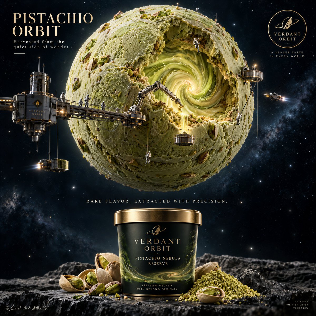
Create a Cannes-level ultra-premium gelato advertising poster for a fictional interstellar dessert house called VERDANT ORBIT, preserving the exact structural logic of a cosmic product campaign while merging narrative atmosphere, forensic material realism, and curatorial restraint. The composition is vertical and highly disciplined: one monumental pistachio gelato planet occupies the upper two-thirds of the frame, partially excavated to reveal a luminous inner vortex, surrounded by a reduced but believable network of elegant extraction structures and tiny astronaut technicians, while the lower foreground presents one hero gelato tub as the sole commercial anchor, supported by a minimal pistachio ingredient still life and extremely restrained editorial typography. The final image must feel colder, cleaner, and more luxurious than a typical fantasy food poster. Core composition: place one giant spherical pistachio gelato planet in the upper center against a deep, quiet star field. The sphere should be slightly asymmetrical from excavation, with one large carved opening revealing a glowing spiral core of pale pistachio-green and warm gold cream energy. Keep the surrounding engineering system selective and intentional: a few refined suspended platforms, one or two articulated drilling arms, subtle tether lines, discreet docking structures, several tiny transport craft, and a small number of astronaut workers placed with believable scale and purpose. Avoid visual clutter. The planet remains overwhelmingly dominant, with the machinery acting only as evidence of a rare flavor-harvesting ritual. Orbit atmosphere: the world should feel like a sacred edible planet being carefully mined for its essence. The inner vortex is not chaotic; it glows with quiet magnetic pull, like the living heart of a rare dessert mineral field. The surrounding darkness should carry a sense of scale, stillness, and distant luxury. The astronauts and craft should feel ceremonial and precise rather than busy, turning the scene into a calm myth of extraction and wonder. Transit material realism: render the pistachio planet as a true high-end frozen dessert object before anything else. Show dense scoop-cut topography, creamy folds, matte-chilled gelato sheen, subtle melt gloss at exposed edges, roasted pistachio fragments embedded in the mass, occasional nut cavities, faint frozen microcrystals, and slightly darker roasted-green strata where deeper cuts expose richer flavor density. The spiral core should feel edible and physical, with creamy rotational turbulence, soft thermal glow, and believable viscous depth. The machinery must show fine metal joints, cable tension, docking pressure, structural weight logic, small industrial lights, and realistic brushed-metal reflectance. The packaging below must show premium print sharpness, lid-edge reflectivity, cylindrical accuracy, and tactile material finish. Port restraint: simplify the layout into a more gallery-like luxury poster. Reduce side badges, callouts, and decorative icon noise. Keep only one refined title block in the upper-left, one discreet quality seal in the upper-right, one centered conceptual line between planet and pack, and one elegant lower-right signature or division mark if needed. Let negative space, scale contrast, and precise hierarchy do the work. The product pack and the planet must read as the two primary visual statements. Hero product design: place one front-facing premium gelato tub in the bottom center, large and perfectly legible, but still secondary to the cosmic planet above. The container should be matte black or deep near-black forest green with a muted brushed-bronze or satin gold lid. Use elegant built-in branding such as “VERDANT ORBIT” and a product name like “Pistachio Nebula Reserve” or “Emerald Core Extraction”. The label design should be minimal, refined, and contemporary, with luxury serif and restrained supporting type. Around the tub, place a small curated arrangement of cracked pistachios, a few open shells, and one neat mound of vivid pistachio powder. Keep the foreground clean and sculptural. Typography and layout: in the upper-left quadrant, place a refined campaign title such as “PISTACHIO ORBIT” with a restrained subline like “Harvested from the quiet side of wonder.” In the upper-right, place a small premium insignia seal for VERDANT ORBIT. Between the planet and the tub, place one centered editorial line such as “RARE FLAVOR, EXTRACTED WITH PRECISION.” Typography must feel international, cinematic, and luxurious, never loud, bulky, or promotional. No copied wording from the source image. Lighting: use two highly controlled lighting systems. The planet and inner vortex receive soft internal warm-green luminosity plus sparse industrial highlights, creating depth without chaos. The lower pack and ingredients receive a refined luxury food-photography key light from the upper front, giving the lid, rim, label, pistachio shells, and powder crisp form separation. Maintain a dark surrounding field but avoid dead black patches. The brightest points should be the vortex interior, selected metallic highlights, and the hero tub rim. Color hierarchy: 60% restrained pistachio green, deep space blue-black, and cold dark neutrals; 30% warm amber-gold industrial lights, roasted pistachio beige, bronze metallic accents, and muted cream typography; 10% vivid acid-green energy glow and selective premium highlights. The palette must feel rich, controlled, and expensive. Design intent: the final poster must preserve the exact impact logic of a giant edible world above and a commercial hero pack below, while merging Orbit atmosphere, Transit realism, and Port minimal curation into one resolved luxury campaign. The image should communicate that this gelato is a rare harvested substance from an imagined gourmet cosmos, yet still feel like a credible, desirable, premium retail product. Rendering style: ultra-photoreal luxury food advertising, cinematic sci-fi gourmet editorial, restrained space-mining fantasy, exceptional frozen dessert realism, high-end packaging photography, elegant negative space, museum-grade campaign finish, world-class commercial retouching. Negative prompt: copied source text, real brand names, childish fantasy styling, toy-like spaceships, cartoon astronauts, cluttered infographic layout, oversized badges, unreadable packaging, plastic-looking gelato, muddy green tones, chaotic star field, random extra planets, warped tub geometry, low-detail pistachios, messy machinery, flat lighting, excessive text, black blotches, distorted typography, watermark