

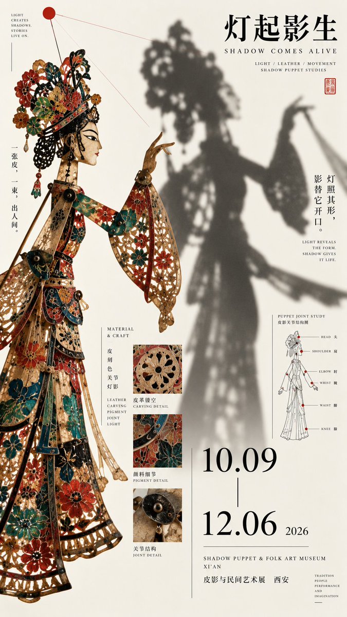
Prompt: 【Theme】: 【Chinese title】: 【English title】: 【Left core content】: 【Right core content】: 【Left-right relationship】: object × projection / subject × text / raw material × result / light-dark contrast / dense × blank / other 【Cross-over element】: subject outline / shadow / lines / material / title / other 【Main color】: 【Auxiliary color】: 【Date / Venue】: 【Aspect ratio】: 9:16 Generate a high-aesthetic, high-information-density Oriental cultural exhibition poster using a "left-right composition / asymmetric two-zone composition". Do not split the image 50/50; build a clear visual hierarchy based on the theme, e.g. 40/60, 45/55, 35/65. The two sides carry different tasks, achieving balance through visual weight rather than equal area. Choose the left-right relationship flexibly by theme: Object × projection: on one side a real figure or artifact, on the other the shadow, light, motion trail or other visual result it produces, forming a cause-and-effect relationship. Subject × text: on one side a large subject dominating the frame; on the other a big title, small text, date, archival info and research diagrams building reading weight. Raw material × result: one side shows ore, woodblock, material or the raw state of a craft; the other shows pigment, imprint, finished product or application, so the composition itself explains the process of change. Dense × blank: one side uses artifacts, archive fragments, patterns and research info for high visual density; the other keeps more white space, with only a title or a few strong graphics, creating design through the dense-sparse contrast. Light-dark contrast: allow one side to use bright paper (bone white, light gray) and the other strong color fields (ink black, deep red, deep teal), forming a clear visual clash. The two sides must not be fully severed. Let the subject, shadow, branches, text, brushstrokes, patterns or fine lines moderately cross the center line, reconnecting both sides into a whole. The boundary can be broken but must not become a chaotic collage. Typography is redesigned per image: full horizontal title, offset large characters, medium title, cross-over text or partial color inversion. Do not fix on four vertical characters, nor repeat the "two horizontal + two vertical" template. Information density references mature museum posters, Japanese editorial design and art catalogs. May include English subtitle, material, craft, date, venue, a short curatorial line, and a bit of theme-related research content, such as structural line art, partial macro, material cross-section, making process or pattern study. Research content is only the second reading layer, concentrated in 2–3 areas; do not turn it into a PPT, encyclopedia page or ruled info card. Control color to 3–5 main colors, with one clear main color as the memory point, plus black, bone white, dark gray as base colors. Keep color blocks clean, material realistic, contrast clear. First glance sees the strongest subject and the left-right visual contrast; second glance reads the title; third glance finds the cross-over or causal relationship between the sides; finally read material, structure, craft and exhibition info. Core principle: the sides need not be equal, but visual weight must be balanced. One side grabs the gaze, the other carries the reading. First establish the boundary, then actively break it. Overall requirements: high definition, sharp, clean paper, crisp subject, hierarchical typography, small text and fine lines as clear as possible, rich but well-ordered information, with the finish of a mature cultural exhibition poster and art publication.