

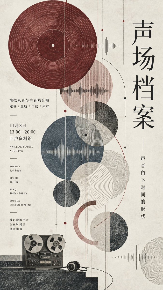
【Theme】: {e.g.: simulated sound / timber architecture / ceramic glaze color / astronomical observation} 【Main title】: {fill in the title} 【Subtitle】: {fill in a short sentence} 【Core visual element】: {e.g.: record and sound grooves / tree rings and timber structure / glaze shards and kiln temperature / star map and orbits} 【Figurative focus】: {e.g.: reel-to-reel recorder / timber pavilion / celadon cup / telescope and figure} 【Main palette】: {fill in 1 main color + 2–4 low-saturation auxiliary colors} 【Event info】: {date, venue, exhibition content, etc.} 【Aspect ratio】: 9:16 Generate a refined, restrained vertical editorial poster with the temperament of an independent publication. Fully apply the graphic composition logic of "point, line, plane," translating the visual characteristics of the 【Theme】 itself into geometric language, rather than simply adding decorative circles. Use one complete large circle or geometric color plane as the primary visual anchor, then add 4–6 circles, rings, open arcs, or partial cross-sections with clearly different sizes, forming an asymmetric visual rhythm from top to bottom. Different geometric elements may overlap, layer colors, and partially intersect, but do not arrange them evenly and do not form a mechanical grid of dots. Inside the circular planes, design different textures according to the 【Core visual element】, such as sound grooves, tree rings, glaze crackle, orbital lines, meridian grids, concentric patterns, parallel fine lines, material cross-sections, etc. The textures must be delicate, clear, and restrained; keep large areas simple, with detail concentrated locally. Add a small amount of extremely fine vertical lines, arcs, measurement lines, or structural lines to naturally connect multiple geometric elements. The lines must be complete, with a clear direction, and genuinely participate in the composition, not becoming random decoration. In the lower-central part of the image, add a small 【Figurative focus】 as a high-contrast visual landing point. The figurative element must not be too large and must not become product advertising or main photography; it should blend naturally into the geometric layout. On the right, arrange a large vertical Chinese 【Main title】, with a slender, elegant typeface and airy letter spacing. Nearby, set the 【Subtitle】 in a smaller size. On the left and in the lower-central area, arrange small, orderly real information, including 【Event info】 and a small amount of theme-related English text, data, or material notes. Form a clear relationship of "large text extremely sparse, small text extremely dense" while retaining ample white space. Do not fill the image evenly; complex areas and blank areas must form an obvious rhythm. Use the 【Main palette】 as the core color system of the entire poster; all colors keep low saturation, weight, and hierarchy. The background uses a uniform, continuous warm ivory-white paper with a very slight natural paper fiber and art-print texture. Overall, it presents the temperament of modern Japanese editorial design, exhibition posters, independent publications, and lightly retro art printing. The image must look like a truly finished design work, not a template or placeholder layout. Special note: The top main circle must be shown complete and natural, keeping a safe distance from the left and top edges, and must not be cropped by the canvas. The background must fully fill the entire image; the white space on the right should belong to the overall composition and must not form an isolated white border or an extra white vertical column.