

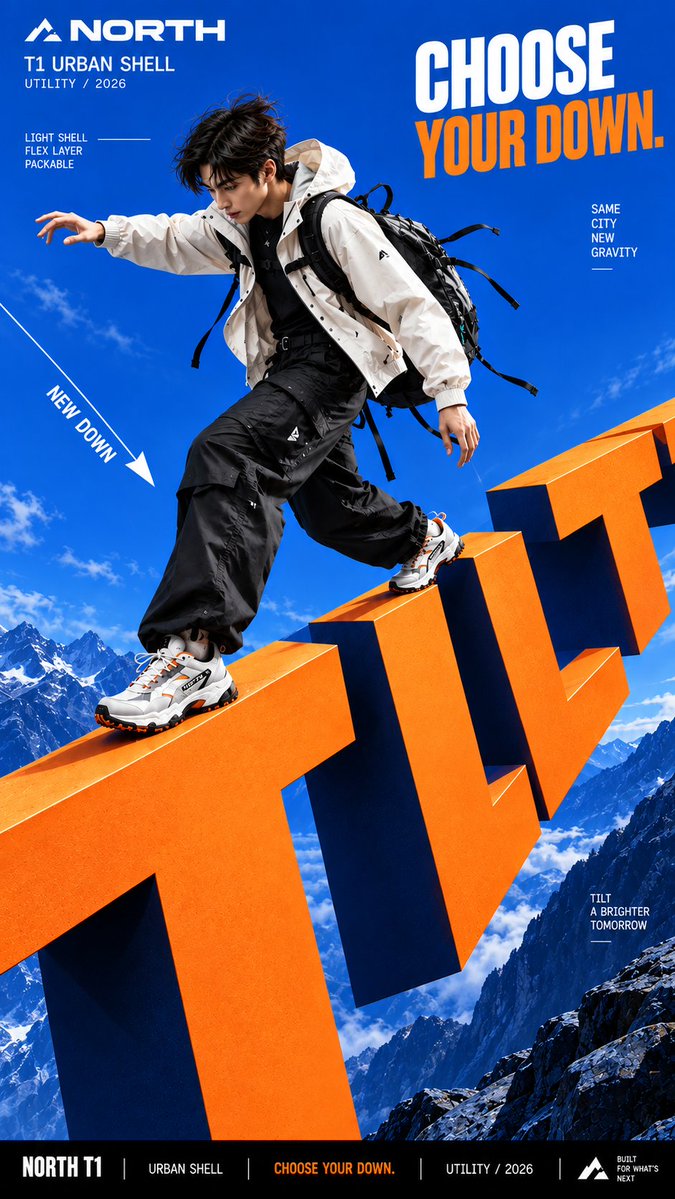
Create a bold commercial campaign poster where oversized typography controls gravity and directly affects how the subject moves. Brand: [BRAND NAME] Product / Campaign: [PRODUCT OR CAMPAIGN] Main Word: [SHORT WORD] Subject: [PERSON / PRODUCT / BOTH] Gravity Effect: [TILT / DROP / FLOAT / PULL / OTHER] Movement: [DESCRIBE THE ACTION] Main Color: [COLOR] Accent Color: [COLOR] Aspect Ratio: [9:16] Use realistic commercial photography, oversized typography, strong perspective, vivid high-contrast colors, and contemporary editorial design. Make the typography extremely large and let it create a clear gravity effect: TILT: rotate the direction of gravity while the normal poster layout stays upright. DROP: pull the subject and typography downward, with stronger vertical displacement toward the bottom. FLOAT: remove the ground and let the subject, clothing, hair, and typography naturally suspend at different depths. PULL: create an opposing force that pulls clothing, hair, straps, or products toward the typography while the subject moves against it. The body pose, hair, clothing, accessories, shadows, and products must all follow the same gravity logic so the effect feels physically believable. Create clear foreground, subject, and background layers, with parts of the typography moving in front of and behind the subject. Keep the main letters crisp, readable, and clean. Use smooth matte surfaces, even color, sharp edges, and controlled depth. Avoid distressed, chipped, dirty, concrete-like, or noisy textures. All motion paths, gravity lines, curves, and callout lines should be continuous, smooth, and clearly rendered. Keep people highly realistic with natural anatomy, believable proportions, real skin texture, controlled highlights, and detailed hair. Avoid waxy skin, oily reflections, CGI appearance, distorted limbs, and exaggerated wide-angle proportions. Use one dominant high-impact color with black, white, and one strong accent color. Add only a few meaningful campaign details such as the brand, product name, slogan, and 2–3 concise feature callouts. The final image should feel like a finished campaign key visual where typography, gravity, and human movement behave as one physical system.