

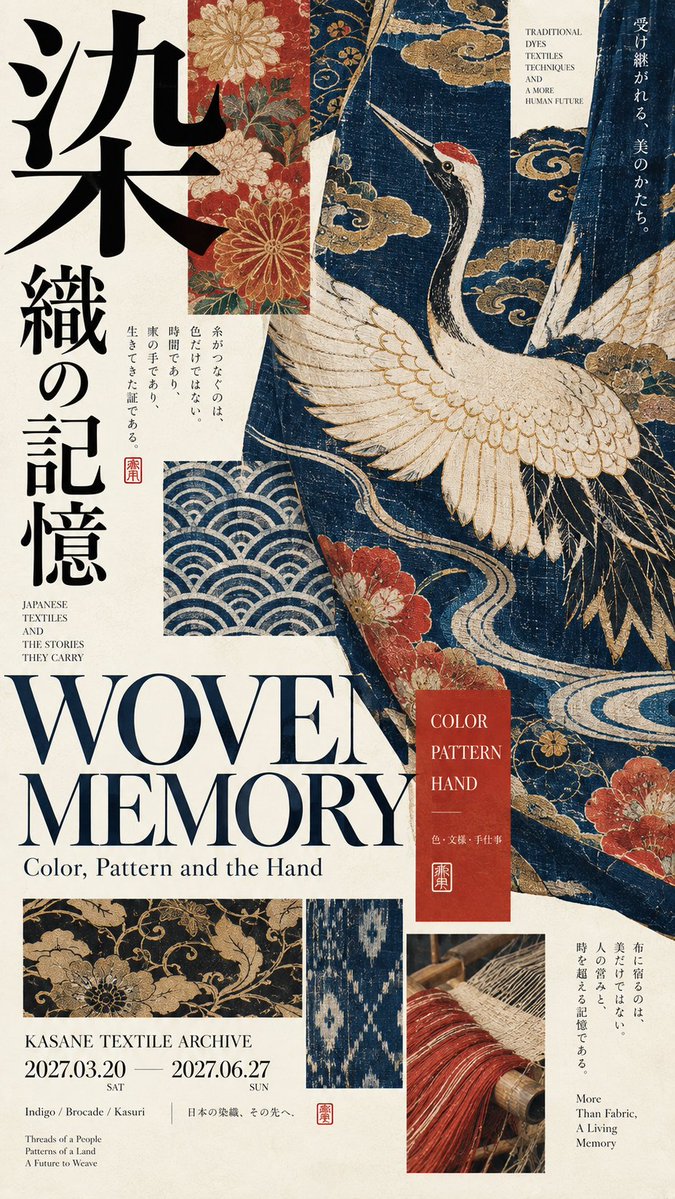
【Theme】: {fill in, e.g. traditional craft / performing arts / architectural space} 【Main title】: {fill in a Chinese or Japanese title} 【English title】: {fill in} 【Main visual】: {textile / object / figure / architectural space, etc.} 【Core material】: {brocade / metal / lacquer / wood / washi paper, etc.} 【Auxiliary archive】: {partial pattern / craft detail / mask / floor plan / material sample, etc.} 【Main color】: {fill in 1–2 traditional colors} 【Aspect ratio】: 9:16 Generate a high-end Japanese Museum Editorial style exhibition poster that combines traditional craft, figures or spatial content with modern editorial design. Use clean, gentle warm ivory art paper as the base, keeping a slight refined print texture; avoid excessive yellowing, stains, cracks or heavy aging. The main visual must be clear enough and become the first visual anchor of the image. According to the 【Theme】, choose textile, object, traditional figure or architectural space for an original design, without copying specific historical works. The subject may be partly enlarged, cropped, run diagonally across, or meet the layout edges, so that the image itself takes part in the composition. Typography must be part of the design structure. Use oversized Chinese characters, Japanese titles or high-contrast serif English, relating spatially to the main visual through vertical setting, offset, edge cropping, occlusion and interweaving. Establish a clear hierarchy: main title largest, main visual second, English title and subtitle in the middle level, date, museum name and material labels smallest. According to the 【Core material】, realistically render surface and craft characteristics, such as textile fiber, embroidery, metal oxidation, lacquer surface, timber structure, washi or clay. Material detail should be refined but restrained, without CGI, glossy plastic feel or over-commercialization. Add 2–4 small museum catalogue plates related to the theme, such as partial patterns, object structure, costume details, masks, sword guards, timber joints, architectural floor plans or material samples. Modules should vary in size, arranged directly on the paper, without rounded UI cards or modern interfaces. Adopt a clearly asymmetric layout, establishing the scale relationship of "large main visual + medium typography + small archive", and keep about 25%–35% effective white space. Do not fill the whole image evenly. Base the colors on warm ivory and ink black, adding only a few traditional colors, such as indigo, vermilion, iron gray, moss green, wood brown or old gold. Colors should be calm and complete, without neon colors, complex gradients or cheap retro filters. The whole should look like a truly mature Japanese museum exhibition poster and a fine art catalogue: from afar clear large form and typography, up close revealing material, craft and collection details. The theme may vary, but paper, type hierarchy, asymmetric layout, white space and the archival information system remain unified, forming a coherent series. Avoid: tourism-promo feel, e-commerce ads, movie posters, PPT layout, modern UI cards, neat template grids, random Japanese, meaningless English, excessive aging, dirty yellowed paper, logos, watermarks, numbering, copyright marks, starbursts and sparkles.