
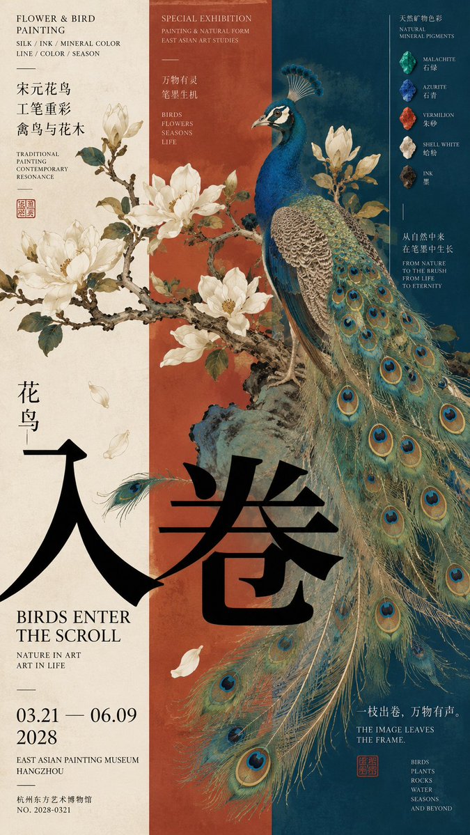
Prompt: 【Theme】: 【Chinese title】: 【English title】: 【Core subject】: 【Three-column relationship】: image crosses columns / off-center subject / phenomenon crosses columns / near-mid-far space / other 【Left column content】: 【Center column content】: 【Right column content】: 【Cross-column element】: flowering branch / subject silhouette / sound-field line / architectural line / waterway / other 【Main color】: 【Date / Venue】: 【Aspect ratio】: 9:16 Generate a high-aesthetic, high-information-density Eastern cultural exhibition poster using a "vertical three-column / left-center-right composition." The point is not to stuff three contents into three columns, but to first establish clear order with three unequal-width columns, then break the column lines through the subject, imagery, lines, space, or intangible visual elements, so the three areas re-form a single complete image. Use the following approaches flexibly according to the theme: Image crosses columns: traditional painting, flowering branches, feathers, plants, or other image subjects mainly sit in one or two columns, but parts must actively break the boundary and interweave with the other color columns and typography. Off-center subject: a large artifact, sculpture, or figure clearly presses on one side, while the other side builds visual weight through dating, material, archival text, and research diagrams. The subject may intrude into the neighboring column but should not be mechanically centered. Phenomenon crosses columns: the physical subject stays on one side, letting sound, light, smoke, water ripples, or motion trajectories become the true visual link connecting the three columns. The lines need clear origin, direction, and propagation logic, and must not become tech UI or random decoration. Near-mid-far space: let the three columns carry foreground, middle ground, and background respectively; branches, wall lines, waterways, stone paths, architectural axes, or sightlines continuously cross the columns, making the three areas look like one space rather than a collage of three photos. Column proportions should not be equal; per the theme use ratios like 24/30/46, 28/22/50, 38/34/28. Each column may have a different background color, information density, and visual weight, but the whole must be balanced. Redesign the typography according to the image content. You may use horizontal cross-column titles, medium-scale titles, local color inversion, image over text, text slightly obscured by the subject. Do not use one giant single character in every piece, and do not fix on four-character vertical layout or "two characters horizontal + two vertical." Information density references mature museum posters, art catalogs, and editorial design. You may add an English subtitle, material, dating, structure, date, venue, a curatorial short line, and a little research content. Research information should relate directly to the theme, for example: artifact surveying, pattern enlargement, material archive, acoustic propagation, near-mid-far relationship, architectural section, or spatial sightline. Keep its area restrained as a second reading layer; it must not steal the main visual and must not become an encyclopedia or PPT. Control color to 3–5 main colors. Prefer large pure color fields such as bone white, ochre red, cinnabar, deep teal-blue, ink green, bronze green. There must be a clear hierarchy among subject color, column color, and typography. Core principle: the three columns establish order, the cross-column elements break the boundaries, the subject provides visual weight, and the information completes the work's content. Overall requirement: 9:16, high definition, sharp, clean color fields, complete subject, crisp text and fine lines, rich but ordered information, with the finish of a truly mature cultural exhibition poster and art catalog. Avoid: mechanical trisection, three independent cards, a three-photo collage feel, subjects all trapped within columns, a fixed title template, PPT info boxes, tech HUD, random cross-column lines, meaningless small text, excessive aging, mottled noise, complex UI, and a low-finish AI poster look.