
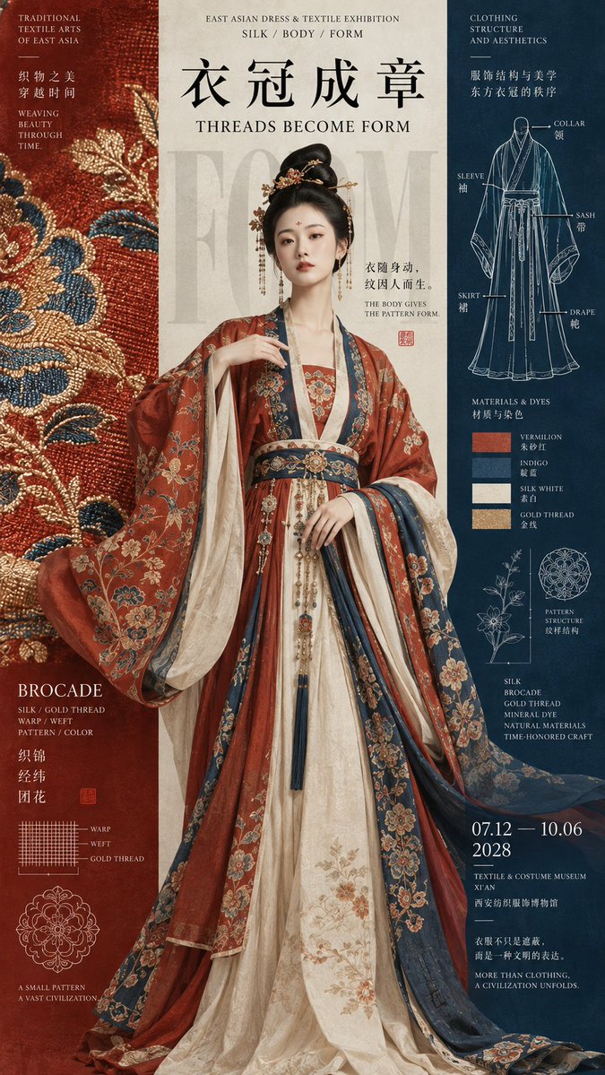
Prompt: 【Theme】: 【Chinese title】: 【English title】: 【Core subject】: 【Three-column relationship】: figure crossing columns / same subject varying across three columns / main scene in the center column / object crossing columns / other 【Left column content】: 【Center column content】: 【Right column content】: 【Main color】: 【Date / Venue】: 【Image ratio】: 9:16 Generate a high-aesthetic, high-information-density Oriental cultural exhibition poster using a "vertical three-column / left-center-right composition." The three columns should not be divided equally, nor made into three independent info boxes. Adjust widths flexibly according to the theme, giving each column a distinct visual role, then let the subject, text, lines, or materials actively cross the column lines, reconnecting the three areas into one complete image. Choose different approaches based on the content: Figure crossing columns: the figure sits mainly in the center column, with sleeves, hem, or ornaments entering the side columns; the left handles patterns and materials, the right handles structure and archival information. Same subject varying across three columns: let one continuous subject pass through all three columns, showing different materials, stages, or states in each, but the contour must stay continuous and not become three separate objects. Main scene in the center column: place the strongest visual (a mountain, building, or large image) in the center column, with the side columns carrying title, date, material, and research info, allowing part of the subject or mist to cross columns. Object crossing columns: a large object enters the other columns diagonally or horizontally, breaking the vertical grid with the subject itself, so the three columns are merely a layout order, not a physical boundary. Typography should be redesigned according to each image's structure: use oversized single characters, full horizontal titles, cross-column titles, medium-scale titles, or a small information spine. Do not fix on four-character vertical text, and do not repeat the "two characters horizontal + two vertical" template. Information density should approach mature museum posters, art catalogs, and Editorial Design: add English subtitles, materials, structure, date, venue, short curatorial phrases, and a few research images, but concentrate them in 2–3 areas rather than spreading evenly across the whole image. You may add small structural line drawings, material studies, production processes, cross-sections, or pattern studies, but keep the area restrained, only as a second layer of reading. Use 3–5 main colors, forming clear column relationships with large pure color fields. Combinations of black, bone white, vermilion, cobalt blue, deep teal, and ochre are allowed, but avoid dirty grays, heavy aging, and complex gradients. Overall requirements: high definition, clear, clean, rich in information but orderly, accurate subject proportions, sharp text and fine lines, with the finish of a mature cultural exhibition poster. Avoid: mechanical three-way equal division, three independent cards, PPT info boxes, fixed title templates, an overly small subject, fully split columns, random small text, meaningless decorative lines, excessive aging, mottled noise, and a low-quality AI poster feel.