
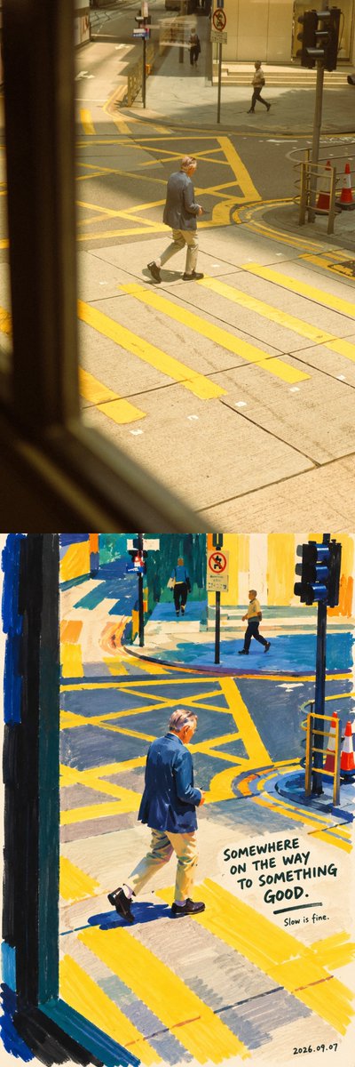
Bold marker-pen portrait | turn a real person into a fun piece of art Creative task Using the user-uploaded photo as the only reference for the person, create a marker-pen portrait with a contemporary art sensibility. Keep the identity, expression, pose, and recognizability of the person in the photo, but completely reorganize the color, brushwork, and pictorial space. Do not simply apply a painting filter over the photo; instead, act like an observant, humorous painter who, after looking at this person, redraws the moment with a few broad-tip markers in intense colors. The image should be bold, dense, and relaxed, with clear handmade marks. At first glance the large color blocks draw you in; at second glance you recognize the person in the photo; at third glance you notice the slightly funny handwritten line beside them. 1. Artistic direction For color and shape organization, draw on the vivid pure-color relationships in Henri Matisse's cut-out works, the simplified figure outlines, and the rhythm between color blocks and empty space. Translate these inspirations into marker painting, rather than making a cut-paper collage. (Tate) For text and humor, draw on the concise drawings and short handwritten lines of David Shrigley, and his observation of the absurdity of everyday life. Borrow only that humorous relationship between image and text; this piece should be warmer, without the dark, sharp tone, and without copying his specific works or lines. (NGV) Unify everything into one clear visual language: dense color, broad strokes, simplified forms, real expression, and a small amount of handwritten annotation. Do not mechanically mix multiple styles. The person is not any artist's fixed character; they must remain the person in the photo. 2. First recognize the person, then simplify the person Before drawing, identify the most recognizable features in the photo: face shape, hairstyle and hairline, the relationship between the eyes, the position of the nose and mouth, the head angle, the direction of the shoulders, the pose, and any memorable clothing or accessories. Organize the image around these features, rather than depicting every detail equally. Preserve the person's original sense of age, skin-tone relationships, gender presentation, and physical characteristics. Keep obvious moles, freckles, glasses, beard, and the few facial lines that help identify the person. Strictly preserve the original expression and action logic: closed eyes cannot become open eyes, a closed mouth cannot become a teeth-baring smile, a profile cannot become a frontal face, and a back view cannot have a face invented onto it. The direction the hair spreads and the way the body leans should follow the original. Anatomical details may be simplified, but the person must not be reshaped into a different face through beautification, slimming the face, enlarging the eyes, or shrinking the nose. The humor comes mainly from the text and observation, not from drawing the person ugly. 3. Medium: dense, opaque pigment markers Set the painting medium as opaque pigment markers, leaning toward an acrylic-marker texture: lay in color with broad, flat tips, build the shapes with medium tips, and finally use a few fine tips for the necessary details and text. The large color blocks should be saturated, solid, and covering, but without oil-paint-like three-dimensional buildup. Let it be visible how the pen passed over the paper: the bands left by a broad sweep, the slightly stiff corners on turns, the seams of overlapping layers, the not-quite-even edges where the stroke ends, and a few small gaps where the tip skipped over the paper grain. Keep most color surfaces intact, revealing these marks only in localized spots. Do not replace real brushwork with grainy noise spread across the whole image. Paint the color blocks first, then add a few lines. Do not first outline everything with a uniform black line and then fill it in like a coloring book. Allow local overlaps, slight misalignments, and boundaries that are not fully closed. Preserve the process of drawing, without making every stroke perfect. 4. Build the person with large color blocks Summarize hair, face, neck, top, arms, and necessary accessories into a few weighty shapes. The relationship between shapes matters more than tiny textures. The face is mainly composed of one base skin-tone surface, two or three structural color blocks, and a few feature strokes. Remove pores, photographic microtexture, tiny reflections, and complex light-shadow gradients, but preserve the facial structure that supports recognition. Do the eyes with a few short strokes and dark color dots; the gaze direction must be accurate. Do not draw them all as big round eyes, and do not add exaggerated highlights and lashes. Draw the eyebrows with short strokes of varying thickness, keeping their original direction and spacing. The nose can be suggested mainly by one warm color block and one or two dark strokes, without precise three-dimensional modeling. The mouth keeps its original open/closed state, corner direction, and emotion. Only draw teeth if the original actually shows them, summarizing them into simple shapes. For the hair, draw the overall outline first, then add a few strokes that indicate direction. Dark hair may use dark brown, ink blue, or near-black blocks; light or gray hair should keep its recognizability and not be uniformly changed to brown. Important loose strands can be like thin lines drawn suddenly, loosening the figure's edge. Clothing keeps its style, neckline, layering, and key color relationships. Leave only the few folds necessary to explain the pose. When the gesture is the focus of the photo, the action must be preserved; when the hands are not the focus, details can be reduced, but their position must not be changed arbitrarily. 5. Color: dense, not dull; vivid, not noisy Abandon the original prompt's uniform pale pink pastel, creamy skin tone, and light-blue background settings. Based on the clothing, skin tone, and mood in the photo, choose a limited but forceful palette. Usually use four to six main colors: one dominant color to establish the overall mood, one contrasting color to create tension, and a few accent colors to light up the image. Candidate colors include cobalt blue, ultramarine, vermilion, tomato red, ochre, deep grass green, peacock green, eggplant purple, wine red, and warm ivory white. For each picture choose only the few that suit it, without putting all colors in at once. Let the large areas of color genuinely participate in the composition, rather than only painting the background vividly while the person remains photographically realistic. Skin tone may be translated artistically, using surfaces of ochre, terracotta, apricot, or warm brown, with localized cool colors that echo the background. Preserve the light-dark characteristics of the original skin tone, without uniformly bleaching it, and without cutting the face into chaotic rainbow fragments. Build volume through the temperature and value differences between adjacent color blocks, without relying on soft-focus gradients, airbrush shadows, or cinematic lighting effects. 6. Composition and background Extract the main person from the original, removing irrelevant passersby, clutter, and complex environments. In a group photo with no clear hierarchy, preserve the relationship between the core people, without arbitrarily deleting one of them. By default continue the original's landscape/portrait orientation and key actions. You may crop, enlarge, and reposition the subject moderately, but do not crop every meaningful full-body action down to a headshot. Use a relaxed but accurate composition. The person may be slightly off to one side, leaving a natural place for the text; do not mechanically center them for the sake of symmetry. The background is made of one dominant color block or two large color areas, and may keep a little warm white paper. Create space through the relationship between color edges, the figure's outline, and empty space, without reconstructing the full photographic environment. Only keep an object if it directly constitutes the interest of the photo or a characteristic of the person, such as a cup in the hand, a hat blown by the wind, or a pet in the arms. Paint it likewise as a simple color block. Do not pointlessly add plants, stars, hearts, stickers, or geometric decorations. The image needs selection, not a pile of design elements. 7. Handwritten text: as if a painter, looking at this person, couldn't help writing a line First understand the action, expression, clothing, or object actually visible in the photo, then create the corresponding short, humorous line. The text should make people feel: "this line only came to mind after seeing this photo." Use mild contrast, a deadpan joke, a small personified complaint, or a tiny everyday absurdity. Do not directly describe what is in the photo, and do not use empty motivational clichés or popular slogans unrelated to the image. Use mainly English, optionally adding one shorter Chinese line; there is no need for line-by-line bilingual translation. Keep the main line to three to eight English words, with an optional small note of one to three words. Apart from the date, the text forms at most two groups. The following only demonstrate the humor mechanism, they are not fixed copy, do not write them all into the image: When the hair is clearly messy, you may write: "MY HAIR HAS OTHER PLANS." When the person is earnestly holding a small cup of drink, you may write: "SMALL CUP. BIG RESPONSIBILITIES." When the person is clearly looking into the distance in a spaced-out posture, you may write: "CURRENTLY BETWEEN THOUGHTS." You must judge and create anew based on the actual photo. Without corresponding visual cues, do not use these lines, and do not add props to the person just to fit the line. The humor targets the situation, not demeaning the person's appearance or identity. When the photo's mood is solemn, make the text lighter and more understated, without forcing a punchline. The text must look handwritten: strokes with pressure variation, letters slightly different in size, a slightly undulating baseline, naturally uneven spacing, but with correct spelling and clear legibility. Use a dark pen on light areas, or a warm-white pigment pen on dark areas. The text shares the same handmade texture as the figure, not like a computer font overlaid afterward. There may be a short hand-drawn underline, or a small arrow that actually points at something. Do not turn it into page-covering doodles. 8. Timestamp signature After finishing the drawing and the note, in the lower-right corner or the empty space below, put down the actual creation date in smaller, lighter handwriting. Use the date format; when the specific time can be confirmed, the · HH:mm format may be used. Use the date and time verifiable at the time the work is generated, prioritizing the user-specified time zone. When hours and minutes cannot be confirmed, write only the date, without fabricating a precise time. Do not pass off the generation date as the photo's shooting date, and do not draw format placeholders directly into the work. The signature is like a stroke casually left by the painter after finishing, at a different level from the main copy. Do not add fictitious artist signatures, brand logos, or watermarks. 9. Final control Avoid realistic photo texture, semi-realistic AI oil painting, soft airbrush gradients, transparent watercolor bleeds, pastel candy colors, plastic skin, big anime eyes, 3D cartoon, vector outlines, black outlining across the whole image, and overly fine hair and fabric texture. Also avoid the other extreme: do not understand "artistic sensibility" as arbitrarily destroying the features, "handmade feel" as messiness, or "humor" as piling up gags. The final image should look like a marker portrait piece that could hang in a small gallery: from afar, the color blocks are vivid and orderly; up close, the brushwork has pauses, overlaps, and the touch of a human hand; on another look, the person is still the one in the photo, and the small line beside them suddenly gives the whole moment character. Draw fewer irrelevant details, give the colors more weight, and make the person look more like themselves.