
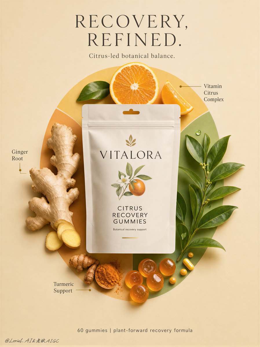
Create a Cannes-level flagship wellness-product advertising poster for an original premium recovery supplement brand named VITALORA, featuring its hero product Citrus Recovery Gummies. Build the image with stronger Orbit logic and a more internationally refined luxury-wellness launch aesthetic, while preserving the exact compositional skeleton: a soft warm-beige vertical poster, one centered matte pouch as the absolute hero, a large circular ingredient field behind it, carefully arranged natural ingredients around the pack, minimal editorial callouts, and a restrained footer line below. Core composition: Use a strict centered composition in a tall vertical format. The background is a smooth mineral-beige field with calm premium stillness and no visual clutter. At the exact center, place one hyper-realistic matte stand-up pouch for VITALORA Citrus Recovery Gummies, front-facing, upright, and visually dominant. Behind the pouch, create one large elegant circular ingredient-disc built from overlapping citrus-yellow, muted tangerine, and botanical-green shapes. The circle should feel cleaner, broader, and more architectural than decorative, functioning as a controlled halo that organizes the ingredient story and reinforces the central hero product. Hero product logic: The pouch is the absolute visual anchor and must feel fully realistic, premium, contemporary, and launch-ready: - matte soft-touch flexible pouch surface - subtle zipper and hang-slot detail - refined logo hierarchy - clean product naming - minimal restrained benefit system Front-of-pack should read: VITALORA CITRUS RECOVERY GUMMIES Optional supporting line: “Botanical recovery support” Keep the pack quiet, polished, and internationally premium, with no noisy claims. Orbit structure: Arrange the supporting ingredients to create a calm circular visual loop around the pouch: top citrus accents -> right leaf mass -> lower gummies and capsules -> left ginger structure -> back upward through the circular disc into the pouch. Use ingredient scale, spacing, and directional placement to reinforce this orbit. The eye should move fluidly around the composition but always resolve back to the pouch. The orbit must feel curated, intelligent, and premium, not playful or cluttered. Ingredient field: Keep the same ingredient-map logic, but edit it for flagship clarity: - one or two sculptural ginger roots with tactile skin detail - one or two halved oranges with crisp juicy pulp - one controlled botanical leaf cluster - a restrained turmeric element, either root or powder accent - a small elegant grouping of translucent amber gummies - a few tiny yellow-orange support capsules or nutrient dots Reduce scatter and keep the composition highly intentional. Every ingredient must feel selected, balanced, and secondary to the packaging. Camera and spatial grammar: Use a clean front-facing editorial still-life composition with slight top-view influence but mostly graphic poster discipline. Keep depth shallow and controlled, with soft object shadows and subtle separation from background. The image should feel like a luxury wellness campaign, not a retail product sheet. Lighting structure: Use soft premium studio lighting: - broad top-front key light creating beautiful pouch volume and ingredient readability - delicate lateral fill to preserve ginger ridges, orange pulp texture, and leaf detail - subtle shadow halos beneath the pouch and ingredients for calm elevation - restrained glossy highlights on orange flesh, gummies, and capsule surfaces The lighting should feel healthy, clean, and internationally sophisticated. Material language: Soft-touch matte pouch film, juicy citrus flesh, fibrous ginger skin, powdery turmeric texture, translucent recovery gummies, waxy green leaf surfaces, smooth capsule coatings, and refined poster-paper background. All materials must feel physically specific, premium, and nutritionally credible. Typography system: At the top center, place a concise premium English headline in elegant uppercase typography: “RECOVERY, REFINED.” Below it, add one short supporting line: “Citrus-led botanical balance.” Around the ingredient field, keep only two or three very minimal editorial callouts: “Ginger Root” “Vitamin Citrus Complex” “Turmeric Support” Typography must feel airy, scientific-luxury, and highly restrained, integrated into the negative space without competing with the hero pack. Branding and footer: Keep VITALORA branding primarily on the pouch. At the bottom center, place one understated footer line: “60 gummies | plant-forward recovery formula” Keep it minimal, balanced, and globally polished. Color hierarchy: Mineral beige, warm cream, citrus yellow, muted orange, turmeric gold, botanical green, matte white packaging, and restrained charcoal typography. The palette should feel fresh, elevated, quiet, and globally premium. Emotional tone: Restorative, composed, intelligent, premium, botanical, modern, product-first, internationally branded. Rendering medium and quality anchors: Ultra-realistic premium product photography fused with luxury wellness branding, clean editorial still-life design, high-end supplement campaign finish, tactile natural ingredient realism, exact pouch geometry, pristine hierarchy, world-class image quality, award-level launch key visual. Structured negative prompt: cheap supplement ad, cluttered ingredient scatter, unreadable packaging, noisy health claims, fake medical layout, plastic-looking oranges, low-detail ginger, muddy turmeric texture, weak pouch realism, warped stand-up pouch, corrupted text, too many callouts, oversaturated wellness palette, flat lighting, messy radial composition, ecommerce sheet look, low-end flyer design, style drift, broken perspective, low-resolution render