
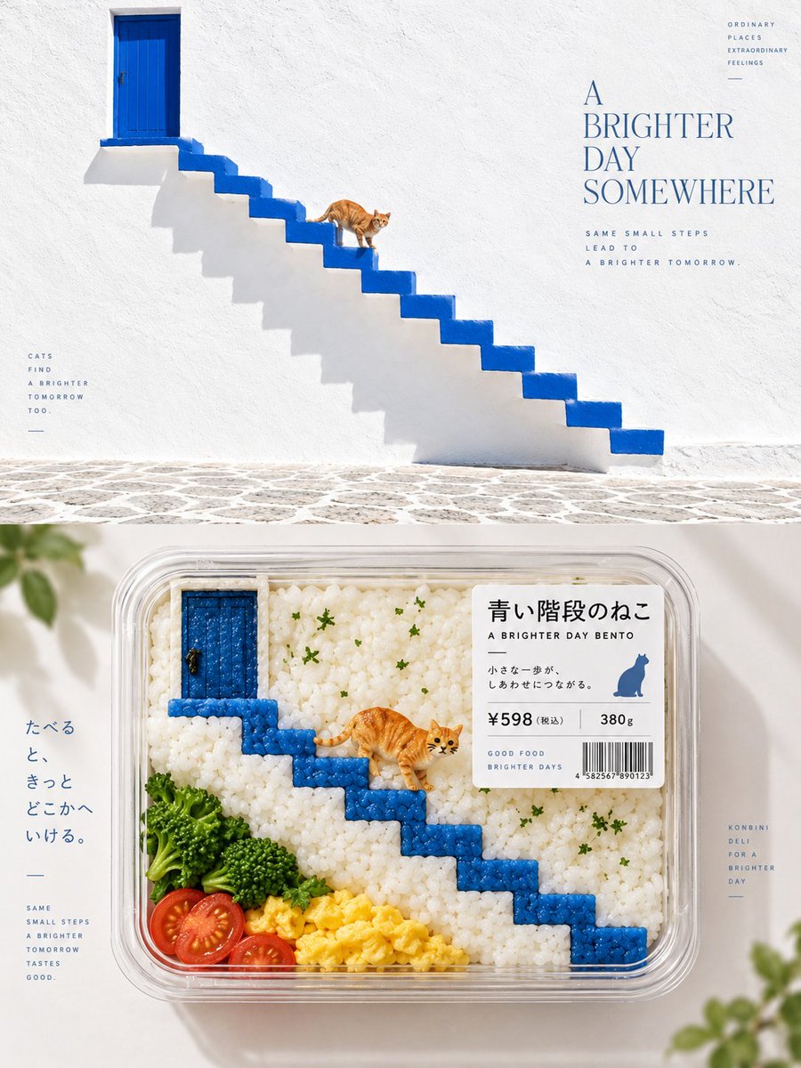
Turn each photo I upload into a separate high-end design poster, no multi-image collage; each photo is output individually. Use an overall 3:4 vertical composition, with the top and bottom areas at a strict 1:1 height ratio, each occupying 50% of the frame. The top half keeps the original photo, preserving the subject's identity, structure, pose, real texture, natural light and shadow, and the original color atmosphere, with only a slight high-end color grade to give it the quality of an art magazine, independent publication, and exhibition image. To fit the frame, the environmental background may be naturally extended, but the subject must not be stretched, distorted, or altered. The bottom half extracts the most recognizable subject, contour, structure, pose, and narrative relationships from the photo and reconstructs them into a Bento-fication convenience-store deli packaging visual. Do not copy object by object; understand the core visual relationships of the original scene and perform semantic mapping and material substitution of people, buildings, plants, sky, water surfaces, objects, or other elements using rice, vegetables, egg, fruit, nori, cheese, sauces, jelly, fish roe, herbs, etc., reorganizing them so that at first glance one still recognizes the soul of the original scene, and only at second glance discovers that everything is actually food. All visual information is ultimately contained within a clear transparent convenience-store deli box, bento tray, or compartmentalized food container. Preserve the most important compositional hierarchy of the original image, but allow re-direction: remove irrelevant background and, through cropping, proportion changes, position rearrangement, ingredient modularization, and container partitioning, turn the originally complex or ordinary scene into a product visual that holds together. Do not stuff it with ingredients just to reproduce everything; keep only the elements that truly define its identity. The bottom half uses overhead product photography / top-view packaged-food photography as the main perspective, emphasizing the real transparent-box material, ingredient granularity, cut surfaces, moisture, freshness, and natural light, so it looks like a real product that could sit on the shelf of a premium convenience store. Keep the subject packaging clear, with ample white space around it, and the whole composition clean, refined, and breathing, without a crowded food platter. The color scheme extracts the most recognizable, most vivid colors from the top photo and converts them into natural ingredient colors. Colors should be bright, fresh, appetizing, and full of life; for example, green can become vegetables and herbs, yellow becomes egg, corn, or fruit, warm red becomes tomato, fish roe, or sauce, and cool colors can be expressed through jelly, packaging, tray liner paper, or other reasonable ingredient relationships. Avoid dark, greasy, dirty tones and a cheap food-ad look. The packaging adds a small product-label system, freely generating, based on the original image's theme, a product name, short phrase, price, weight, barcode, shelf-life info, or micro descriptions, with no language restriction and no fixed fields. The labels should look like real Japanese convenience-store or premium food packaging, with clear hierarchy and restrained sizing, blending naturally with the transparent box and ingredient composition. The whole presents the visual language of Japanese konbini deli packaging aesthetic / packaged-food reinterpretation / semantic food substitution / containerized composition / retail product visualization. The core principle is: not to paint the photo as food, but to preserve the visual soul of the original scene and re-direct it once using ingredients, containers, and product packaging.