
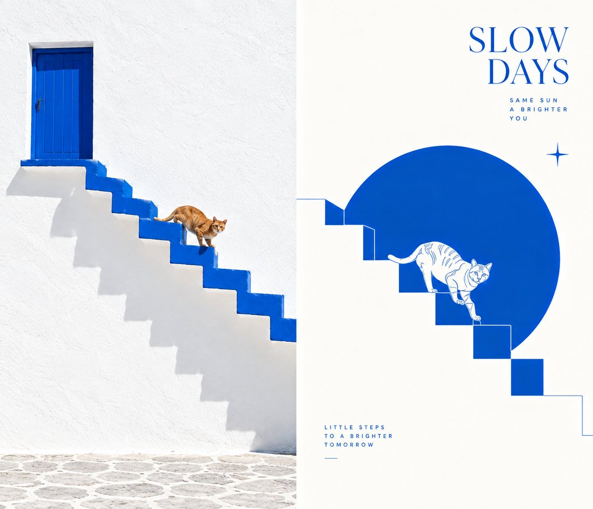
Turn each photo I upload into a separate, high-end design poster — no multi-image collages, each photo output individually. Use an overall 3:4 vertical composition, with the top and bottom areas strictly 1:1 in height, each occupying 50% of the frame. The top half keeps the original photo, preserving the subject's identity, structure, pose, real texture, natural light and shadow, and original color atmosphere, applying only slight high-end color grading to give it the quality of an art magazine and exhibition image. To fit the aspect ratio, the environmental background may be naturally extended, but the subject must not be stretched, distorted, or altered. The bottom half extracts only the most recognizable subject, outline, structure, pose, and narrative relationship from the photo, reconstructing them into a minimalist flat composition of botanical line-art illustration + geometric color-block construction + positive/negative forms and reversal treatment. Do not copy the whole photo or keep irrelevant backgrounds and details; actively reduce, keeping only the core visual information that best represents the object, so its correspondence to the photo above is recognizable at a glance. The bottom half uses a detailed yet restrained line-drawing vector illustration language, drawing on botanical line art: fine, clear outlines, structural lines, and a few internal lines summarize the subject without relying on realistic light-shadow modeling. Whether the subject is a person, building, animal, plant, object, or landscape, convert it into this clean, refined, graphic line expression. The image is based mainly on monochrome or very few-color vector relationships and introduces one clear geometric color-block visual anchor, such as a vertical rectangle, a horizontal color band, a circle, or another restrained regular shape. The subject can overlay the block, building layers through positive/negative form conversion, reversal, and outline revelation: when entering the block area, the subject can stand via reversal or negative space; when leaving it, it holds mainly via lines or a monochrome outline, letting positive and negative forms switch naturally within the frame. The composition emphasizes frame-breaking, overlap, and abundant white space. The subject need not be fully contained within the geometric block but should be allowed to partly cross the boundary, creating breakout, overlap, and breathing room. The background has large white areas, and the white space itself is part of the image, forming together with the subject, color blocks, and lines a sense of space, rhythm, and high-end layout order. Even if the original photo has poor composition, a messy background, or a small subject, re-direct it into a coherent work through reduction, reorganization, cropping, scale changes, and white space. The palette extracts 1–3 of the most recognizable and characterful colors from the photo above, compressing and organizing them, keeping the whole fresh, restrained, and modern, possibly leaning toward a monochrome system or a few auxiliary colors. The background is mainly white, off-white, or very light; if necessary, a very small number of decorative symbolic elements may be added, such as small star sparkles, tiny geometric marks, or dot-like visual symbols, to balance the white space and add lightness, but not to steal the show. Text appears only as a minimal editorial intervention, with no language restriction. Based on the subject, place, action, emotion, or metaphor, freely generate a few words or short phrases, quietly placed in the white-space area, forming a refined text-image relationship with the graphics. The overall result presents a high-end visual effect composed of line drawing, reversal, frame-breaking, geometric color blocks, and abundant artistic white space. Avoid realistic illustration, complex backgrounds, detail pile-up, heavy shadows, gradients, cartoon feel, 3D feel, and templated layout. Switch to side-by-side logic, ratio 7:6.