
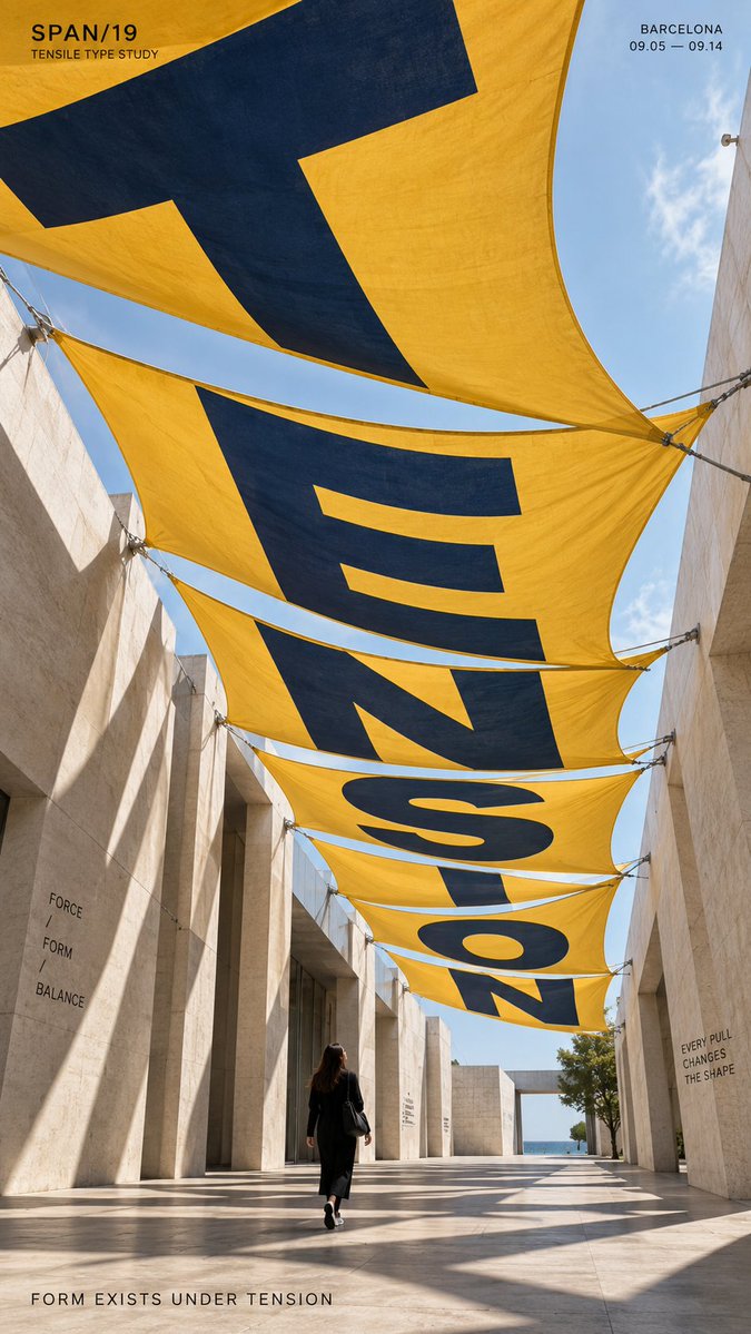
TITLE: [TENSION / DRIFT / FOCUS / REFRACT / your own word] PROJECT: [brand / exhibition / campaign name] ENVIRONMENT: [fabric canopy / terrain / mirror installation / water / other] TYPE MECHANISM: [surface distortion / terrain warp / reflection / refraction] SUBJECT: [small human figure / none] MAIN COLOR: [accent color] FORMAT: 9:16 vertical poster Create a contemporary perspective typography poster where oversized type is physically transformed by the material or environment around it. The main word should occupy roughly 35–55% of the composition and become part of the scene itself. Let the letterforms stretch, bend, split, compress or realign according to the chosen surface or optical medium. For fabric, let the type follow tension, curvature and suspended folds. For terrain, let it wrap across slopes, ridges and valleys. For mirrors, distort the source typography so the reflection resolves into a readable word. For water, use depth and refraction to shift and reconnect the letterforms. Keep the spatial logic physically believable, with correct perspective, occlusion, reflections, refraction and surface contact. Use one strong accent color against a restrained architectural or natural palette. Keep the typography bold, clean and highly legible from the intended viewpoint. If a person is included, keep them small and use them mainly as a scale reference or observer within the typographic space. Add only a small amount of secondary editorial information such as project name, date, location and one short thematic line. Overall style: perspective typography, spatial graphic design, contemporary installation art, editorial poster, strong depth, clean hierarchy and high visual impact.