
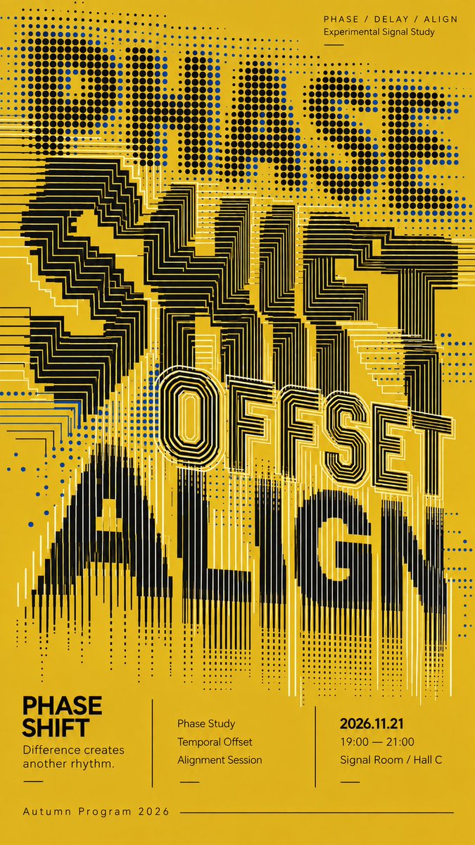
TITLE: [poster title] CONCEPT WORDS: [3–4 related words] BACKGROUND COLOR: [color] PRIMARY COLOR: [color] ACCENT COLOR: [color] GRAPHIC SYSTEMS: [dots / wave lines / concentric arcs / offset contours / radiating lines] EVENT TYPE: [sound art / exhibition / live performance / cultural program] EVENT INFO: [date / time / venue] FORMAT: 9:16 vertical poster Create a high-end experimental typography poster where oversized English words become the main visual system. Use 3–4 layered words with clear conceptual relationships. Do not simply place normal bold text and apply textures inside it. Rebuild the letterforms directly from precise geometric systems such as dot matrices, parallel wave lines, concentric or eccentric arcs, stepped contours, offset registrations, radiating segments, and frequency-like line bundles. Give different text layers different graphic behaviors, then connect them through controlled transitions: dots may stretch into lines, arcs may open into waves, waves may shift or drift, and line systems may gradually realign. The poster should feel like one evolving typographic field rather than several separate effects. Use overlap, compression, partial cropping, displacement, and negative space to create dense multi-layer typography. Maintain strong density contrast: some areas highly compressed and bright, some medium-density, and some deliberately open. Keep all dots and lines exceptionally clean, sharp, continuous, and intentional. Smooth curves, consistent spacing, clear endpoints, stable dot shapes, no accidental broken lines, fuzzy edges, random noise, messy moiré, glitch artifacts, or low-quality AI textures. Use a restrained, high-contrast color palette with one dominant background, one main typography color, and only small accent areas. Reserve the lower 25%–30% for a refined editorial information section with the poster title, one short concept sentence, 2–3 program items, date, time, venue, and program name. Use clean modern sans-serif typography, multiple hierarchy levels, thin divider lines, and an asymmetric cultural-poster grid. The final image should work at three distances: a strong abstract composition at thumbnail size, readable layered typography at medium distance, and rich geometric detail up close.