
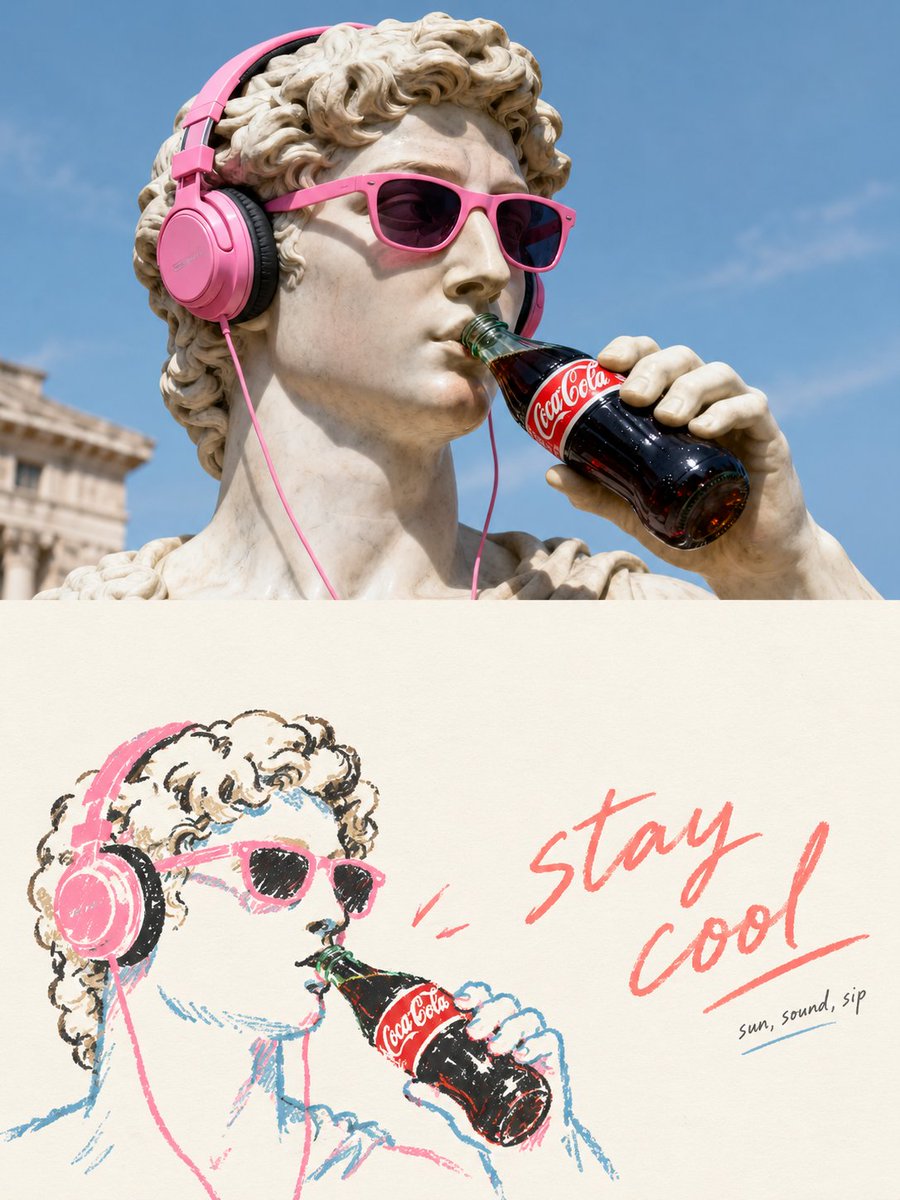
Turn each photo I upload into a separate, high-end design poster—no multi-image collage, each photo output individually. Use an overall 3:4 vertical composition, with the top and bottom areas at strictly 1:1 height, each occupying 50% of the frame. The top half retains the original photo, preserving the subject's identity, structure, pose, real texture, natural light and shadow, and original color atmosphere, applying only slight high-end color grading to give it the quality of an art magazine and exhibition image. To fit the frame, the environmental background may be naturally extended, but the subject must not be stretched, distorted, or altered. The bottom half makes a fresh artistic judgment, **extracting only the most recognizable subject, contour, structure, pose, and narrative relationships from the photo**, and reconstructing them as Hand-drawn Doodle Lifestyle Illustration / Naïve Illustration / Marker Drawing. Do not keep all objects, do not copy the original scene; actively remove the vast majority of the background and irrelevant information, and re-direct the composition through reduction, rearrangement, cropping, and scale change, so that even an ordinary composition becomes a work that stands on its own. Forms are simplified, symbolic, relaxed, and characterful, using slightly shaky, intermittent, not fully regular hand-drawn lines, as well as natural coloring like marker, crayon, and oil pastel. Allow slight overshoots, exposed white, and handmade errors; do not pursue realistic proportions, complete perspective, or fine rendering. The bottom half must have **a huge amount of deliberate white space** at its core, with solid shapes occupying only a small proportion and the rest of the space actively left empty. The subject may be off-center, edge-hugging, suspended, or partially cropped, with position determined by the direction of the pose and the visual center of gravity. White space and subject together form positive-negative shapes, distance, pause, and breathing room; rather draw less than fill the frame. **The graphics and text must be re-laid out as one whole, not "a phrase on top, a figure below."** First establish an invisible grid, visual axes, and reading path, then decide text position; the text may sit close to the subject's contour, follow the direction of movement, align with the head or shoulder line, fall into large negative space, or form offset, interweaving, and asymmetrical resonance with the graphics. Avoid mechanical centering, vertical stacking, and fixed templates; let the graphics carry emotion and the text carry rhythm, both completing the composition together. The text is not limited to any language, keeping only a very small amount of truly meaningful words or short phrases. Use a **light, natural handwritten font with slight variations in character width and pen pressure**, retaining a bit of a casual handwritten feel, but with letter spacing, line spacing, and overall placement controlled by editorial design. A slightly more prominent short phrase may be paired with tiny auxiliary text to form hierarchy, but no menu-style titles, long copy, or full-page text. The color scheme uses a soft, bright, healing limited palette, extracting the most vital colors from the original image and re-mixing them, forming cream yellow, peach pink, coral red, sky blue, lake teal, tender green, lavender purple, and other fresh colors; vivid but not glaring, soft but not muddy, with warm white or very light neutral tones as large areas of breathing space. The whole pursues **naïve drawing, mature composition, smart image-text relationships, and a huge amount of white space**, like a high-end independent magazine, lifestyle editorial illustration, or art publication, not a children's scrapbook. Avoid the fixed structure of centered subject + centered copy, random small icons scattered all around, complex backgrounds, information pileup, a filled frame, cheap cartoon feel, and template-style layout.