
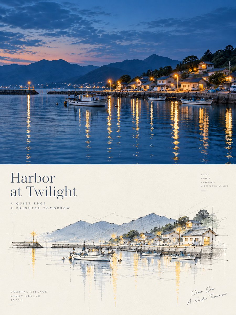
Turn each photo I upload into a separate high-end design poster—no multi-image collage; output each photo individually. Use an overall 3:4 vertical composition, with the top and bottom areas strictly 1:1 in height, each occupying 50% of the frame. The top half keeps the original photo, preserving the subject's identity, structure, pose, real texture, natural light and shadow, and original color atmosphere, applying only a slight high-end color grade to give it the quality of an art magazine and exhibition image. To fit the format, the environmental background may be naturally extended, but the subject must not be stretched, distorted, or altered. The bottom half extracts only the most recognizable subject, outline, structure, pose, and narrative relationships from the photo, reconstructing them into an architectural concept perspective sketch / architectural scheme hand-drawing. Do not preserve the entire scene, do not copy the photo object by object; actively remove most of the background, staffage, and irrelevant details, leaving only the core forms, spatial relationships, and visual memory points that best represent the original theme. The bottom half makes a fresh artistic judgment. Even if the original has poor composition, a messy background, or a small subject, rescue it into a valid work through reduction, reorganization, cropping, scale change, and white space, truly giving the model the power to re-direct the image. The style uses free freehand perspective line work + a few selective color blocks. The lines are loose, restrained, with a slight sense of repetition and pause; a few auxiliary lines, extension lines, construction lines, and geometric reference lines of architectural hand-drawing may be kept, forming a clear sense of design deliberation. Color is lightly applied only at a few key spots, to emphasize the subject, structural layers, local shadows, or spatial focal points; the rest is left as unpainted as possible. The image must have a large amount of conscious white space as its core. The subject should be smaller and more refined, with the rest of the space left largely empty. White space is not an empty background but part of the composition, forming a sense of breathing, space, and rhythm together with the subject, line work, reference lines, shadows, and few color blocks. The subject may be off-center, edge-hugging, partially cropped, or reduced in scale; better to draw less than to fill it up. A few geometric shadow color blocks may be added to strengthen volume, depth, and spatial layers, but avoid heavy rendering, complex environments, and a realistic rendering feel. Keep the background extremely minimal, retaining only a tiny necessary hint of the site. The palette extracts 2–4 of the most recognizable and vivid colors from the photo above, reorganized into a cleaner, more restrained, and easy-on-the-eye sketch color system. The whole may be moderately brightened, purified, and de-grayed, dominated by cream white, light gray, warm gray, soft green, light wood tone, light blue-gray, etc., locally keeping a few more vivid but not glaring accent colors. Avoid dirty gray, dinginess, excessive retro, and a cheap high-saturation feel. Text appears only as a minimal editorial intervention, with no language restriction. A few words, short phrases, or notes may be generated based on the subject, location, action, or emotion, quietly placed in the white space area, forming a restrained image-text relationship. The whole presents a high-end visual effect composed of architectural concept hand-drawing, free line work, geometric reference lines, a few color blocks, geometric shadows, an enormous amount of white space, and editorial layout. Avoid full-scene preservation, object-by-object copying, complex backgrounds, full-frame coloring, realistic rendering, thick outlines, a cartoon feel, a 3D feel, and templated representation.