
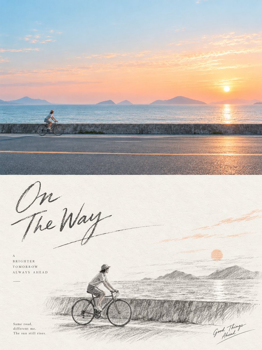
Turn each photo I upload into a standalone high-end design poster, with no multi-image collage; each photo is output separately. Use an overall 3:4 vertical composition, with the top and bottom areas strictly 1:1 in height, each taking up 50% of the frame. The top half keeps the original photo, preserving the subject's identity, structure, pose, real texture, natural light and shadow, and original color mood, applying only a slight high-end color grade to give it the feel of an art magazine, independent publication, and exhibition image. To fit the aspect ratio, the environmental background may be naturally extended, but the subject must not be stretched, distorted, or altered. The bottom half undergoes a fresh, independent artistic judgment and image direction. Do not copy the original photo's composition, and do not transcribe object by object; first understand the theme truly worth keeping, the structural flow, the subject relationships, and the visual memory points of the original, then recompose through deletion, rearrangement, cropping, scale change, position adjustment, and white space. Even if the original subject is small, the background cluttered, or the composition ordinary, actively correct it so the bottom half is itself a complete, coherent work with aesthetic judgment. Rebuild the retained key subjects, partial structures, or related objects into a hand-drawn pencil-sketch-style thematic combination illustration. Use graphite pencil outlines, natural hatching, a little cross-hatching, and light gray tones, with forms that are slightly loose, naive, and illustrative-sketch-like, not pursuing academic realism or complex perspective. Draw only the most meaningful parts, so the correspondence with the photo above is felt at a glance, but it is not a pencil copy of the photo. The composition emphasizes abundant intentional white space. White space is not background but a compositional element as important as the subject; arrange it freely according to the subject's direction, proportion, and visual center of gravity—it can be off-center, edge-hugging, suspended, enlarged, shrunk, or partially cropped—building breathing room, a sense of space, and editorial order through positive/negative shapes, density, clustering, and asymmetric balance. Prefer to remove information rather than fill the frame. Overall it is mainly black-and-white or natural graphite grayscale, with the option to very sparingly extract 1–2 identifiable colors from the original for local emphasis. Text is only a light editorial intervention, with no restriction on language or fixed format, and may freely generate a few words or short phrases based on the subject, location, mood, or metaphor, quietly blending into the white space and forming the layout together with the illustration. Overall it presents a re-directed image, pencil hand-drawing, thematic combination, active reduction, abundant artistic white space, and high-end editorial typesetting. Avoid photo replication, traditional academic sketching, complex backgrounds, a filled frame, overly dense detail, mechanical layout, and a template feel.