
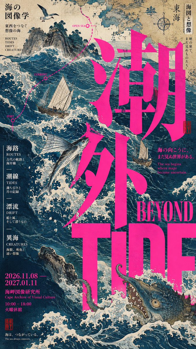
【Theme】{fill in the theme} 【Chinese title】{fill in 2–4 characters} 【English title】{fill in short English} 【Core subject】{person / object / classical image / product / scene, etc.} 【Layout mechanism】{old image × fluorescent giant type / giant-type architecture × subject interpenetration / person × geometric slices / monochrome field × ultra-thin vertical axis / other} 【Main color】{fill in} 【Accent color】{fill in} 【Information density】{low / medium / high} 【Aspect ratio】9:16 Generate a text-and-image poster with the refinement of a mature Japanese art museum, cultural publications, and Editorial Graphic Design. Do not apply the fixed "title + main image + info bar" template; instead, based on the 【Layout mechanism】, first establish a sufficiently striking visual action so that text, image, color blocks, and subject truly participate in the same composition. Typography must become the visual structure. The Chinese or English title may be extremely enlarged, run off the edge, misalign, cross zones, be occluded by the subject, or conversely press down on the subject; allow the subject to enter the negative space of the letterforms, so that "type" and "image" create interpenetration, occlusion, and front-to-back layering. Establish an obvious scale contrast: giant title × strong subject × tiny Micro Typography; do not keep all text at similar sizes. The image may be boldly cropped, with no requirement to show the subject in full. Depending on the subject matter, use old paintings, archival photography, portraits, objects, plants, or other visual materials, but each poster keeps only one strongest subject and one strongest compositional conflict. Information density should be locally concentrated: dates, English subtitles, short phrases, and micro annotations may grow naturally along edges, color blocks, letterforms, or the subject; do not spread them evenly, and do not make a card UI. Keep the palette within 2–4 main color families; boldly use combinations of fluorescent pink, vermilion, orange, teal, black and white, letting traditional imagery clash with modern colors; you may also use a large monochrome field, keeping only minimal subject and text. Slight paper texture, print overprint feel, or handmade traces are allowed, but no heavy aging, grime, or noise. The final effect should look like a genuinely art-directed Japanese cultural poster: bold text-image relationships, layout with personality, information that is rich yet orderly, each piece with its own independent visual action, rather than the same template with swapped content. Avoid: plain title-on-top image-below, regular grids, card UI, PPT-style info modules, left-right symmetry, all subjects fully centered, meaningless English, random gibberish, excessive CG, cheap retro filters, numbering 01 / 02 / Vol., four-point star flares, and sparkle.