
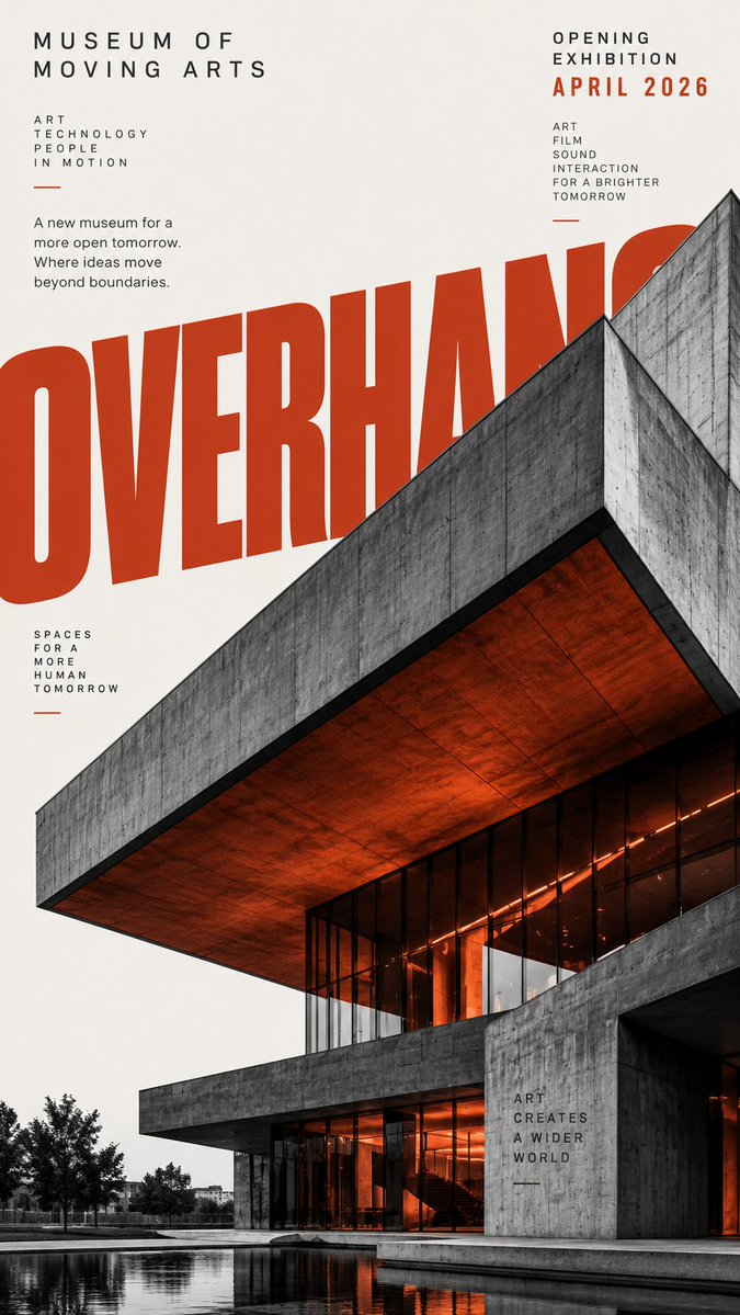
Theme: [museum / city campaign / design week / hotel / public space] Main title: [YOUR TITLE] Architecture: [building type and key geometry] Accent color: [orange / blue / teal / yellow / other] Type interaction: [behind / overlapping / wrapping / cropped by architecture] Aspect ratio: 9:16 Create a vertical architectural editorial poster combining real architectural photography with bold graphic typography. Use a warm off-white background and mostly monochrome architecture with strong contrast, realistic concrete, glass, steel and natural shadows. Make the building large in frame with dramatic cropping, clear geometry and a strong silhouette rather than showing the entire structure neatly. Use only one saturated accent color, applied selectively to oversized type, geometric blocks, outlines or small architectural areas. Typography must act as part of the composition, not simply sit on top of the photo. Use oversized bold sans-serif lettering that overlaps, hides behind, cuts across or extends beyond the architecture and poster edges. Add a small amount of structured editorial information such as event name, date, location, categories or a short statement. Keep the hierarchy clear: architecture and oversized type first, supporting text second. Aim for a sophisticated architectural magazine / cultural campaign aesthetic with strong negative space, graphic tension and clear thumbnail impact. Avoid generic real-estate advertising, futuristic CGI buildings, excessive colors, meaningless text, logos, numbering, watermarks and decorative clutter.