
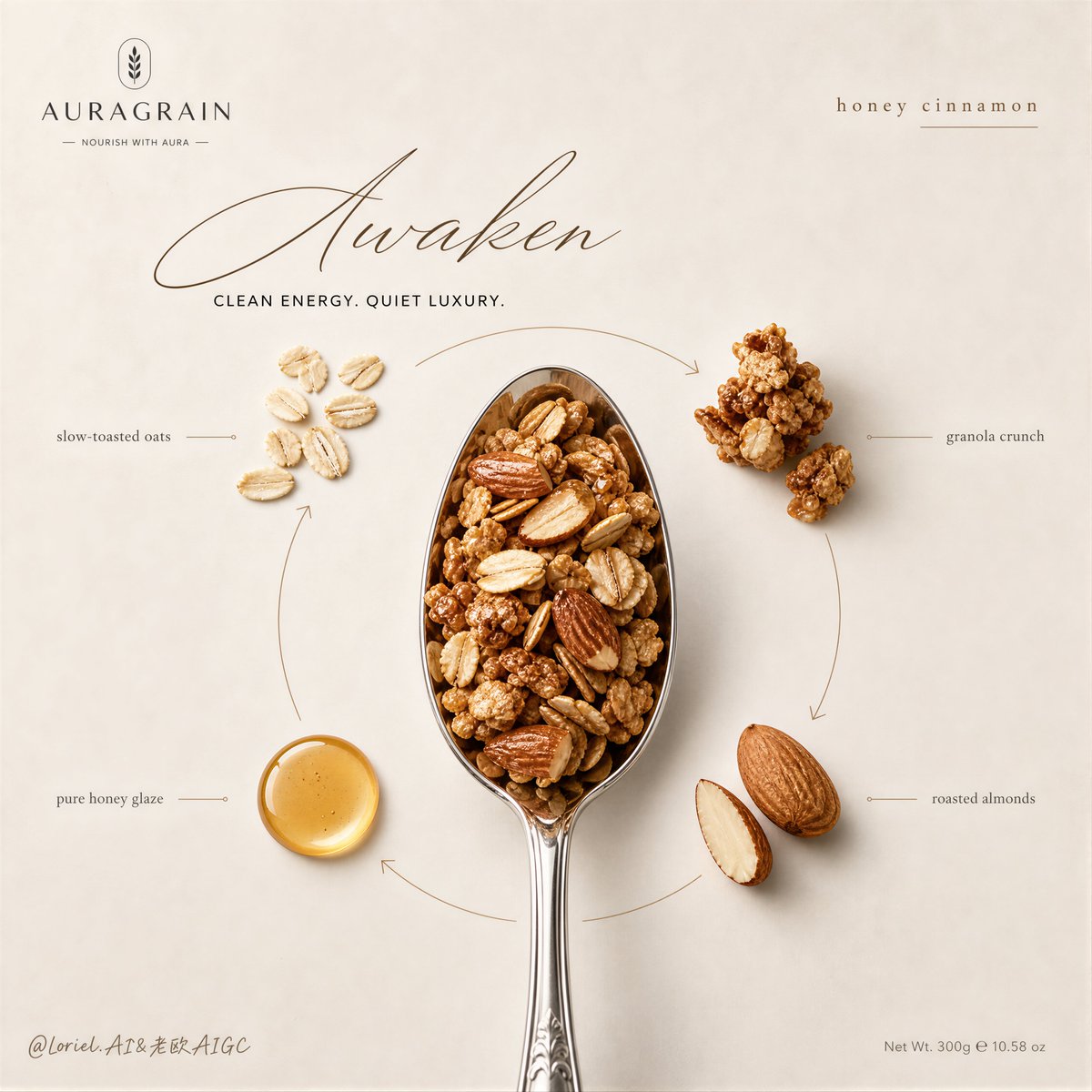
Create a Cannes-level flagship advertising poster for an original premium granola brand named AURAGRAIN, featuring the product Honey Cinnamon Oat Granola. Build the image with a refined Orbit composition and a cooler, more international editorial aesthetic. Core composition: A vertical luxury food campaign poster with a soft mineral-off-white background, subtle natural paper texture, very clean negative space, and a calm premium atmosphere. In the exact center, place a polished silver spoon vertically as the hero object, filled with ultra-realistic honey cinnamon granola. The spoon must dominate the composition and feel precise, sculptural, and appetizing. Hero product logic: Inside the spoon, show detailed toasted oat flakes, compact crunchy granola clusters, roasted almond pieces, and a restrained glossy honey-coated texture. The food must feel authentic, premium, dry-crisp yet lightly glazed, with real commercial food-photography detail. No mess, no excessive crumbs, no rustic chaos. Orbit structure: Arrange 4 key ingredient elements around the spoon in a controlled circular flow: oat flakes, granola clusters, roasted almonds, and a small drop of golden honey. Their placement should create a subtle closed-loop visual rhythm around the spoon, guiding the eye in an elegant orbit. Use very thin refined directional lines and understated curved graphic gestures to connect the surrounding ingredients back toward the center. The orbit should feel intentional, premium, and quiet, not playful or messy. Typography system: Use a highly refined international typography layout. Replace any overly casual rustic feeling with a more elevated editorial balance: - Large elegant custom script headline near the upper center-left: “Awaken” - Small uppercase sans-serif line beneath it: “CLEAN ENERGY. QUIET LUXURY.” - Small refined flavor descriptor at the upper right: “honey cinnamon” - Minimal ingredient annotations placed near each ingredient in tiny sophisticated English editorial type: “slow-toasted oats” “granola crunch” “roasted almonds” “pure honey glaze” Typography must feel art-directed, airy, and premium, with beautiful spacing and hierarchy. No heavy fonts, no cheap health-product design, no crowded copy. Branding: Place a minimal AURAGRAIN logo in the upper left corner, understated and official. Add a very small net weight line in the lower right corner. Branding should feel discreet, international, and luxury-natural. Lighting and color: Soft controlled studio lighting with gentle highlights and quiet shadows. Color palette should be cooler and more restrained than rustic breakfast advertising: mineral ivory, oat beige, muted almond brown, soft cinnamon tan, pale honey amber, brushed silver. Avoid overly warm farmhouse tones. The final image should feel calm, premium, modern, and globally polished. Visual quality: Ultra-realistic commercial food rendering, premium FMCG key visual, elegant ingredient isolation, crisp texture definition, believable metallic spoon reflections, subtle tactile shadows, clean layout, sophisticated negative space, international wellness-brand campaign aesthetic. Mood: Quiet confidence, premium nutrition, modern restraint, editorial elegance, clean appetite appeal, luxury naturalism. Negative prompt: rustic farmhouse styling, cluttered layout, cheap packaging look, noisy annotations, playful doodles, messy crumbs, oversaturated warm tones, ugly bold fonts, plastic-looking oats, fake honey, dirty background, crowded composition, low-end organic branding, blurry food texture, distorted spoon, casual supermarket flyer aesthetic