
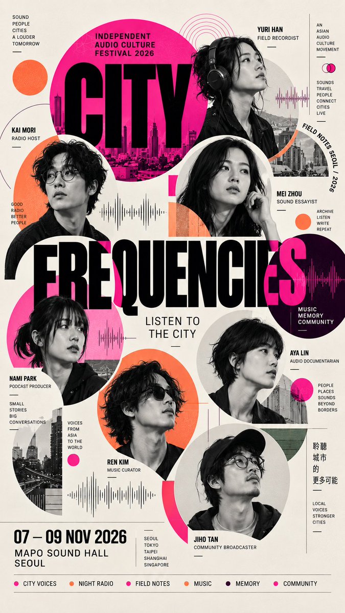
[THEME / EVENT]: {fill in} [MAIN TITLE]: {fill in} [SUBTITLE]: {fill in} [PEOPLE]: {4–8 people + roles} [LAYOUT]: {oversized type / circular grid / geometric grid / vertical slices / centered composition} [MAIN COLOR]: {fill in} [ACCENT COLOR]: {fill in} [DATE / LOCATION]: {fill in} [FORMAT]: 9:16 vertical poster Create a high-end multi-portrait editorial poster with strong typography, modular portrait placement and rich but controlled information density. Build the composition around ONE clear layout system selected above. Do not simply arrange portraits in equal rows or a basic speaker grid. Treat each person as a graphic module: use varied portrait scales, cropping, cutouts, geometric containers, overlaps, edge-breaking and foreground/background relationships. Use realistic, high-quality portrait photography with a consistent visual treatment across all people. Vary poses, head angles and crop sizes so the cast feels dynamic while still belonging to the same visual system. Typography must actively shape the composition. Make the main title large and visually dominant, allowing portraits and letters to overlap, intersect or sit behind one another where appropriate. Add the subtitle, names, roles, date, location and a few meaningful topic labels as secondary information. Keep the layout information-rich but organized: combine dense portrait areas with quieter breathing space, and create clear hierarchy between the main title, people, event details and small editorial text. Use a restrained color system: a clean neutral background, one dominant color and one supporting accent. Geometric shapes, lines, circles, frames or architectural modules should support the chosen layout rather than act as random decoration. The final image should feel like a finished contemporary exhibition, festival, forum or editorial poster — not a PowerPoint speaker lineup or a generic template.