
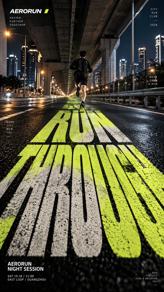
TITLE: [e.g. RUN THROUGH / SHIFT / ASCEND / IDEAS HAVE WEIGHT] PROJECT NAME: [brand / campaign / editorial / exhibition] SCENE: [city road / architectural corridor / concrete stairs / abstract typographic space] SUBJECT: [runner / fashion figure / climber / small human figure / none] PERSPECTIVE TYPE: [road depth / folded surface / stepped perspective / type-built space] MAIN COLOR: [one strong accent color] SUPPORTING TEXT: [location / date / short tagline] FORMAT: 9:16 vertical poster Create a high-impact perspective typography poster where oversized type becomes the main spatial structure of the image. The composition should be built around one clear perspective system. Let the main word stretch, compress, fold or recede into space depending on the scene, so the typography feels physically integrated into the environment rather than placed on top of it. Use the title as the dominant visual element, occupying roughly 35–60% of the composition. The letterforms should feel bold, clean and highly legible, while also creating strong depth and directional movement. If the scene is a road, let the word extend along the ground toward a vanishing point. If the scene is an architectural corridor, let the typography continue across floor and wall planes. If the scene is stairs, let the letters break naturally across the steps while still reading clearly from the chosen viewpoint. If the scene is abstract typographic space, let the word itself construct the spatial perspective. If a person is included, keep them secondary and use them as a scale anchor. They should interact naturally with the typographic space by running through it, walking across it, climbing it, or standing within it. Use a restrained palette with one strong accent color and a clean editorial layout. Add only a small amount of secondary information such as project name, date, location and one short thematic line. Overall style: perspective typography, oversized type, editorial poster design, architectural composition, strong depth, clean hierarchy, bold visual impact. Avoid floating text, weak perspective, random distortion, decorative 3D effects, excessive filler copy, cluttered backgrounds, watermarks and numbering.